
We are celebrating 15 years — and counting — of stories that are deeply researched and deeply felt, that build a historical record of what the city has been.
We are celebrating 15 years — and counting — of stories that are deeply researched and deeply felt, that build a historical record of what the city has been.
Maps are so ubiquitous — embedded in everything from phones to cabs to a little box on the right-hand side of this screen — as to be taken for granted, dictated by the unquestioned omniscience of satellite-enabled GPS, census-data-enabled GIS or Google. But even in an era of enhanced tools for image manipulation and increased interest in data visualization and infographics, studying the visual representation of complex information (spatial or otherwise) is not always seen as a prerequisite for sophisticated urban analysis or design. So, when architect and educator Louise Harpman was given the chance to develop a “dream course” for undergraduates at NYU’s Gallatin School of Individualized Study — one that integrated student demand for practical design skills, for engagement in the discourse of sustainability and for an introduction to key topics in urbanism — she chose an expanded idea of “mapping” as the topic. In the conversation below, she shares some examples from student work and discusses how the visual representation of research informs her practice as a designer, teacher and lifelong student of the built environment and its conflicts. –C.S.
What do you do?
I am an architect by training. I have an architectural practice here in New York called Specht Harpman, and for the last seventeen years I have also been as committed to my teaching. Until last year, I taught in professional schools of architecture – University of Pennsylvania, Yale, University of Texas – and I began thinking about a larger set of questions that isn’t commonly asked within the curricula of formal architecture schools. How do we stop talking exclusively to ourselves? How do we understand and respond to the multiple forces – technological, political, sociological – at work in the built environment? We need to expand our range.
A year ago I was hired as a professor of architecture, urban design and sustainability at the Gallatin School of Individualized Study, a school within New York University whose undergraduates and graduates create their own concentrations and courses of study. It was the students who were agitating for designers to be brought onto the faculty. And I think part of the impetus comes from the discourse of sustainability. In light of Copenhagen and Kyoto, it’s apparent that the building industries have, unfortunately, presided over the environmental degradation of our planet. So, as designers, are we going to be part of the solution or part of the problem? My feeling is we’re both, so we need to marshal our forces in order to get beyond ourselves, to get more positive thinking done.
How did you decide that mapping was going to be a topic you wanted to address in the courses you offer?
Mapping’s increasing prevalence in our lives is not exclusively because of technological advances such as GIS or handheld devices. Geography and related work in the social sciences speak to me in meaningful ways. I was really drawn to the writing of Graham Burnett, Denis Cosgrove, Mark Monmonier and others. As a topic, mapping is very broad, and something I wanted to dig into deeper. And the students I’m teaching at Gallatin don’t necessarily have visual skills; they consume images but they are not exposed to a critical discourse of image consumption or production. So I wanted to engage with maps as products that students create and put out there in the world.
Why do you think mapping is important for students of the urban environment?
For a couple of reasons. Maps are primarily received as directional; a subway or bus map is understood as a tool to help you get somewhere. So, often I’ll start the course by looking at the New York subway maps over time, tracking, for example, the different depictions of Central Park in various versions of the map. Simply showing students the decisions that mappers made demonstrates how much information we accept uncritically, and how much images participate in forming our understanding of the world. How do we make sense of information and for what purposes? How do we promote or suppress ideas through representation? Very early in the course, we get into how ideology underlies maps.
Distinct from why mapping is important for your students, why do you think it is an important topic for designers and architects to engage?
The best design work comes out of a strong research base, which may rely on demographics, on use patterns, on flows of capital. And you can’t just write a report; you need to make that information visible. In the design world, we are so used to image production: plans, sections, elevations, aerial photographs. And yet we assume the neutrality of maps. I want students to understand what biases go into the production of an image, what is privileged, limited or excluded.
I’m interested in what you said about the insularity of architectural discourse. At the same time, obviously architecture is taking on more and more intellectual territory – from ecology to political economy and everything in between. When you were first studying and practicing architecture, how would you characterize the professional interest in systems, in socio-political or environmental issues, and data?
I don’t think it was there. In the early ’90s, when I was in graduate school, the emphasis was on formalism, on the ability to craft a thoughtful, sympathetic, elegant response to a site, to a program, to a client. It was a bit “me and my building.” These days, it’s become sexy to talk about landscape. What I find positive about that change is the fact that architecture has opened itself up to larger and larger scales. I think the emphasis on landscape and transportation and systems is, again, a very positive development in architectural education.
What kind of maps do you make in your professional architectural practice? How do interpretive or analytical projects affect your design?
The most recent example is the work we have done on zeroHouse, a solar powered, self-sufficient, off-the-grid modular dwelling unit.
We designed it specifically for optimal performance within certain latitudes. So, the geo-spatial data helped us determine where it would work. But on a different scale, we also produce an exploded axonometric that’s literally a how-to map for someone to make his or her own zeroHouse: assemble these parts, part A connects to slot B. I think that’s another kind of information production and another type of mapping.
Which raises the question, what is a map? Not all of the work your students produce is territorial.
We talked a lot about geo-spatial mapping versus information mapping. When I ask my students questions about the information they have gathered as part of a research process, I’ll say “What does it look like to you?” And their first instinct is to write a paper or report. I’ll say again, “No, what does it look like to you?” I want students to formulate a research question, find the data and make it visual. That’s how I’m thinking about what mapping is.
So is it important or irrelevant to you to draw a distinction between a map and a diagram? Is the visual language of architecture – plans, sections, axonometrics – something different than the kind of mapping you are talking about?
I think that diagrams – which powerfully distill information – reside within our maps. Maps, for me, are a more inclusive category, a larger field of information. And I think maps make evident their own subjectivity. That’s why I try to get my students to understand all of their choices down to color and typeface.
Tell me how the course is structured.
The first assignment is to read Walter Benjamin’s essay “Unpacking my Library.” The goal is to get them away from thinking that mapping is only wayfinding, is only directional. I had them “map” the essay, which was challenging for them as they were still getting up to speed with Adobe Creative Suite and building the relevant skills. After that we mapped water and waste.
The next assignment was to map a contemporary conflict. One student chose to map Craigslist apartment ads that are listed under Clinton Hill but are actually in Bed-Stuy. This project really dealt with how the very act of naming is loaded with conflict. We went to see Matt Knutzen, the geo-spatial librarian at the New York Public Library and talked about how this type of conflict has been going on for a long time. Again, the point of the class is to understand that there’s no neutrality in a map; framing information foregrounds some of it and ultimately denies the rest.
And then, in the middle of the class, Occupy Wall Street erupts. And it was pretty fortuitous: teaching is always political and I think the best thing teachers can do is be upfront about their biases. One student tells me that the Occupy movement is what she wants to map. So I asked, “What about it do you want to map?” This led to a lot of research about privately-owned public spaces, ownership models, the benefits that prime tenants enjoy, the regulations. This conversation may be familiar to architects, but what’s so important about this is the notion that understanding the built environment can’t reside singly, solely in architecture schools.
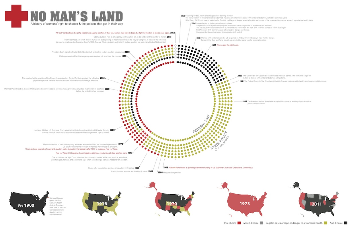
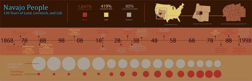
The final project was to map a conflict over 100 years. One student mapped banana production and land ownership in various Central American countries. One of the things that’s so fascinating about what she’s included here is demonstrating how and when the United Fruit Company disinvested in the land once they controlled the crop.
The best part of teaching is having a question that can sustain you for 14 weeks. We do a series of reflective writing projects in this class too, at the beginning and at the end of the course. The question was, “Do you think a class like this will help you understand the built environment?” Many of them answered with “I’ve seen things that have always been there that I’ve never seen before.” As a teacher, that’s what I want. I want students to see what’s already there and also to see a place for themselves in the production of that understanding: whether it’s research, image production, design. For undergraduates especially, that sense of agency can be very empowering.
The views expressed here are those of the authors only and do not reflect the position of The Architectural League of New York.


Comments