We are celebrating 15 years — and counting — of stories that are deeply researched and deeply felt, that build a historical record of what the city has been.
We are celebrating 15 years — and counting — of stories that are deeply researched and deeply felt, that build a historical record of what the city has been.
On November 26, 1967 the opening of the Chrystie Street Connection — the first true integration of the IND and BMT systems since they were merged with the IRT to create the unified subway system in 1940 — offered subway riders traveling on lines through the Lower East Side and Brooklyn the first opportunity to access to the three systems with a single ticket. Called “the big switch,” one might assume this event would be relished by subway-goers. In reality, it was somewhat of a disaster. As described in an article in the next day’s New York Post entitled “Riders Burn as TA [Transit Agency] Pulls the Switch,” passengers at affected stations were largely confounded by the new system’s hard-to-grasp routes.
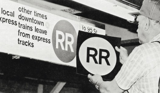
The main culprit was the confusing signage that greeted subway customers and transit officials alike. From the Post: “A mild panic set in at the Atlantic Ave. station when TA officials arrived early to find old signs still hanging. They quickly ordered the old signs and maps covered with newspapers before the rush set in.” At the affected stations, new signs integrating the lines — the first in the system designed by Massimo Vignelli’s design firm Unimark International in a spare, modern sans-serif — had been hung. But they stood in the same space as decades-old signs originally erected by the defunct transit companies.
Furthering the confusion, officials at individual stations erected hand-drawn signs on pieces of cardboard, in an attempt to clarify the changes for customers not familiar with the new transfer system. It quickly became obvious that the New York City Transit Authority had a major communication problem on its hands.

Installing a decal on a Unimark-style sign at an unidentified BMT Broadway line station, c. 1979 | Courtesy of MIT Press
This mishap is just one of many that fill the pages of Paul Shaw’s excellent new book, Helvetica and the New York Subway System (MIT Press, 2011). Expanded from an earlier piece published online under the title “The (Mostly) True Story of Helvetica and the New York City Subway,” the illustrated essay is both a history of the signage of the New York Subway system as well as an attempt to complicate, in Shaw’s words, “the commonly held belief that Helvetica is the signage typeface of the New York City subway system,” (a myth notably perpetuated in Gary Hustwit’s popular 2007 documentary Helvetica).
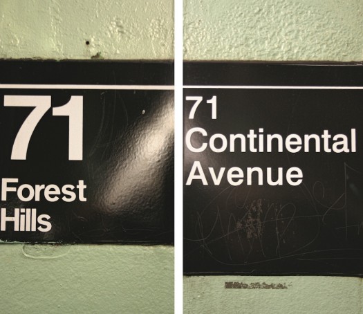
As noted, the Vignelli-designed signage was not rendered in the typeface Helvetica (as the famed type designer and recipient of this year’s Architectural League President’s Medal would have you believe) but rather in Standard (also known as Akzidenz Grotesk), the subway’s predominant typeface throughout the 1960-80s. In the course of showing how the Helvetica myth “is not true — or rather, it is only somewhat true,” Shaw’s story is compelling by showing just how complicated a thing as conspicuous as a subway sign can be. And how the examination of this complicated thing can reveal much about the history and workings of the subway system, and of the city itself.
Shaw weaves together the histories of subway signage in New York, the development of international transportation systems in the 1960s, the involvement of Vignelli’s firm and the history of the typeface Helvetica. He surveys an impressive collection of photographs of tile mosaics and screenprinted tiles that were used by the three different subway companies. He illustrates the point that these signs varied not only by company but also by line and station, establishing a precedent through which the system’s hodgepodge quality endured.

Platform signs at Forest Hill-71st Ave. Left sign is set in Standard; right sign in Helvetica | Courtesy of MIT Press
While systems in Europe and the MBTA in Boston created coordinated signage systems (many adopted Helvetica and like variations, specifically) in the early- and mid-1960s, the New York Subway had yet to heed any of the calls to get its act together. It was not until 1966 that the NYCTA hired Unimark International to undertake plans for such an effort. When Unimark made their proposal to the TA in 1967, they were told that the agency lacked the funding to commission a design manual, let alone implement any of the ideas. And when the TA’s in-house sign shop attempted to implement some of the signs at various stations, Vignelli called the result “the biggest mess in the world.” By 1970, Unimark put out the first official design manual for the New York system, but it specified Standard Medium as the font to be used. Despite Vignelli’s expressed desire to use Helvetica, Shaw postulates that it would have cost too much effort and money to the in-house sign shop at the time, and therefore Standard was selected.
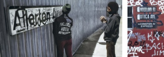
Despite this failure, Vignelli held out hope that his manual for the system would nonetheless bring the system’s signage into a more rational state. This, too, proved impractical. The 1970s brought the near-bankruptcy of the city and the transit system. Writing in the New York Times in 1979, Paul Goldberger declared that the state of the signage of the system was such that “the signs are so confusing that one is tempted to wish they were not there at all — a wish that is, in fact, granted in numerous other stations and on all too many of the subway cars themselves. And the system is so complex that one might feel signs make very little difference — a rider may as easily find his destination by taking a chance as by any sort of careful planning.” In addition to such failures of clarity, these years were marked by graffiti-laden cars and walls. In criticizing the hypocrisy of the city’s spending millions on anti-graffiti programs when many cars and stations lacked any official signage at all, Patricia Conway wrote in Print, “If nothing else, the subway graffiti are a testimony to the monumental failure of TA officials and their design consultants to make the system legible.”

L: Allerton Avenue, 1973. R: Subway car, 1971. Photos by Jack Stewart, from Graffiti Kings: New York City Mass Transit Art of the 1970s. | Courtesy of MIT Press
Although Shaw traces the myth that Helvetica was the official typeface of the Subway back to the 1970s, it was not widely implemented until 1989 and into the following decade, when capital improvement campaigns allowed a coordinated signage system to be undertaken for the first time.
While Helvetica and the New York Subway System is ostensibly about undoing the Helvetica myth, it is more of an exploration into the mutable and untamed history of the New York Subway System. Shaw demonstrates that much of the look and feel of today’s official signage is, in fact, the result of misinterpretation, obfuscation and politics, both personal and structural. In both its scope and explication, Shaw’s book has something to teach the practicing typographer and the historian alike.
There’s a scene in Hustwit’s Helvetica where the Swiss designer Lars Müller implies Helvetica is “the typeface of the city,” and viewers are subsequently treated to a montage of him pointing to a series of encounters with the typeface in the urban landscape. Müller here reifies the modernist ethos of a perfectly communicating typeface that is easy to apply universally. Shaw’s book provides a poignant counterpoint to this notion on his journey through the subway, documenting (though endless footnotes and photographic juxtapositions) a deluge of irregularities contained within the transit system.

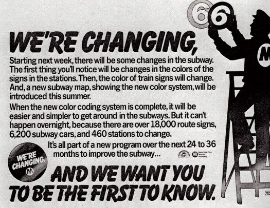
MTA poster heralding route designation changes, 1979 | Illustration by Nancy Stahl | Courtesy of MIT Press
.
The views expressed here are those of the author only and do not reflect the position of Urban Omnibus editorial staff or the Architectural League of New York.
The views expressed here are those of the authors only and do not reflect the position of The Architectural League of New York.