
We are celebrating 15 years — and counting — of stories that are deeply researched and deeply felt, that build a historical record of what the city has been.
We are celebrating 15 years — and counting — of stories that are deeply researched and deeply felt, that build a historical record of what the city has been.
Neil Freeman’s Brooklyn Typology Project is an artwork that imbues the sometimes prosaic and quantitative vocabulary of urban planning with a peculiar kind of poetic sensibility. The point of departure for his exploration is residential density – one of the most often cited and poorly understood metrics in urban analysis. But the project also reflects the boundless curiosity of a tireless flâneur: Neil visits and and documents a cross-section of Brooklyn communities that many New Yorkers will never see in a lifetime of exploring the city. But the way he has arranged the fruits of his exploration – cogent, interactive, and infused with delight at the dizzying diversity of the city’s neighborhoods and building stock – makes it more than the sum of its parts. Check out the project here and then read, in Neil’s own words, how it works, how it came about, and, crucially, how the practices of urban planning and art can inform each other. – C.S.
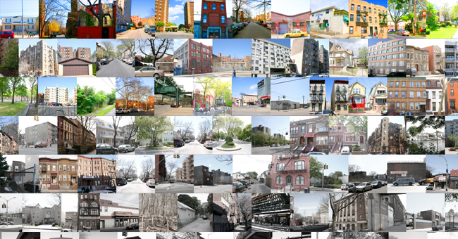
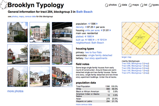
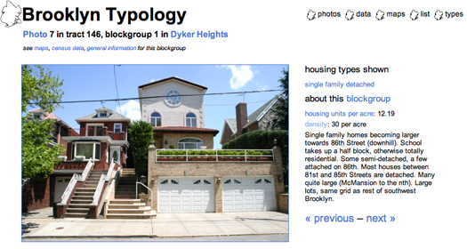
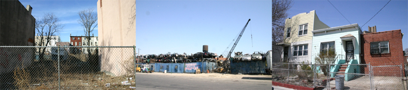
Brooklyn Typology is a portrait of Brooklyn, created by illuminating the interconnections of the physical, social and economic city. The site consists of thousands of photographs, detailed demographics and historical information for a sampling of areas throughout Brooklyn, presented in a web of hyperlinks. General information might lead one to photographs from one neighborhood, then to a particular housing type which might lead onward to census data, density figures, and other study sites. For instance, clicking on a photograph on the front page brings the viewer to general information about a particular study site. From there, he or she can link to nearby study areas, perhaps then to a neighborhood (Canarsie), then a particular housing type (single family attached). This brings up photographs of examples of that housing type, which can lead onward to census data, density figures, and other study areas.
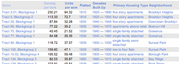
The project is both a planning and an art project. The artistic intention lies in the links between the elements of the site. Each datum, map, or photograph is linked to others in several ways. Density figures and dates link to other instances of similar values, historic periods or styles bring up lists of similar sites, or to all the sites sorted together. The network of connections enables novel forms of exploration of the borough. One can simultaneously investigate both the physical structure (in photographic or map form), and the underlying data or history.
Urban neighborhoods, in the grand scheme of things, present complex and wildly variable conditions. They are open to interpretations through a wide range of lenses – economic, political, social, and even geological. Cities are a human habitat, so it’s reasonable to examine them every way one might examine any other aspect of the world.
In one of my first projects, Chicago Mile by Mile, I took the unvarying grid of Chicago as a framework for determining where to take a sampling of photographs evenly distributed throughout the city. Organizing photographs of a city around a simple index, like a grid, reveals the rich complexity of the city. Although regularly spaced and rectilinear, each of the major intersections in the Chicago project has a unique identity and ambience.
In Brooklyn, I decided not to let the street system directly structure the project. Instead, I looked to a basic statistic: residential population density, usually expressed in residents per acre or square mile. Density is used by the Census Department for defining urbanization and by other agencies and businesses for deciding where to locate services. Decreasing or increasing urban population density has long been a central objective for urban planners. From the Tenement Acts through Levittown, high population densities were associated with disease, immorality and poverty. These days, planners associate higher population densities with culture, lower environmental footprints, and community, while the home-buying public tends to associate lower densities with safety, autonomy, and open space.
Residential population density is only one kind of density that’s important in a city. Employment density (sometimes called “daytime density”) determines the feel of an area just as much. The built form of the city can play a huge role in perceived density. A neighborhood of narrow streets and buildings without setbacks will be thought of as ‘denser’ than a neighborhood of widely spaced towers. Much of the dialogue about “density” tends to revolve around the relative merits of various physical forms. Physical form, culture, and economics together determine the density of an area. A detached house might have a higher population density than an apartment building, if the house is inhabited by a group of day laborers, and the apartments by upper-income singles.
Brooklyn is a great laboratory for exploring different densities and housing types. Brooklyn’s neighborhoods were built up in the beginning of the colonial era, and continued through the middle of the twentieth century. The street patterns in Brooklyn range from remnant Dutch colonial village ways to the access drives of towers in the park.
I began the project by taking a sampling of over 100 block groups from over 2000 in Brooklyn. A block group is a US Census-defined geography that generally consists of 3-4 city blocks, although there are some exceptions. For instance, Prospect Park is a block group with a 2000 Census population of 12. I thought this was interesting, so I included the park (tract 177, block group 1) in the project. I made the sampling representative of the range of population densities in the borough, and chose from throughout the borough.
I gathered census demographics for each block group, historical information on Brooklyn’s development, and made maps to guide me. Overall, this looked very much like the early analysis phases of a planning project. Soon, I was riding my bike around the borough, visiting each site and photographing it in turn. I wanted to explore the city, visit every neighborhood, and see it from ground level. Once the photography was completed, the photographs and data were edited, collated, and organized onto the website.
In the project, a general information page presents collected data for that site: photographs, historical information, census demographics, a map, and my field notes. Other pages present sortable matrices of the census data, Google maps of the sites, and larger versions of the photographs. Based on my observations in the block groups, I created 16 rough housing typology categories (e.g. single family attached or high rise apartments), and grouped each area by the typologies it contains.
Although the bulk of the website is photography, the photographs themselves aren’t the focus of the project. The compositions are straightforward – the fronts of buildings and views down a sidewalk or straight down a street. They’re reference images, useful as the basis for constructing elevations of houses, perspectives, and sections, but not directly concerned with aesthetics.
I’m fascinated by how relatively simple structures, like grids, can lead to diversity and complexity. Much of my artwork begins with a small set of rules that structure the work, and provide a jumping off point for a composition. I’m less interested in composing a work myself, and more so in setting up rules for compositions. I became a planner for similar reasons. I love architecture and design, but I’m more interested in the economic and social forces that drive the creation of the built environment. As a planner, I believe that our cities should allow for diverse experiences to occur in close proximity, and for neighborhoods to support communities of all kinds. Plans are often very simple documents, and the tools planners have at their disposal often tend toward the blunt and slow. I believe that planning must challenge itself to create simple rules that will allow a place to grow and change productively. Unlike in art, planning rules must reflect and foster shared values: for equity, limited environmental impacts, and diversity.
Brooklyn Typology was created at a moment when the booming housing market became widely recognized as a bubble. The project is a time capsule of the era when new cranes daily adorned the Brooklyn waterfront, Red Hook was pronounced the “next big thing,” and luxury condos popped up in Borough Park and Gravesend. Between the time that I finished taking the photographs and completed the website, regional home prices peaked, and the borough that I captured began the next stage of its evolution.
Planning has a great deal to learn from artistic understanding and reinterpretations of daily life. Both art and planning are (or should be) flexible and adaptable to a variety of temporal and physical scales. The only constant in cities is change, both in planning and art. Seeing both art and planning as processes of rule-setting and adaptation, Brooklyn Typology means to sit between the two worlds, presenting concrete information, while also fostering a nuanced and layered understanding of the city.
The views expressed here are those of the author only and do not reflect the position of Urban Omnibus editorial staff or the Architectural League of New York.
The views expressed here are those of the authors only and do not reflect the position of The Architectural League of New York.

Comments