We are celebrating 15 years — and counting — of stories that are deeply researched and deeply felt, that build a historical record of what the city has been.
We are celebrating 15 years — and counting — of stories that are deeply researched and deeply felt, that build a historical record of what the city has been.
Here on Urban Omnibus, we often cover the role design plays in making the city better. As a number of recent pieces have taken shape, the work of a particular group of designers kept popping up — influential in each of the projects being covered but not out in front as the main event.
So if you are a regular reader, you are likely already familiar with Partner & Partners‘ graphic design work, present in UO pieces on the long history and remarkable continuity of tenants’ rights advocacy, a project highlighting the city’s urban renewal areas, a documentary project on the Southside of Williamsburg, an activist boat trip down the Hudson River, and a temporary outdoor cinema built from junked cars. Eager to hear directly from the folks behind the designs, we sat down with the firm’s three partners — Greg Mihalko, Kathleen Scudder, and Zach Mihalko — to discuss their work and the role they play in what are often fundamentally activist endeavors.
–J.T.
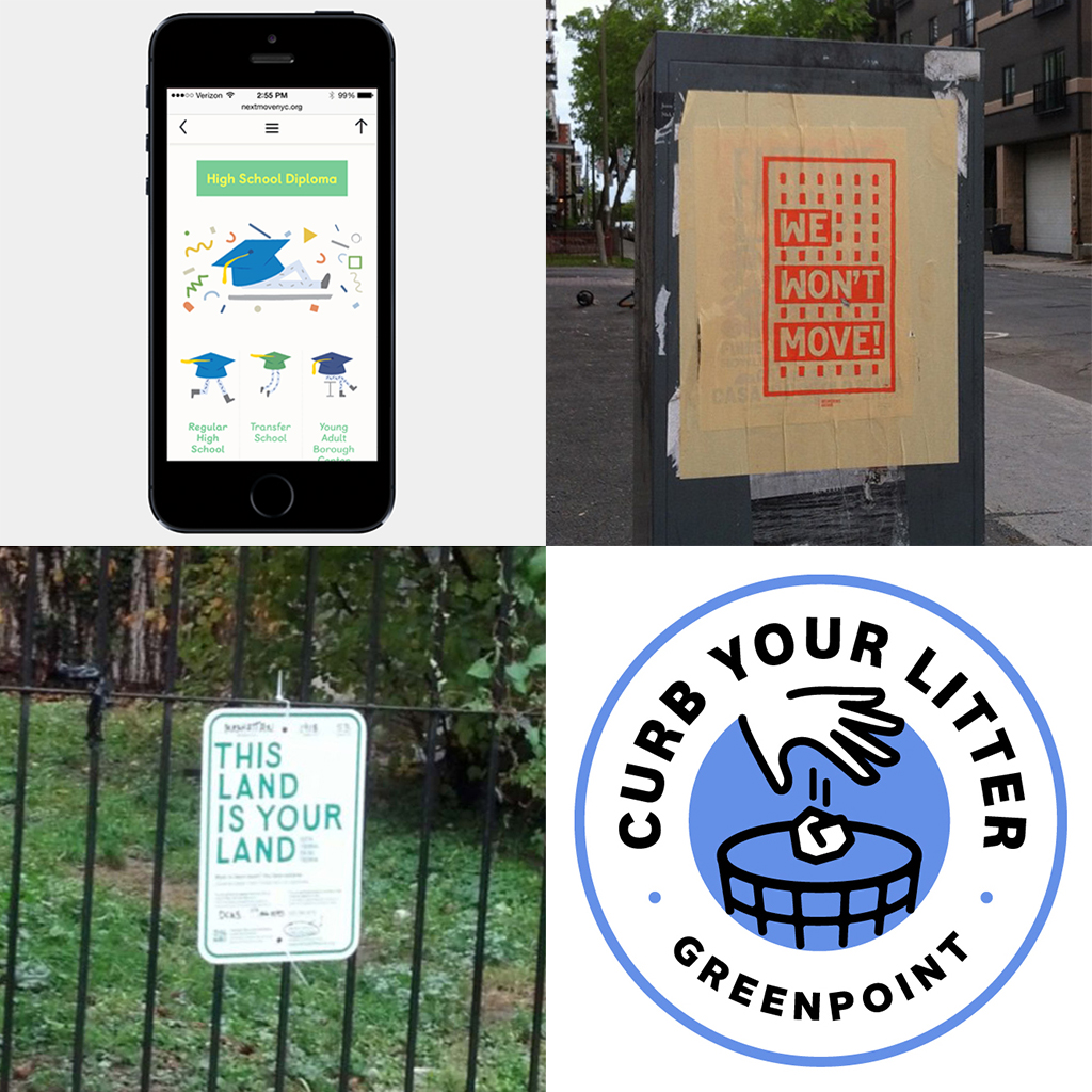
Partner & Partners designs for (clockwise from top left) a Center for Urban Pedagogy collaboration with the Center for Court Innovation, Interference Archive’s We Won’t Move exhibition, 596 Acres, and Curb Your Litter | Click the image to view more designs by Partner & Partners.
Jonathan Tarleton: You work primarily with clients in art, architecture, and activism. Why that angle for your practice and how does it affect your approach to design work?
Greg Mihalko: It’s important to us that we share the values of our projects and that we’re interested in the overall work of our clients. We actively seek projects that we feel create social value for the people and places we work within. The problems we’re solving are not necessarily different than in any other type of design. And even though we have this focus, that doesn’t mean we don’t take on other types of projects to keep the doors open. But when we’re connected to the ideas encapsulated in the work, we stay invested and feel good about it. We really feel like we’re partners as opposed to operating simply in a client-agent relationship.
We recognize that the role in which a graphic designer can be effective is very different from that of an urban designer or architect. We focus on the value of the communication of an idea. That’s far more powerful than trying to design over people’s existing work. You have to design with it and amplify it. We have a problem with design that intends to be noticed before the thing that it’s supposed to communicate. We want our design to be noticed, but we don’t want to overshadow the message we’re advancing.
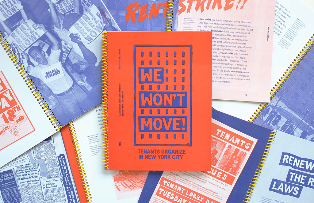
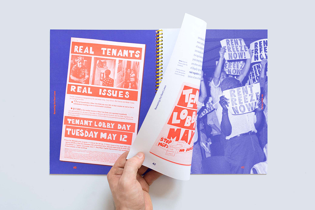
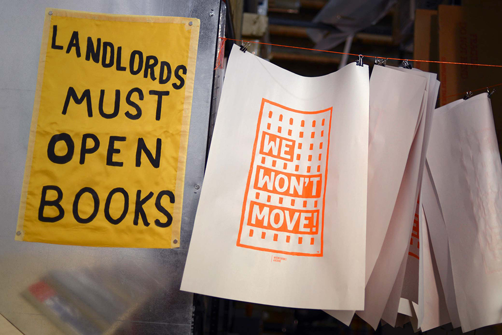
The Interference Archive, a collective archive that explores the relationship between cultural production and social movements, exhibited We Won’t Move: Tenants Organize in New York City from March 26 to June 15, 2015. The exhibition provided “an exploration of collective action by NYC tenants for decent and affordable housing from the 1940s to the present.” Identity, exhibition, and catalog design (pictured here) by Partner & Partners. | Click the image to view more materials from the exhibition.
We Won’t Move catalog
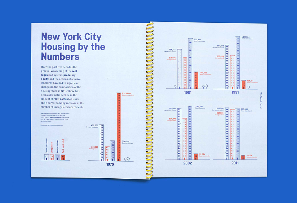
We Won’t Move catalog
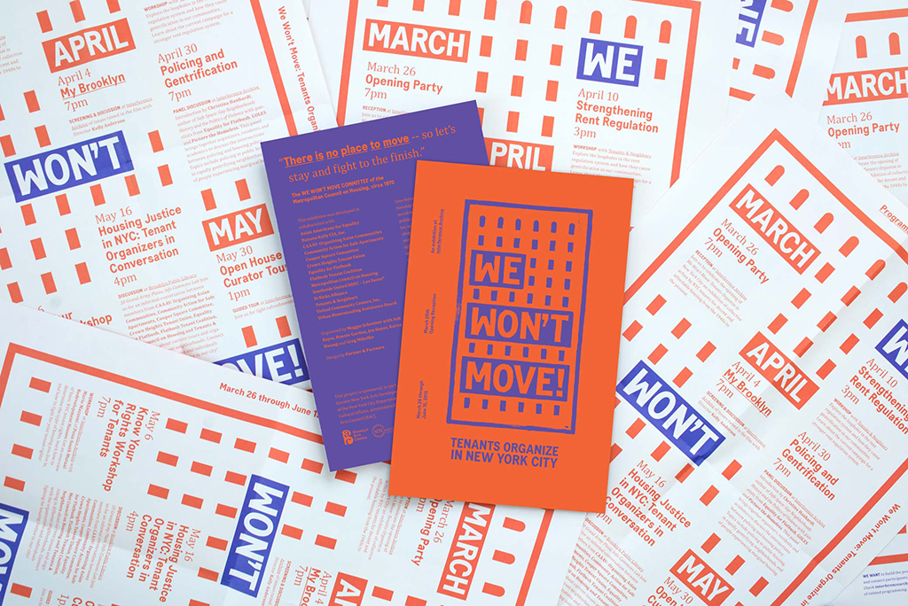
We Won’t Move flyers and poster
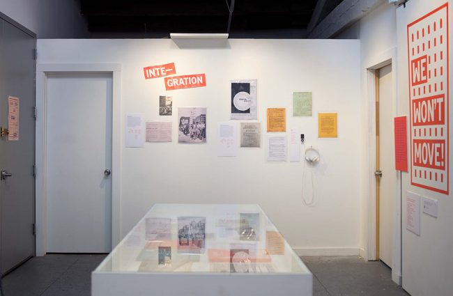
We Won’t Move exhibition
What’s an example of the process and outcomes of this approach?
Zach Mihalko: When we started working on the catalog for We Won’t Move at the Interference Archive, Greg and Kat had already done a bunch of research out of an interest in tenant rights. Better understanding of the problem allows you to communicate it much better; you actually know what you’re trying to design and whom you’re designing it for.
Greg: Our political outlook definitely influences how our projects develop. It’s one thing to design an exhibition; it’s another thing to design an exhibition and an identity that can be used by a specific community.
Kathleen Scudder: We created the We Won’t Move identity after looking at tenant organizing posters from the ‘40s to the present from the Interference Archive, Met Council, Tenants & Neighbors, and organizations doing work on the ground now. We wanted it to look like what people in those situations would actually do — paint or handwrite a sign.
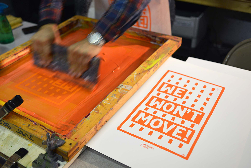
Screenprinting the We Won’t Move logo at the Interference Archive | Click the image to view more materials from the exhibition.
A screenprint of the We Won’t Move logo alongside a historic protest sign
Greg: The show was also intended for organizers in the lead-up to rent law renewal actions this past summer. So we made a catalog with a directory and glossary of resources for those organizers that showed what people have done and are doing.
We made a decision two days before the exhibition opening to buy a whole bunch of newsprint, make a screen, and print the main exhibition image like 500 times during the exhibition with people watching. They could then take those images away, with the intent that they would be used in another context.
The idea of the Interference Archive — that preservation of materials and ideas occurs through their use, rather than their being stuck in a box — extended into our work in a very sincere way. So we made the show’s identity totally applicable to other cities.
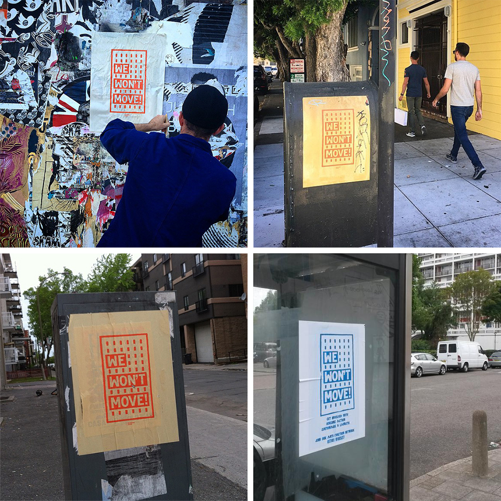
The We Won’t Move logo in use in San Francisco (top row), Montreal (bottom left), and London (bottom right).
Kathleen: Why make that logo exclusive? It should be open source. As designers, we aren’t afraid to relinquish some control. It’s important for people to take the idea and go with it, far more so than how tight the typography is.
We started noticing people taking it as their own, which is great. They started changing the color, and we’ve seen the logo elsewhere in New York and in Montreal and San Francisco.
Greg: For the design to be noticed by the same people doing organizing work in other places is more of a compliment than seeing your stuff in a design catalogue, in my opinion.
<<Click here to download a photoshop file of the We Won’t Move logo.>>
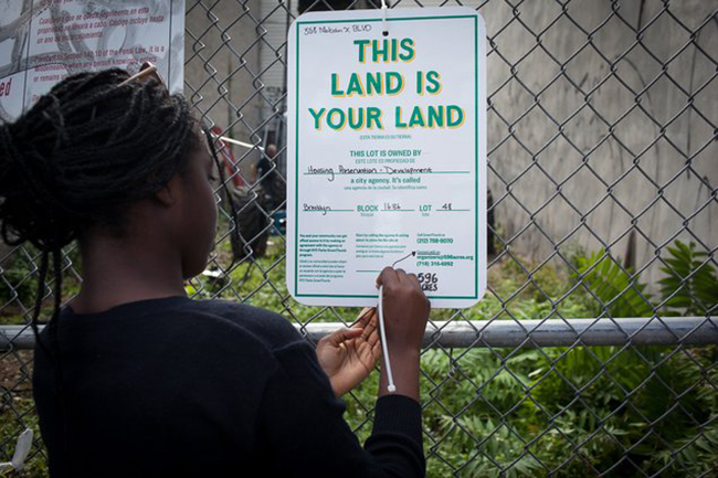
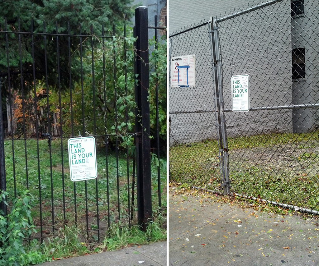
596 Acres, through its NYC Community Land Access Program, identified undeveloped, public land throughout the five boroughs. By placing “This Land Is Your Land” signs on these lots, 596 Acres encourages community members to seek access and productive uses for the land. | Photo courtesy of 596 Acres | Click the image for more 596 Acres projects featuring Partner & Partners designs.
“This Land Is Your Land” signs on two lots in Manhattan | Photos courtesy of 596 Acres
What role did you play in 596 Acres’ Urban Reviewer project?
Greg: We first worked with 596 Acres on the “This Land Is Your Land” signs that have been placed on fences surrounding vacant City-owned land. There are blanks to write in, customized to each vacant lot, and the message is hand-lettered.
Zach: We’re comfortable with those getting used. We like people to write on them, and people do cross things out and Sharpie all over the signs.
Kathleen: There was one sign where someone had written a whole paragraph about who to contact and how she could help. It’s much better when you can feel that person and that tone.
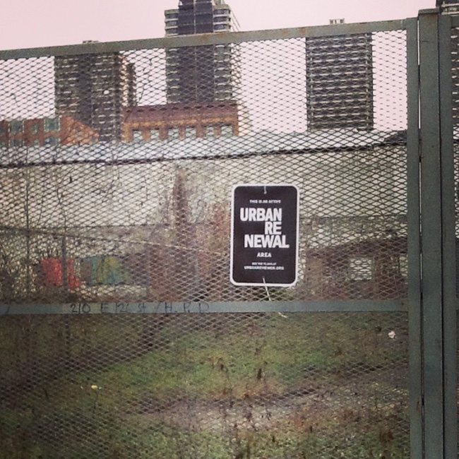
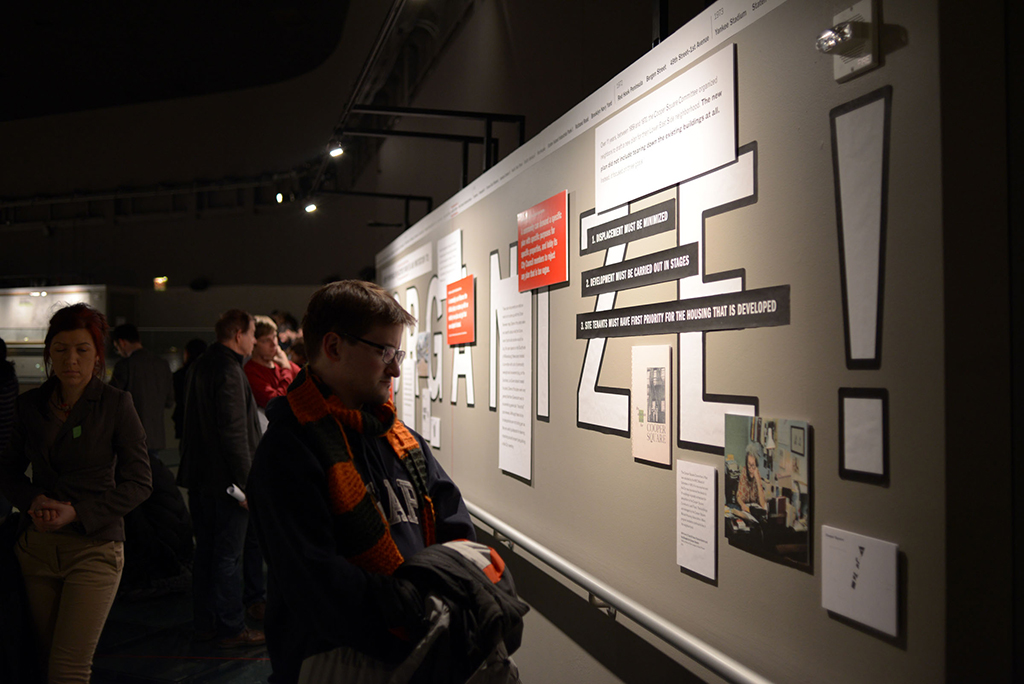
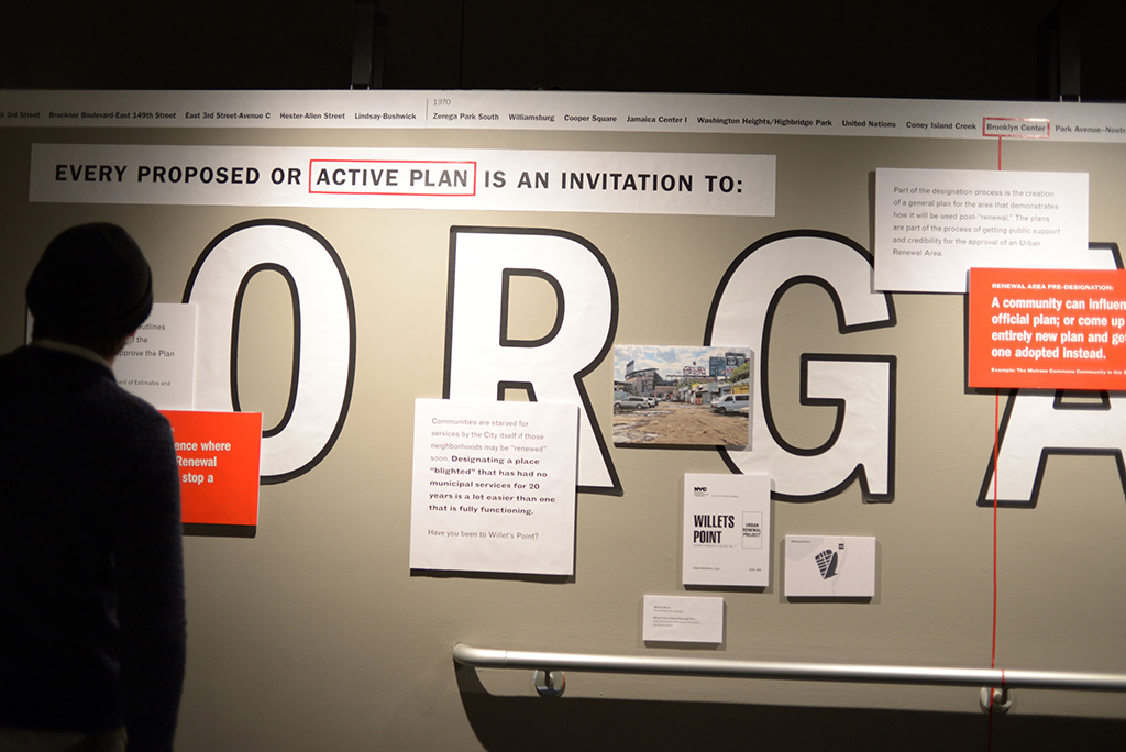
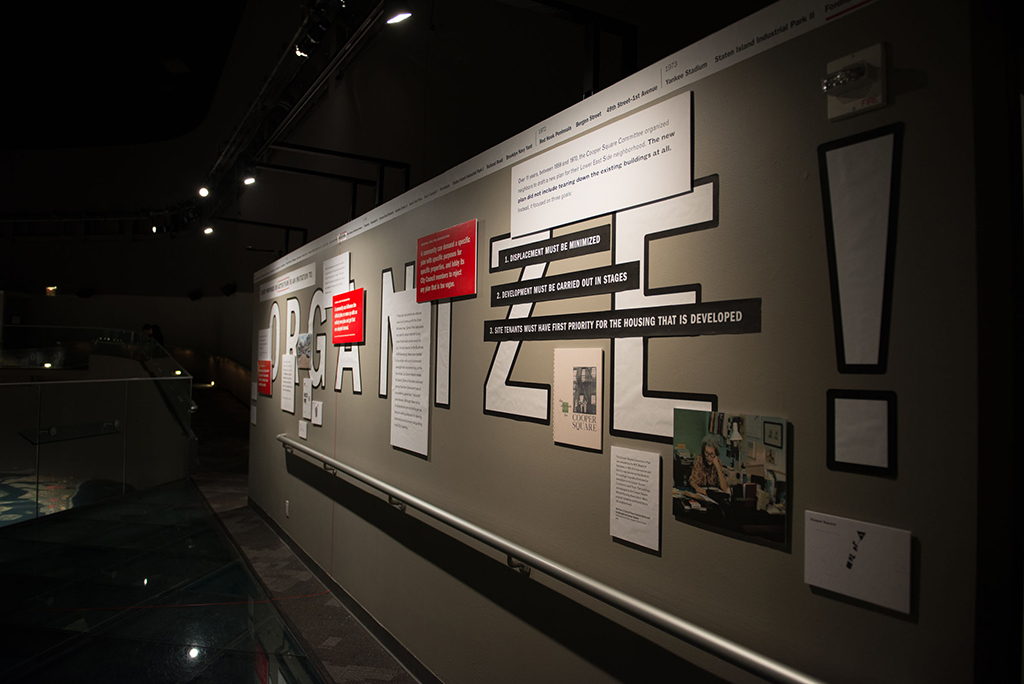
Another set of 596 Acres signs, also designed by Partner & Partners, mark active urban renewal areas across the city. | Photo courtesy of 596 Acres | Click the image to view more Partner & Partners designs for Urban Reviewer.
Zach: As part of the larger Urban Reviewer project, we also designed signs to mark each active urban renewal area in the city. The goal is to mark the space and the holes or injustices in various systems so that people have reason to organize around changing that system.
Greg: Part of doing that is to make something that might have originally been inaccessible really approachable and easy to digest, using more of a visual language. To create the visual identity for Urban Reviewer, we reappropriated visuals that were produced around urban renewal in the ‘60s and focused them in a different light. We re-viewed them — that’s why we broke the name “re-viewer” up in the logo; we hoped to shift its perception in a way.
Kathleen: For our design of the online tool, we worked from how users might find and explore some of the city’s urban renewal plans. You can scan by time period, or by what plans are active or have expired.
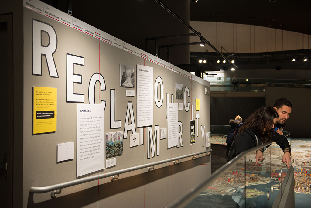
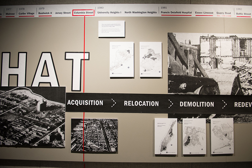
596 Acres’ Reviewing Renewal exhibition at the Queens Museum presented all 155+ urban renewal plans adopted in New York City on the museum’s Panorama. Exhibition and identity design by Partner & Partners. | Click the image to view more photos from the exhibition.
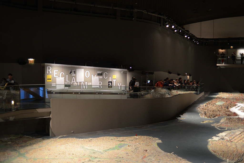
Reviewing Renewal exhibition at the Queens Museum
Reviewing Renewal exhibition at the Queens Museum
Reviewing Renewal exhibition at the Queens Museum
Reviewing Renewal exhibition at the Queens Museum
Reviewing Renewal exhibition at the Queens Museum
Greg: And we all worked tirelessly on the exhibition at the Queens Museum, in which we sifted through an immense amount of content in the urban renewal plans and told a story from their start to the present. That project gets at this idea of the causes or symptoms of the city’s systems — we try to make those visible to people.
The messaging that we came up with alongside Paula Segal, the director of 596 Acres, centered on what we can do as a city now — that it’s really not about history so much as this stuff that’s actually affecting us today and that we have control over.
Kathleen: And to arm them with clear tools and platforms that actually allow them to connect, communicate, or engage.
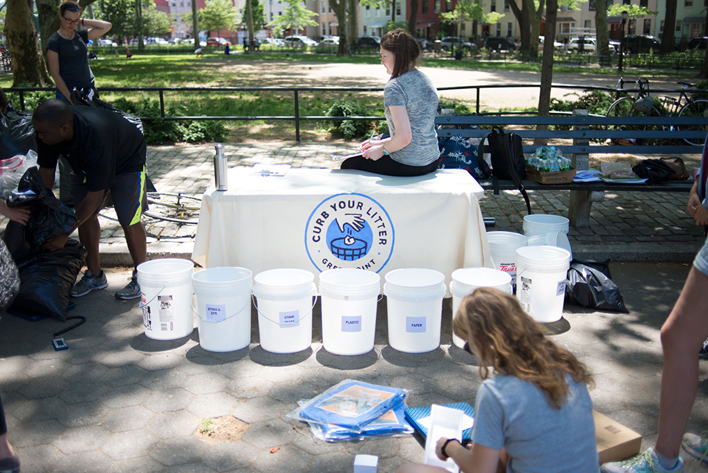
A Curb Your Litter table in McGorlick Park showcasing the badge designed by Partner & Partners. | Click the image to view more Curb Your Litter materials.
Curb Your Litter badge
Is there a current project you’re particularly excited about?
Kathleen: We’re working on Curb Your Litter, an anti-litter initiative through the Greenpoint Chamber of Commerce. They’re doing the first ever waste and litter analysis for Greenpoint — collecting and categorizing litter to see what the issue actually is — to then potentially put new cans where they’re most needed. And they are getting the community to help out, because residents walk the streets every day and know the issue best.
We came up with an identity for the initiative, and we’re just starting the wireframes for an interactive map and database that will show the problem areas and embed a way to request trashcans and recycling bins. We’re getting 311 data, so the map will feature reported can overflows, rat sightings, dirty sidewalk reports, and other things like that for a very localized area. Right now that data doesn’t seem to be acted upon; it just kind of disappears after people call it in.
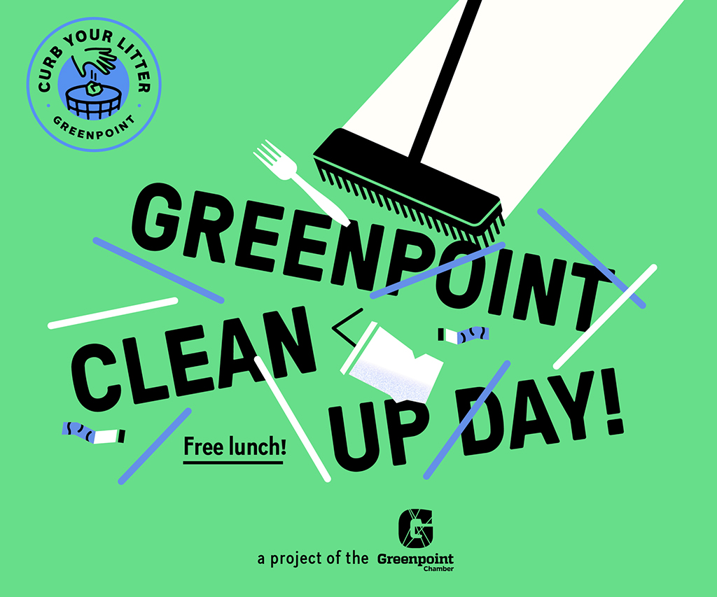
Curb Your Litter flyer for a Greenpoint Clean-Up Day
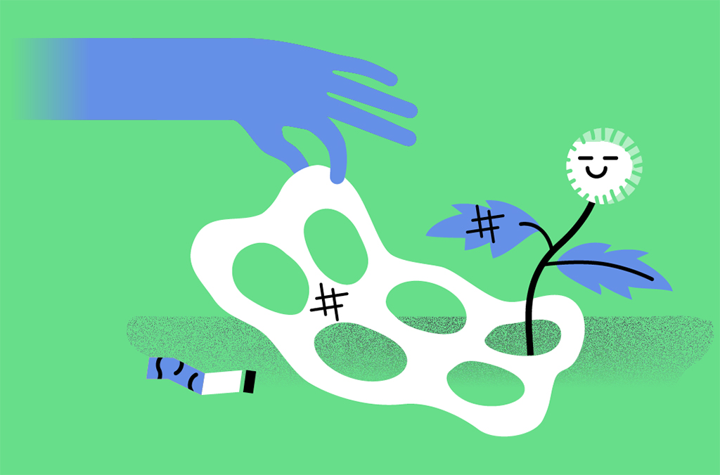
Curb Your Litter illustration
Greg: Like some of our others, this project deals with the city as a system, and this time with the perception and taboo around waste. Making an identity around a project that’s explicitly dealing with trash is not that easy. The logo is someone putting trash in a can, but it’s playful in a way. We also put a seal around it so it feels official but is still visually accessible to the community.
Zach: We’ve also begun to think about Curb Your Litter on your phone and what that could bring. One thing Caroline Bauer, who’s running the initiative, needs right now is documented evidence of the issue. So an app might ask the user for a picture of the problem, then allow them to say what kind of can, recycling or trash, would help where.
Kathleen: Once the actual analysis is complete, we can brainstorm creative ways to address the causes. A Norwegian friend of mine recently mentioned that her city government painted footprints onto the sidewalk leading to each trashcan. It actually worked; people would follow the footprints and throw their trash away. We’ve been talking about some other graphic ways to encourage people in a similar way.
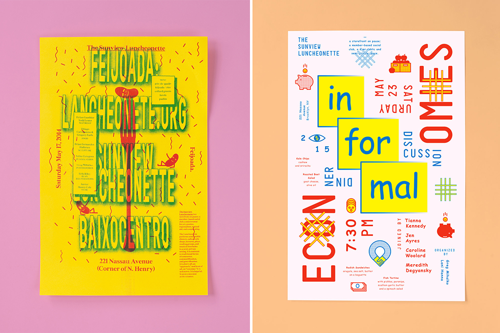
Event flyers designed by Partner & Partners for the Sunview Luncheonette, a “a space for art, politics, poetics, solidarity” in Greenpoint, Brooklyn.
What do you hope for in future projects?
Greg: We feel that our work won’t always rely on a client or someone coming to us. We’re working towards being flexible enough to self-initiate projects that address issues that we notice. For example, we might approach a key partner with a grant that we applied for and received ourselves rather than be contracted by them.
We want that to be a central part of our practice, and I think we’re inching our way there.
Greg Mihalko, Kathleen Scudder, and Zach Mihalko make up Partner & Partners, a design practice focusing on print, exhibition, interactive, and identity work with clients and collaborators in art, architecture, public spaces, and activism.
Unless otherwise noted, all images and designs by Partner & Partners.
The views expressed here are those of the authors only and do not reflect the position of The Architectural League of New York.