We are celebrating 15 years — and counting — of stories that are deeply researched and deeply felt, that build a historical record of what the city has been.
We are celebrating 15 years — and counting — of stories that are deeply researched and deeply felt, that build a historical record of what the city has been.
At the Museum of Modern Art in Midtown Manhattan, visitors can ride an escalator up to the fifth floor to take in Van Gogh’s Starry Night, take the elevator down to learn about Latin American architecture on the third floor, or head to the basement for a screening of New Wave Cinema deep cuts. But throughout its crowded galleries and in its noisy, echoing atrium, the institution is seeking to make its programming accessible to a wider range of visitors. Thursday afternoons feature drop-in programming for LGBTQ+ teenagers, as well as “Meet Me at MoMA” tours created for people with Alzheimer’s or dementia. A few times a year after-hours, blind and low-vision guests attend a program to hear live descriptions of paintings and sculptures on display and touch selected artworks. And on the first Friday of each month, from 4 to 8 pm, the $30 admission fee is waived, and visitors, many of whom cannot afford the normal ticket price, crowd in to experience MoMA’s collection.
As museums across New York City answer a moral call — and funder demands — to make their institutions accessible and inclusive to more visitors, they find they must reconsider not only their programming but everywhere it takes place. How can the design of one building (which has long served primarily white and wealthy visitors) navigate the needs of many different groups, including people with disabilities, communities of color, queer and trans people, and people who practice Islam, Orthodox Judaism, and other non-Christian religions, amongst others?
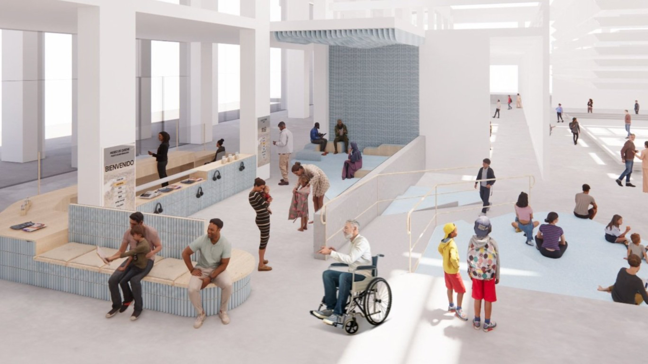
The design studio JSA/MIXdesign, helmed by architect Joel Sanders, has been working with museums in New York City and beyond to closely observe and rethink the spaces surrounding the galleries that hold the artworks and historical objects: entrances, admissions desks, security checkpoints, atriums, bathrooms, and more. This work has taken the form of a participatory design process with institutions like the Queens Museum, Cooper Hewitt, and the Whitney Museum of American Art, working with staff and a diverse set of visitors and constituents to identify accessibility challenges at their institutions, and begin to develop a toolbox of interventions that cultural organizations might implement to create more inclusive spaces.
In January 2024, JSA/MIXdesign and The Architectural League of New York convened a panel discussion and workshop for museum professionals to learn from each other’s work in navigating accessibility and inclusivity at their institutions. These conversations, highlighted below, build on the longstanding work of community activists, and are part of a long process of assessing how museums might better design themselves to serve many communities with divergent and overlapping needs.
In 2019, the International Council of Museums (ICOM) began the process of writing a new definition of the “museum.” Clocking in at just under a hundred words, their proposal cast museums as “democratizing, inclusive and polyphonic spaces for critical dialogue about the pasts and the futures.” After some museum professionals, especially in Canada and Europe, criticized this definition for downplaying what they believed to be core functions of the museum — collecting, preserving, and displaying artworks and historical objects — ICOM ultimately adopted a new, 57-word definition that incorporated the statement: “Open to the public, accessible and inclusive, museums foster diversity and sustainability.” But while ICOM may have successfully approved a new definition of the word “museum,” it did not clarify the meaning of “accessible” or “inclusive.”
In the United States, government and philanthropic funders are increasingly asking the institutions that they support to serve a diverse audience and employ a diverse staff. Recently, New York City’s Department of Cultural Affairs (DCLA) has created new funding criteria that look towards institutions’ commitments to advancing access, equity, and inclusion, and the New York State Council for the Arts (NYSCA) has similarly announced that it will “prioritize organizations that are within and serve historically underrepresented communities.” To meet these inclusivity goals, museum directors and boards are creating new staff positions — the Whitney Museum has a Director of Social Impact, the Metropolitan Museum of Art a Chief Diversity Officer — and leaning on their education departments to develop new programming initiatives. But as museums take on new commitments to accessibility, diversity, and inclusion, they’re left to grapple with big questions: Accessible to whom, exactly? How do you build — and operate — an inclusive museum?
Programming and public relations statements communicate a museum’s values. So too does its building: the gallery spaces and atriums, the stairways and elevators, the admissions desks and bathrooms. Museum buildings struggle to project many different, sometimes contradictory, messages and make room for many kinds of uses. Museum staff and donors have asked a lot of recent renovations: expanding education spaces for programming, but also simultaneously creating flexible open spaces that can be rented for fundraisers, weddings, and other events, generating revenue for institutions that are facing an increasingly difficult funding landscape. It’s an age-old adage in the non-profit world that to truly understand an organization’s values, you should look at its budget. But for museums, you might look at their buildings too: grand or modest, in a constant state of reimagining and renegotiation.
The Metropolitan Museum of Art’s limestone exterior extends for four city blocks, punctuated by alcoves that were long empty and have more recently hosted exhibitions of contemporary sculptures by artists including Wangechi Mutu and Carol Bove. A large exterior staircase beckons people to ascend to the main entrance. After being screened by security guards, visitors enter the Great Hall, with temporary installations of contemporary art and huge floral arrangements, paid for through a permanently endowed fund. It is a lively, awe-inspiring space for many. But this entrance is not accessible to those who cannot climb stairs. Disabled visitors, older visitors, and families with children in strollers must enter through a side entrance and proceed down a low-ceilinged hallway adjacent to an outpost of the Met Museum’s store, towards a ticket desk where no grand floral arrangements await them. Given that most museum buildings predate Americans with Disabilities Act (ADA) regulations, it is common to have separate entrances for non-disabled and disabled visitors. Architect Joel Sanders observed that such a set-up may “unintentionally segregate and in the end stigmatize” disabled visitors. But an entry sequence for everyone is not necessarily desired by all disabled people. While the separate entrance may deny disabled visitors the main entrance’s sense of ascension and awe, it’s also less crowded and less overstimulating. Some disabled and elderly visitors are fond of the entrance’s shorter lines and efficient ticket desk.
While the Met’s grand exterior stairs epitomize the museum entrance, other museums struggle to make themselves legible to passersby as visitable places. Cooper Hewitt, Smithsonian Design Museum is located in a Gilded Age Fifth Avenue mansion. The official entrance is located on a side street, where a few small steps and a ramp meet at a door staffed by a security guard — after which guests can proceed to the ticket counter. Landmarking rules constrain the interventions the museum might undertake to communicate with visitors before they enter. Kirsten Sweeney, the Cooper Hewitt’s Accessibility & Inclusion Manager, observed: “We may have a ramp, but it’s super narrow and not very visible from the grand mansion. Any proposal to change that is really not possible because of the specifics of maintaining the integrity of Andrew Carnegie’s home.” Discreet signage on the building’s fence announces current exhibitions and the museum’s hours. The entrance is easy to miss.
To the south of the building, Cooper Hewitt also has a terrace and garden with its own, separate entrance into the museum. Cherry trees and rhododendrons dot the garden, and visitors spin around in perennially popular Thomas Heatherwick-designed chairs or eat salads at café tables. The two entrances create a confusing dynamic for would-be visitors. Sweeney says: “The back entrance is through our garden, but the garden is a much more enticing, welcoming space. A lot of people enter through the garden, and it’s a very long, convoluted, confusing path to actually get all the way through the building to the other side to purchase your tickets.” While the garden entrance may be more legible to many visitors, the circuitous route poses challenges for blind or low-vision visitors and those with cognitive disabilities.
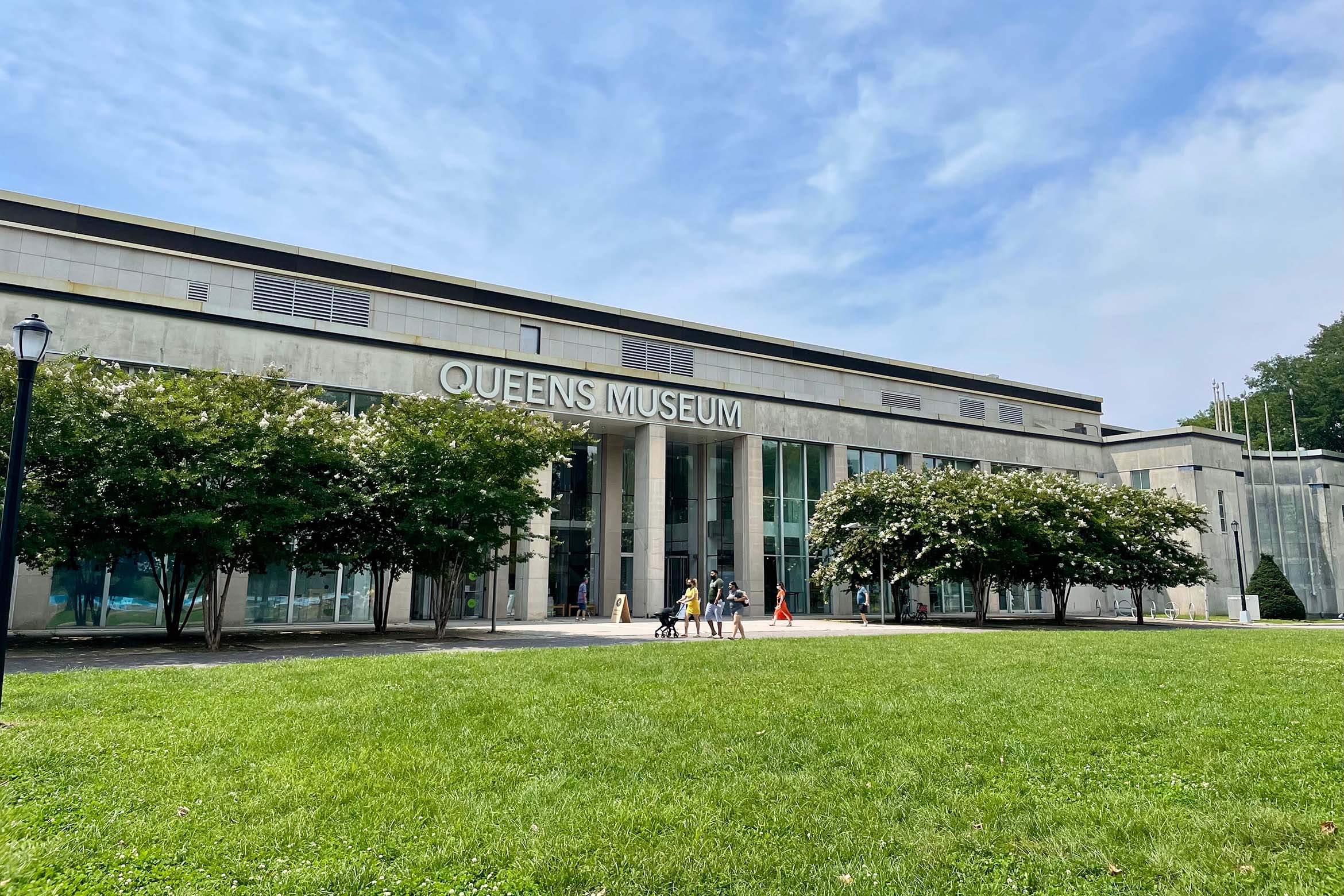
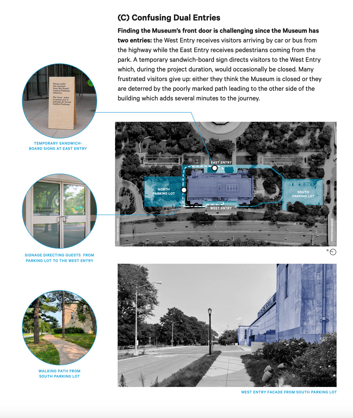
Located within the borough’s largest park, a stone’s throw away from the iconic Unisphere, the Queens Museum’s entryway and siting nonetheless prove confusing to many visitors. The building has entry doors on two sides. Sally Tallant, the museum’s President and Executive Director, noted, “Nobody can work out which door is the door. Nobody knows which is the way in.” Surrounded by lively green spaces on one side and a highway on the other, and far from the subway, the building’s siting can put off would-be visitors.
Tallant said: “Robert Moses built us in a completely inaccessible place. If somebody has any mobility issues or if there’s any trouble getting from the subway, the museum can be a challenge. Our address is literally ‘New York City Building.’ Access-A-Ride can’t find it. The facade of the building is reminiscent of 1930s fascist architecture, which isn’t that welcoming in some ways. Despite being in a park which is full of people playing and having a great time, getting people to enter into the building and understand what we are, and that we’re free and there for them, is more of a barrier than one might imagine.”
Even with its many Renzo-Piano-designed floor-to-ceiling glass windows for pedestrians to peer into, the Whitney Museum struggles to make its role as a museum clear. Nestled amongst luxury retailers and new developments along the West Side’s waterfront, the facade presents more questions than it answers. Dyeemah Simmons, the Whitney’s Director of Social Impact, remarked: “I hear that folks sometimes don’t even know that the Whitney is a museum. The name of the museum is in a weird location on the facade. Usually people are approaching from the east side to the west, but the front of the building is facing south. So people don’t actually see ‘Whitney Museum of American Art.’ They’re like, ‘What is this?’ There’s a lot of glass and people moving around inside, but there’s not art visible. I’m not really sure what people think it is.” In order to mitigate some of the entryway’s confusion, during warm weather the Whitney employs visitor services staff — not security guards — to stand outside wearing branded uniforms and welcome guests and help them enter the building.
At least in the US, entering a museum commonly means going through security and a bag check. Security protocols are ever-evolving, and current practices were often not in place (or even conceptualized at all) during the architectural design process, so the sequences can often clash with the intended flow of the space. After coming through the main doors, the Whitney’s security checkpoint takes guests off to the side and an area demarcated by an ad hoc arrangement of stanchions. At the Met’s main entrance, security has carved out space just inside the doors, causing a long line of visitors to stand waiting on the stairs outside, sometimes exposed to snow, rain, or intense heat.
At some institutions, visitors have to walk through metal detectors and send their bags through airport-style scanners. At Cooper-Hewitt, which, as a federally-funded Smithsonian Institution, must follow its protocols, security guards are armed. Seb Choe of JSA/MIXdesign observed, “When security is an architectural afterthought, this can pose an uncomfortable situation, especially for people of color, trans people, and immigrants who may have fraught relationships with security and policing.”
Security guards are omnipresent, well beyond the museum entrance. In gallery spaces, the guards’ primary task is protecting art, an imperative that can often lead guests to feel unwelcome. In 2023, the National Gallery of Art in Washington came under scrutiny after escorting a disabled visitor out of the museum because of their medical backpack — the institution has a policy that backpacks must be worn on one shoulder so that visitors don’t accidentally knock art with their bag. In Portland, Oregon, a visitor was asked to remove her baby carrier, a traditional Native American design, in an exhibition of works by Indigenous artist Oscar Howe.
At the same time that many museums are encouraging security guards to take a more welcoming approach, frontline staff, like those who sell tickets, ring up café orders, or staff info booths, increasingly face harassment and violence from members of the public. In 2022, two members of MoMA’s cinema ticketing staff were stabbed by a former visitor, leading the museum to shutter for a day and overhaul its security processes — eliminating the separate entrance for the theaters. A contentious climate has led some institutions to consider adding security guards to the team. But, as it stands, guards are often amongst the lowest-paid employees at museums — in 2018, New York City museum security guards were making less than half of the region’s area median income. They face grueling working conditions, spending nearly all day on their feet, often on concrete floors and sometimes subject to the same abuse that they are hired to protect other staff from.
While on paper, the role of security guards is to protect the artworks, staff, and visitors, in practice they also shape guest experience. It is often left to guards to help confused visitors make their way through buildings that are not intuitive to navigate. At the Whitney, the primary mode of circulation is a bank of four elevators, where security guards help to orient visitors to the museum’s programming. Simmons observed: “A security guard staffs the big freight elevator. They’re always so welcoming. They find joy in talking about the story of the art.”
Museum buildings can be confusing spaces for first-time visitors. Many older buildings, like Cooper Hewitt’s, were not purpose-built as museums, and conversions can create challenging traffic flows for visitors and staff. Preservation strictures can make it difficult to expand wayfinding in historic structures. Kirsten Sweeney observed: “There are a lot of things that we physically cannot remove or change. The idea of wayfinding on the floor: we cannot put anything on our floor because they are historic wood, and we cannot damage them in any way. Trying to find alternative ways of non-visual wayfinding is very challenging. The nature of the space adds another layer.” Instead, wayfinding often falls to staff members, or to other means like printed maps or smartphone apps.
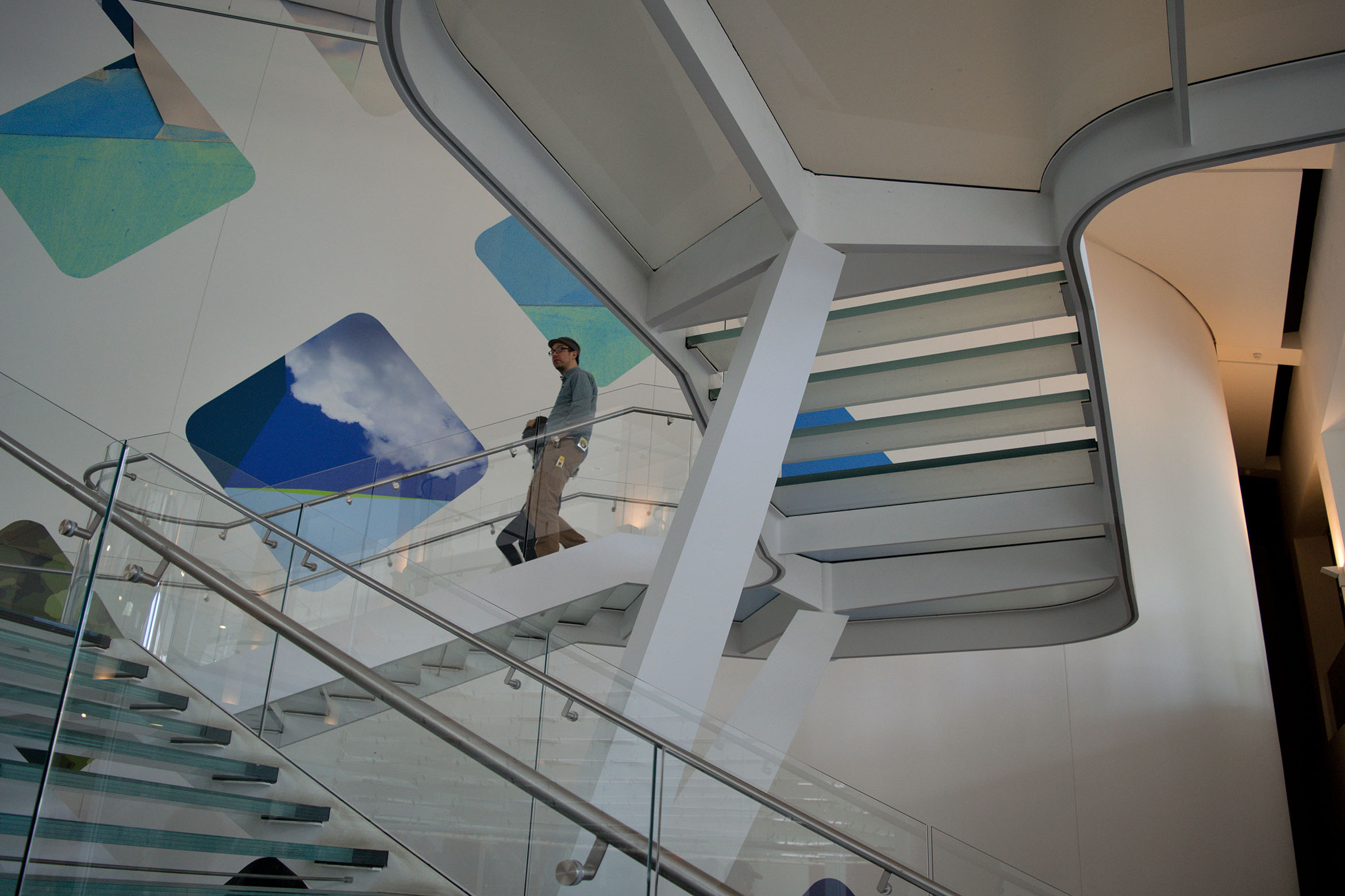
But wayfinding challenges certainly aren’t limited to older, repurposed buildings. The white cube esthetic that dominates in late 20th and 21st century structures discourages institutions from implementing wayfinding devices that may distract from the art on display. The Whitney building has only limited wayfinding signage: the text is also often small and sometimes only in English. Many museums have had successive renovations over the decades, each embodying the particular values and esthetics of the moment. At the Queens Museum, Tallant noted: “We have a lot of stairwells that were built as part of an active design strategy, which is an earlier design policy. Overcoming them is super expensive. I don’t want money to be a barrier, but it is some of the issue.” In Queens, elevators are very small and placed far out of the way in order to encourage visitors to utilize the stairs, which, constructed out of translucent glass, are difficult to navigate for low-vision visitors. And both the small size and the location of the elevators require time-consuming detours for visitors who cannot climb stairs.
Many museums lack sufficient seating for visitors, scattering just a few uncomfortable benches throughout gallery spaces. For guests who cannot stand for long periods of time, museums may also provide folding stools or wheelchairs, though these are usually tucked out of sight. Uninitiated visitors may not know these even exist. Visitors are calling for more comfortable seating. Speaking about the public feedback process undertaken with JSA/MIXDesign, Tallant noted: “All the feedback we’ve had from our community is that they want more seating and space that’s more sociable and welcoming. We’ve got some horrible old sofas — we don’t have the budget — but at least we’re providing seating and it’s heavily used.”
Museums are committing themselves to welcoming diverse audiences, a complex and expensive proposition, while simultaneously facing an immense budget crisis. Government funding is increasingly precarious. In January 2024, New York City Mayor Eric Adams proposed cutting funding to DCLA by $9.3 million. In March 2023, Governor Kathy Hochul proposed cutting 56 percent of NYSCA’s budget. At the federal level, Republican members of the House of Representatives attempted to fully eliminate funding for both the National Endowment for the Arts and the National Endowment for the Humanities in November 2023, part of a decades-long culture war in which conservative lawmakers continually threaten to strike arts spending from the budget. These efforts have been unsuccessful so far, but they lead to a sense on the part of cultural institutions that government funding is less reliable than ever.
This leaves museums to walk a difficult tightrope. While government agencies encourage — or even require — museums to serve diverse communities, polarization encourages museums to ensure that such efforts are perceived as apolitical and serving all people, lest they be accused of political partisanship as they seek to serve queer and trans visitors or visitors of color through exhibition and education programming. At the “Making the Inclusive Museum” panel discussion at Cooper Union, Maria Nicanor, the director of Cooper Hewitt, part of the federally funded Smithsonian Institution, remarked on this dynamic: “I think all the time about the current political climate of the country — the lack of agreement on definitions on what ‘inclusion’ or ‘accessibility’ should be. If I have to speak to one of these issues as a political issue, I can be immediately neutralized. There’s a great need for having shared definitions of what inclusion, accessibility, and equity work means. Language is crucially important in this effort. I can advocate for a shared value that is more universally understood to be a right for all.”
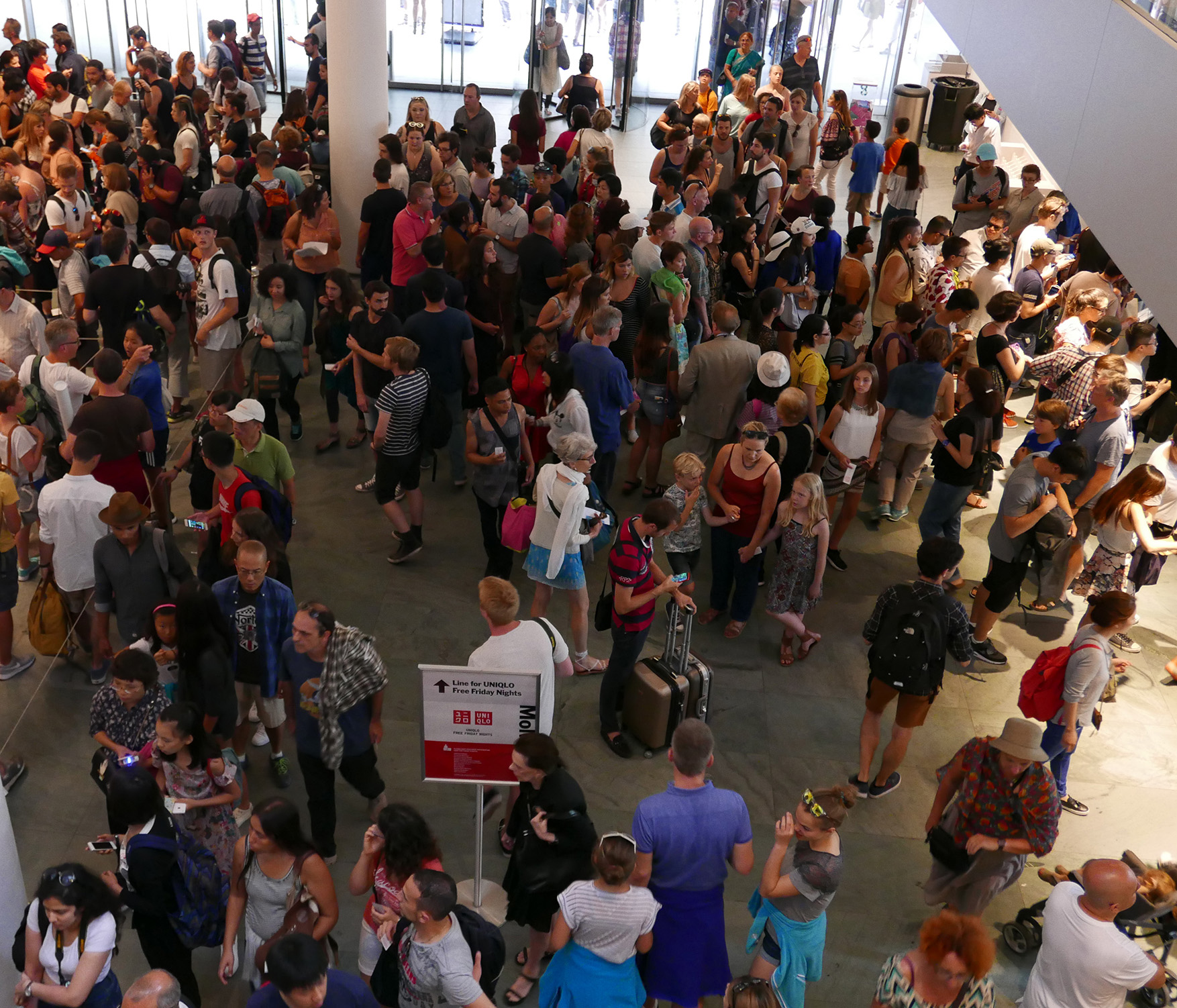
Many museums have yet to see visitorship numbers return to pre-pandemic levels. (Two-thirds of museums have yet to recover pre-pandemic attendance, according to an 2023 American Alliance for Museums report.) Lower attendance, combined with inflation-related rising costs to mount exhibitions and run programming, has led museums to try to find new sources of revenue. In many cases, this has included raising ticket prices. In the past year in New York City, the Whitney Museum, the Museum of Modern Art, and the Guggenheim Museum all raised their ticket prices to $30. Minimum-wage workers in New York City would have to work for over two hours (factoring in taxes) to pay for standard admission to these museums. Some disabled workers — to whom the federal government allows employers to pay a sub-minimum wage — would have to work even longer. All three institutions do offer some hours that are free for all visitors, but these events tend to be incredibly well attended, both serving to illustrate the demand for free or lower-priced museum tickets and creating new accessibility challenges related to crowding.
The funding crisis has implications for museum buildings as well: physical interventions to make buildings more inclusive and accessible are sorely needed, but costly. Short of glamorous new capital projects that can bear their names, donors may be hesitant to pay for smaller-scale improvements. Accessibility interventions like ramps, elevators, new entry sequences, and sensory rooms don’t come cheaply; more funding is necessary, but is difficult to find. In the meantime, museum staff have been working to make their institutions more welcoming and accessible on the ground level — filling in where the building can’t.
The views expressed here are those of the authors only and do not reflect the position of The Architectural League of New York.
