
Celebrate ten years of Urban Omnibus and support ten more years of fresh, independent perspectives on citymaking with a donation today!
Celebrate ten years of Urban Omnibus and support ten more years of fresh, independent perspectives on citymaking with a donation today!
Last night, the Museum of the City of New York brought together a panel of New York City subway map dignitaries for “The New York City Subway Map – Form v. Function in the Public Realm:” designer Massimo Vignelli, designer John Tauranac, author and typographer Paul Shaw, and KickMap creator Eddie Jabbour, in a discussion moderated by Steven Miller. A packed room listened to a dialogue about the designers’ efforts to help riders understand and navigate the New York City subway system and the unfortunate (d)evolution of the Metropolitan Transit Authority’s official map in recent decades into increasingly complicated, intermodal and difficult to read versions of itself — the latest of which was released earlier this year.
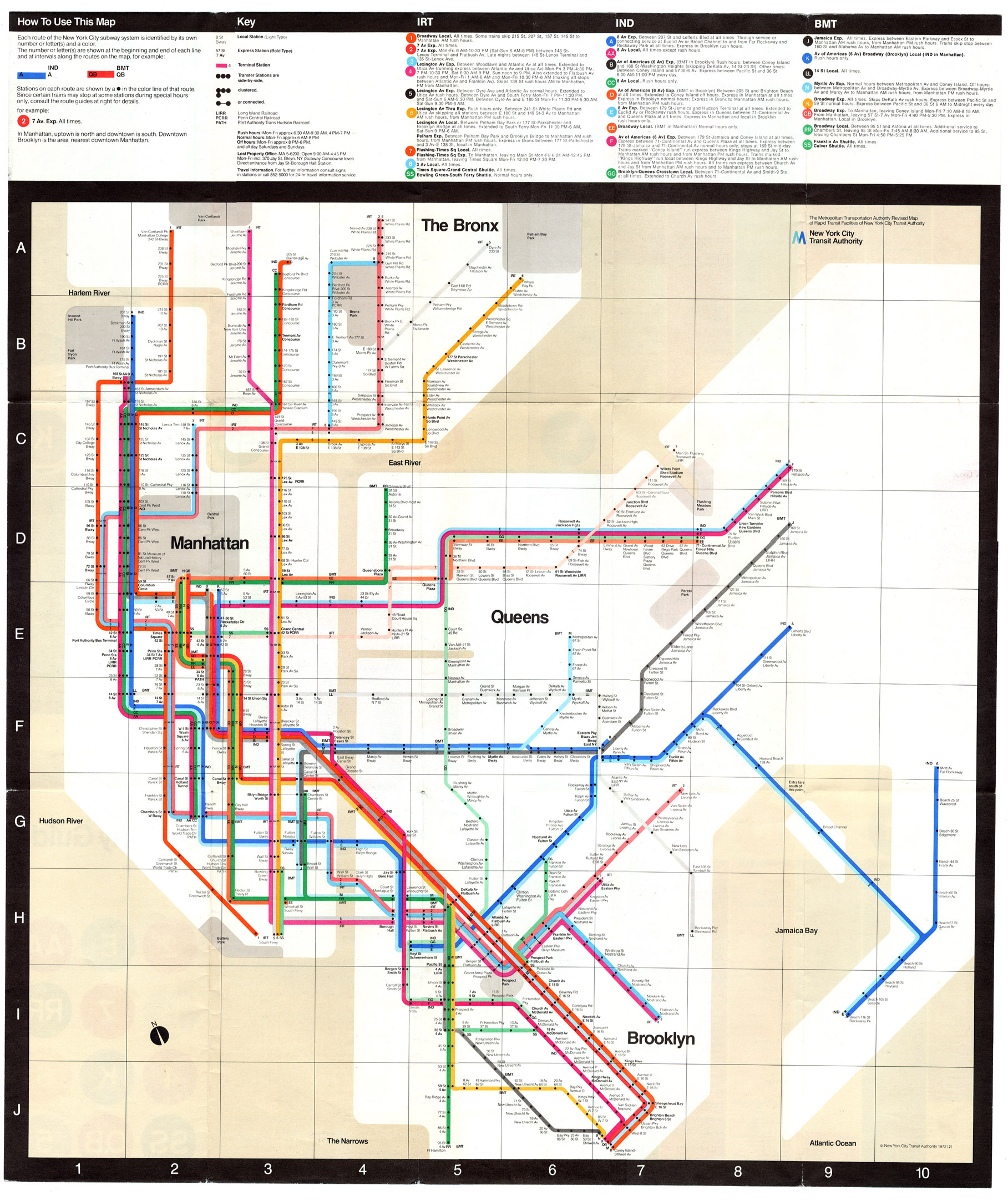
Massimo Vignelli started off the conversation with an introduction to transit diagrams around the world. Massimo noted the differences between a diagram and a map, but stressed the importance of both form and function in both. A map is geographic, with streets and topography. It can locate you on a wide variety of scales, but it typically needs to be very detailed. A diagram depicts the structure of a system. Diagrams are commonly used to illustrate transportation systems all over the world. The 1972 Vignelli NYC subway map was an attempt at a diagrammatic display for the subway system, consisting of 45 and 90 degree angles, many colors, and extreme legibility. However, the map was criticized by the public, who found the lack of above-ground geographic and navigational details confusing. In 1979 the MTA ousted Vignelli’s diagram for a “more legible” version — legibility defined, not as visual and textual clarity, but as geographical clarity.
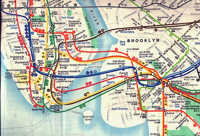
Thus brings John Tauranac into the picture. Tauranac is a New York City native who has been making maps of the city for almost 40 years and sat as the chair of the committee to redesign the MTA subway map in 1979. The redesign intended to retain certain elements of a diagrammatic map, but based on geography, with a new color coding system for grouped trunk lines (prior to this, there was a different color for each line). Tauranac showed the progression of “quasi-geographic” maps since the 1979 version (designed by Tauranac and Michael Hertz), which he described as becoming “more quasi and less geo, with a loss of legibility.” As he zoomed in on Manhattan’s Financial District, it was easy to see how the maps have gotten more muddy, with type running over the lines and no designation of service changes (i.e. weekday versus weekend versus nighttime). The theme of the night should have been, Tauranac declared, “Basta!”
Paul Shaw, author and typographer, then introduced some common problems to consider when making a subway map. He explores the subway system, looking at signage and stations, and has come to understand the complexities that are inherent in a large transit system such as that of the MTA. One archival image he presented showed a woman in a station, standing at a large call board. If you just pushed a button representing your final destination, the board would tell you how to get there from your current station. This behemoth was the predecessor to smart phones and Google maps, but why did such a useful concept disappear from the subway system? Now, for unfamiliar travelers, it is hard enough even to know where to get on the subway, let alone travel from one destination to another and transfer trains. The current map is not for travelers who need expedited information, but for the person who has time to scan tiny type to decipher whether or not the N train stops at 28th Street.
With the onset of new technologies, more and more people are taking it upon themselves to alleviate some of these issues. Eddie Jabbour designed the KickMap as a geographical and graphically legible alternative to the MTA map, and even offered it to them to use. They declined. So Jabbour and his son created an iPhone app, which notes day and nighttime service changes, options to receive notifications of unexpected delays, GPS technology to help locate nearby stations and a compass to help orient yourself after exiting to the street. The app has been downloaded by over 350,000 people — a sign, Jabbour pointed out, that people are calling for a less confusing option. But, he added, we can’t rest on smartphone tools, which are only used by a fraction of subway riders. There is still a dire need for easily-accessible print media, or other innovations that can benefit everyone.
Despite the obvious frustrations with and criticisms of the MTA’s design choices (and perhaps because no MTA representative sat on the panel), it was a jovial evening overall. Serious discussions were balanced by more lighthearted conversations, such as favorite subway stations (which ranged from the abandoned City Hall station to the grand space of the 181st Street station in Washington Heights). Ultimately, the evening reminded us that the struggle between complexity and simplicity, comprehensive information provision and distilled clarity, that is inherent to an infrastructural system the size and breadth of the NYC subway is one that can be aided — or sometimes hindered — by design choices.
The views expressed here are those of the authors only and do not reflect the position of The Architectural League of New York.

Comments