
We are celebrating 15 years — and counting — of stories that are deeply researched and deeply felt, that build a historical record of what the city has been.
We are celebrating 15 years — and counting — of stories that are deeply researched and deeply felt, that build a historical record of what the city has been.
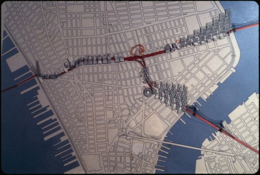
Paul Rudolph, Isometric drawing of overall project showing the HUB including people-mover, c. 1967-1972, Color slide. Courtesy of the Paul Rudolph Archive, Library of Congress Prints and Photographs Division.
Few figures invoke the tensions of urban planning in New York City like the larger than life Robert Moses. But it is another iconic figure, Paul Rudolph, who may have the last word on the project that Moses hoped would seal his legacy — the Lower Manhattan Expressway. An important new exhibit at Cooper Union, organized by the Drawing Center, provides a much-needed reminder of Rudolph’s breadth of vision for Lower Manhattan.
In 1967, following Rudolph’s tenure as dean of the Yale School of Architecture, the Ford Foundation commissioned him to do a study of the Lower Manhattan Expressway project. The idea for an expressway connecting the Holland Tunnel with the east side of Manhattan was, of course, nothing new. City planners had conceived of such a project in the ’30s and Moses, with his broad brushstrokes across the New York City canvas, envisioned three major expressways in Manhattan: the Lower Manhattan Expressway, using Broome Street as a corridor; an elevated midtown route that would punch through skyscrapers; and a third expressway uptown coursing through Central Park. Moses attempted to break ground several times throughout the next three decades. By the 1960s, however, with a trail of condemned lots, razed blocks and miles and miles of new highways behind him, the City and Governor Rockefeller had finally grown tired of his particular brand of public works and, perhaps, his hubris. In 1961, Jane Jacobs published her famous tome about preserving the social fabric of the city, very much in reaction to Moses, and this contributed to and reflected his waning influence. In 1968, Moses was removed from his position and his LoMEX project was demapped and eventually canceled.
Into this atmosphere of Moses disfavor and a nascent, outspoken preservation movement entered the Gropius-trained, modernist Paul Rudolph. From 1967-1972, with the continuous financial backing of the Ford Foundation, Rudolph devoted himself to this study.
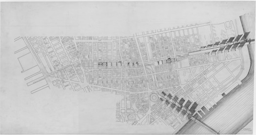
Paul Rudolph, Plan of overall project prior to the HUB development, 1970. Ink and graphite on mylar, 36 x 68 inches. Courtesy of the Paul Rudolph Archive, Library of Congress Prints and Photographs Division.
Rudolph was known as one of the best architectural draftsmen, and it is through his drawings that the Lower Manhattan Expressway has come to life, at first to Brett Littman, director of the Drawing Center, and then to us, in the exhibit Littman organized with Cooper Union and Ed Rawlings’ architecture office.
It is only recently that any attention was paid to Rudolph’s original drawings for the study and it is their “rediscovery” that fueled this exhibit. In 2008, after years of fermenting curiosity about the LoMEX study, Littman went to the Library of Congress to look at Rudolph’s drawings. According to Rachel Liebowitz, a curator at the Drawing Center, “It was the first time anyone had looked at the drawings and until we came, the Library of Congress hadn’t catalogued and photographed [them].” It is because of Littman’s interest, and the work on this exhibit, that the Library of Congress has now catalogued, scanned and uploaded this portion of the archive.
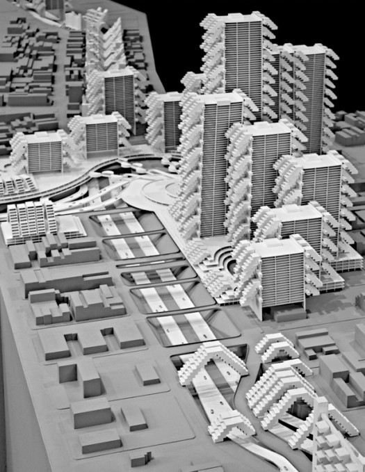
View looking west toward the HUB showing depressed roadway with Broome Street corridor in the background. Photo by Barb Choit / The Irwin S. Chanin School of Architecture of The Cooper Union.
Using 31 reproductions of drawings found in the archive, the curators, Ed Rawlings and Jim Walrod, recreated the vision of Lower Manhattan Rudolph developed over those four years. The drawings on display range from skeletal sketches that he must have used as notes to himself, to immense, colorful perspectives of the project that don’t seem to have possibly been made by a human hand. At the center of the room, anchoring the exhibit, is an amazing 33’ × 16’ model built by the curators and students from Cooper Union and based on the archive material and on some pictures of a film Rudolph made of his project (the script of the film is also on display, though no copy of the film could be found). You can spend a long time surveying that model, and, after understanding the project further by studying the drawings, you will surely return to it with renewed curiosity. If you have lived in New York for any significant amount of time, the moment you fully comprehend what it is you are looking at in the exhibit, the drawings become utterly jarring. There is one drawing, just in front of the model, that looks east across Manhattan Island with the Williamsburg Bridge in the distance. For some reason that image, possibly because it is the most contextualized, makes Rudolph’s vision seem most real.
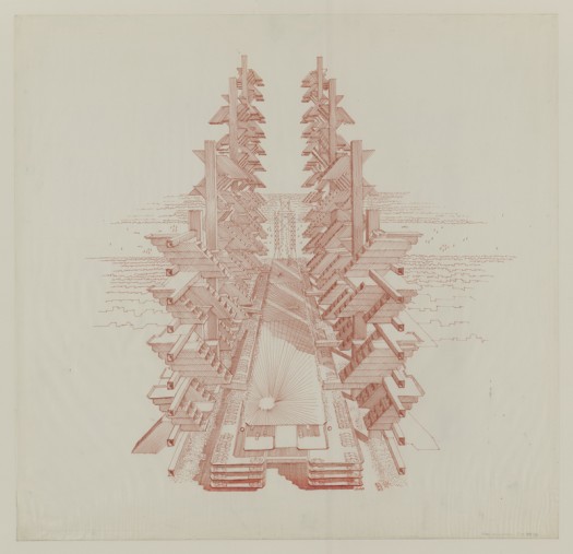
Paul Rudolph, Perspective rendering of vertical housing elements at the approach to the Williamsburg Bridge, 1970. Brown ink on paper, 29 x 30 inches. Courtesy of the Paul Rudolph Archive, Library of Congress Prints and Photographs Division.
Rudolph’s conception of the LoMEX took some inspiration from Moses’ plan but mostly used it as a point of departure for his own vision of tomorrow. His study consisted not just of a super expressway and a massive central HUB, like Moses’ plan, oriented by traffic flowing to and from the Holland Tunnel in the west and the Manhattan and Williamsburg Bridges to the east. His was a completely integrated world where the flow of cars existed in tandem with life in the residential towers above. This included monorails, people movers, and a surreal vertical expanse of multilevel parking lots that are likewise integrated into the buildings, leaving space surrounding the structures. The basic unit composing this megastructure was Rudolph’s “20th century brick,” which can be added infinitely and in various ways, unifying the whole structure while also providing variety, like a large modernist Lego.
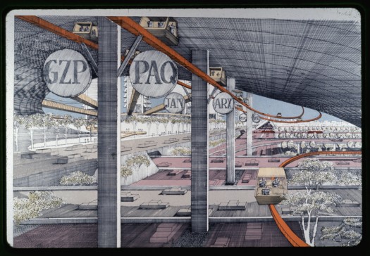
Paul Rudolph, Final rendering of the interior of the HUB including people mover, c. 1967-1972. Color slide. Courtesy of the Paul Rudolph Archive, Library of Congress Prints and Photographs Division.
Rudolph’s design differs from Moses’ in another significant way. Moses planned his expressway to career down Broome Street and, as he had made plain before, buildings and neighborhoods in his path posed no obstacle. Simply condemn and raze. Perhaps as a token gesture to Jane Jacobs and other preservationists, Rudolph’s expressway would use the back gardens between Spring and Broome as its corridor, though the scale of the project would still disrupt the street life of any neighborhood it passed through, even if one block removed. Like Moses, and many other utopian modernizers of the post War era, Rudolph designed with the automobile in mind. As the curators described the HUB in their wonderful essay, “It is automotive transit fetish at its most decadent.” The other mid-century modernizer’s imperative – slum clearing – also characterizes Rudolph’s approach and he designed his tall towers to house a mass of people and also provide each one with an outdoor terrace.
For various reasons, projects of this scale and vision, at least in New York, might be a thing of the past. Futuristic utopian solutions have fallen out of favor (indeed they had already fallen out of favor when Rudolph created this) and the public does not have the appetite to appropriate public funds for such large scale projects. Ratner’s Atlantic Yards is minuscule in comparison. However, Norman Foster, who studied with Rudolph, just recently unveiled his own megastructure in Abu Dhabi, the same week this exhibit opened. It even includes people-movers, elevated buildings and an underground world, much like the LoMEX. And as one of the curators pointed out, Mayor Bloomberg’s demapping of streets in the heart of the city is very much related to Rudolph’s vision of our world.
Several interdisciplinary projects, like MoMA’s and PS1’s Rising Currents, have recently attempted to address New York’s 21st century infrastructural needs. The time seems ripe for novel approaches to New York’s urban fabric, and this exhibit is a brilliant way to further tap into that creativity and stoke the imagination.
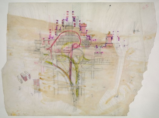
Paul Rudolph, Plan diagram of the HUB area showing transportation networks, 1970. Graphite and color pencil on paper with taped overlays of the same, 24 x 32 inches. Courtesy of the Paul Rudolph Archive, Library of Congress Prints and Photographs Division.
Paul Rudolph: Lower Manhattan Expressway
On view: October 1 – November 14, 2010
The views expressed here are those of the authors only and do not reflect the position of The Architectural League of New York.
Comments