
We are celebrating 15 years — and counting — of stories that are deeply researched and deeply felt, that build a historical record of what the city has been.
We are celebrating 15 years — and counting — of stories that are deeply researched and deeply felt, that build a historical record of what the city has been.
Last week, Karen Kubey took us on a trip to Brownsville, Brooklyn to re-examine Marcus Garvey Park Village, a deliberate attempt from the 1970s to provide low-rise, high density affordable housing that embraced its urban context, emphasized design quality, and experimented with form. As Kubey reminds us, this experiment, spearheaded by the Urban Development Corporation (among others), reflected and reacted to the mounting criticism of the existing high-rise models of subsidized housing, particularly towers-in-the-park. But not all high-rise subsidized housing is the same, in either its physical form or its social experience, as Susanne Schindler and Juliette Spertus discover in their examination of two very different high-density projects in the Bronx: Co-op City (constructed between 1966 and 1973), lauded for the amount of housing it provides while criticized for its design and insularity, and Twin Parks (1970 – 1974), a less famous example of subsidized housing — and another UDC project — that sought to introduce modern architecture that responded to the scale and character of its neighborhood. While the design and planning philosophies behind these two Bronx projects were vastly different, both offer lessons for designers, planners and housing advocates who seek once again to employ ambitious, innovative design strategies to increase and improve the housing stock of New York City. –C.S.
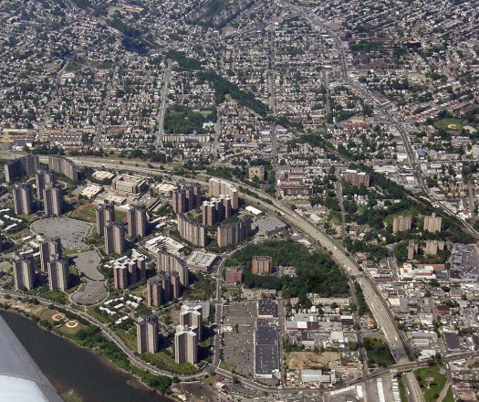
Co-op City | Photo by Payton Chung via Flickr.
Hunter’s Point South, or: is there a future for large-scale affordable housing developments?
In February 2011, Mayor Bloomberg unveiled the development plans for Hunter’s Point South, a new 5,000-unit development on the Queens waterfront, and proudly announced that it would be New York City’s “largest affordable housing development … since Co-op City and Starrett City.” We were intrigued. In the age of so-called contextual urbanism and affordable housing development driven by the private sector, the City is referring back to the blank-slate development models of the late Robert Moses era?
So we started to look into Co-op City, a place we knew well from viewpoint of a car, heading north out of the city on I-95. Described by some as “gargantuan,” with 32 extra-high towers, articulated with prefabricated concrete elements and balconies, Co-op City seems oddly socialist in its scale and rigor, an unlikely creation in a capitalist society that celebrates the individual. And quite different from FXFowle’s approach to the master plan of Hunter’s Point South, which extends the existing street grid and defines the new blocks with a continuous perimeter of residential buildings around private courtyards. By virtue of this massing, the site plan practically assumes buildings will adopt the double-loaded corridor (a floor plan in which apartments with a single exposure are distributed on either side of a typically windowless central hallway) — the spatially limited but apparently unbeatably efficient typology in mid- and high-rise residential development today — leaving the architects (a design team headed up by SHoP Architects) with little more to design than the building skins.
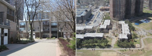
Co-op City | L: View from a townhouse pedestrian court. R: View of the townhouse, triple-core and parking structure building types from Tower Bldg #34, Section 5 | Photos by Juliette Spertus
For Co-op City, the focus certainly wasn’t an elegant building skin. And the City’s focus in its Hunter’s Point South press release was, again, the number of housing units provided. The Bloomberg administration understands that creating housing affordable for all levels of the city’s workforce is essential to the city’s economic success. Hence, with the “New Housing Marketplace Plan,” launched in 2002, New York City has in fact committed extraordinary funds to realize what is today called “affordable housing,” or publicly-subsidized, income-restricted housing.
Beyond its provision of 15,382 units for moderate- and middle-income residents – an impressive figure by any measure — we became curious to learn what lessons for affordable housing might be learned from Co-op City today. Our interest was driven in part by earlier work each of us has undertaken: Juliette’s work on the planning of Roosevelt Island, a “new town in town” built between 1969 and 1975 by the New York State Urban Development Corporation (UDC), and Susanne’s search for alternative housing development models, ones that would both ensure long-term affordability through alternate ownership models and achieve a higher level of design and construction, moving beyond the ubiquitous double-loaded corridor.
Co-op City. It is hard to like.
Cut off from the city by I-95 to the West, and the Metro-North railroad along the Hutchinson River to the East, Co-op City is an enclave. Your only choices are to drive in, take a city bus or walk (the nearest subway station is a mile away and there is no Metro-North station). Relating to the site’s low-rise surroundings was not a concern for the United Housing Foundation (UHF), the union-based developer that built Co-op City and other major limited-equity cooperative housing developments in New York from the early 1950s to the early 1970s. When it bought the 300 acres of landfill on the fringe of the northeast Bronx, UHF’s goal was to build generous apartments with sensible layouts and modern amenities, like central air conditioning, for a price middle-income families could actually afford.
Co-op City was controversial from the beginning. Ada Louise Huxtable saw it as a missed opportunity and used it to illustrate why it is so difficult to build good housing in New York City. In her 1968 New York Times essay “Co-op City: A Singularly New York Product,” she describes a “settlement” of 60,000, as big as the European new towns, but built without any urban planning. Indeed, the site plan appears to have been generated by drawing perimeter loop roads and then clustering the residential towers, parking structures and shopping centers around individual cul-de-sacs to preserve as much open space as possible (and to keep expensive road infrastructure to a minimum). As we made our way, disoriented, around the well-kept grounds, we realized that Co-op City is closer in form to a Sun Belt golf course community than to other superblock developments where the access to sun and air was paramount to the design. Huxtable distributes the blame for the lack of urban design evenly between the UHF, the Department of City Planning, and New York State’s Mitchell-Lama program. She points out that even though over half of the State’s subsidy for low-interest mortgages for low- and middle-income housing had gone to UHF projects, this funding was not leveraged to ensure the quality of the spaces it generated.
As a developer producing housing by and for union members, the UHF and its architect Herman Jessor, the only architect the UHF had ever engaged, calculated every decision in terms of the cost per room of the investment and monthly “carrying charges” each “member” is assessed. Unlike market-rate co-op apartments, residents of limited-equity co-ops pay a low fee per room (in 2011, the fee for the largest, a three-bedroom, was $29,000) and then monthly carrying charges for maintenance and operations (in 2011, charges ranged from $580 per month for a one-bedroom to $1250 for a three-bedroom); in return, they agree to sell their shares back to the co-op at the price they paid plus interest. They do not benefit from any increase in value of the apartment. To ensure that apartments are affordable, in addition to the cheap land and state subsidies, UHF projects leveraged enormous economies of scale. UHF brochures proudly list the number of bricks, gallons of paint and buckets of cement along with other data to illustrate the effectiveness of Jessor’s strategy (see Tony Schuman’s “Labor and Housing in New York City: Herman Jessor and the Cooperative Housing Movement.”) .
In contrast to Huxtable, Robert Venturi and Denise Scott Brown, in their provocative article “Co-op City: Learning to Like It,” published in 1970 in Progressive Architecture, call for an aesthetic of banality of the frugal kind perfected by Jessor and the UHF. Co-op City is portrayed by Venturi and Scott Brown as the high-rise version of Levittown, and, like Los Angeles and the Las Vegas Strip, a symbol of the kind of housing and amenities people actually want. They admit that the layout is harsh, but suggest that, with a little repositioning, the same anonymous towers could generate quality urban space.
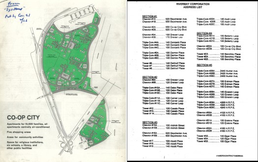
Co-op City | L: Site plan produced for the 1965 groundbreaking ceremony showing cul-de-sac circulation, via CHPC Archives. R: Riverbay Corporation Address List.
We were aware that building locations were abstract even before we started walking around. On the official visitor map, Co-op City is divided into five roughly equal sections like a pie (1-4 to the north of the Parkway and 5 to the south) and everyone uses those numbers to identify their portion of the 300-acre city within a city. On the back of the visitor map, the individual buildings are identified first by shape — chevron (slab), tower, triple-core — and then by street address.
When we asked Riverbay Corporation, Co-op City’s management company, for a tour last spring, we were directed to Joe Boiko, their ombudsman, who also happens to be responsible for each of Co-op City’s 179 elevators. On the tour, Boiko pointed out that a multi-year effort to replace 135,000 windows was nearly complete. Boiko is enthusiastic about his community and, like many of Riverbay’s employees, he is also a resident. Not only does he live and work here, Boiko and some of the other administrators we met are actually children of early residents, who grew up and chose to move into their own Co-op City apartments. He pointed out that Co-op City is one of the country’s largest NORCs, or “naturally occurring retirement communities.” It is easy to see why: everything is taken care of, there is 24-hour maintenance, and even the electricity bill is included in the carrying charges. The community considers itself safe. Boiko says residents are ambivalent about adding subway service or a railway station because these amenities might make it too easy for outsiders to come in.
So we’re torn. We came to Co-op City seeking lessons. And while we are very much in favor of the nonprofit nature of this venture, of resident (or “co-operator”) involvement, of the fact that residents identify with their community, the environment it has produced — so set apart, so hard to reach, and so difficult to navigate — challenges some of our most firmly held beliefs about the importance of economic diversity and public access for urban neighborhoods. Co-op City demonstrates how a design and development team with a deep understanding of high-rise housing production collaborating closely with construction management (UHF was its own general contractor) can produce high-quality, low-cost apartments en masse for middle-income New Yorkers. But it left us wondering why this had to be at the expense of buildings and public spaces that orient the experience of coming, going, playing and just being, not only for residents, but for all users. Is there no middle ground?
Twin Parks: “Contextual” Redefined
The construction of Co-op City is generally cited as a reason for the demise of the Grand Concourse, that much-admired Bronx boulevard laid out in the early 1900s, lined with six-story art-deco residential buildings mainly from the 1920s. As the argument goes, Co-op City drew the boulevard’s white middle-class away to a place protected from the Concourse’s socio-economic changes. We walked up the boulevard, from 149th Street to Fordham Road, with this narrative in mind. And while that slightly undulating, well-framed space certainly is an achievement from an urban-design perspective, the prevailing housing typology, with its ten-foot entry courtyards and side setbacks creating unusable six-foot gaps between buildings, has its own problems. The light, sun and air of Co-op City must have been a compelling reason to relocate.
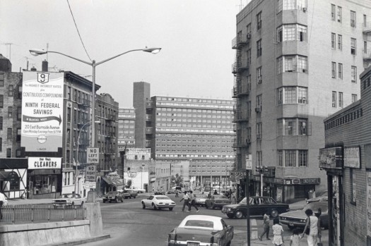
View east down Burnside Avenue toward 2000 Valentine Avenue, mid-1970s | Courtesy of PKSB Architects, P.C.
But there was another, unexpected lesson for large-scale affordable housing development waiting to be discovered nearby. Crossing Burnside Avenue, glancing east, down from the Grand Concourse’s high ground, our sight fell upon a large slab building whose brick facade, to an architect’s eye, instantly revealed a skip-stop accessed building, where (as in Le Corbusier’s Unité) there is a central corridor at every third floor, from which the two-story, floor-through apartments, spanning either above or below the corridor, are accessed. 1960s São Paulo modernism in New York! 16 stories, set on pilotis, and almost two blocks in length; carefully architecturally detailed, if not immaculately maintained; with residents dressed in color print patterns, likely recent immigrants from Africa and the Caribbean, mingling in the glass-enclosed foyer: we were mesmerized. Here was ambitious architecture that, for a change, was not hard to like.
A little research revealed that the buildings at 2000 Valentine Avenue and 1985 Webster Avenue were designed by Giovanni Pasanella and were part of a fifteen-building, scattered site urban renewal project called Twin Parks. The buildings, encompassing a total of 1,900 low- and moderate-income dwellings, were constructed between 1970 and 1974 by the UDC — the same UDC that was responsible for Roosevelt Island and Marcus Garvey Park Village.
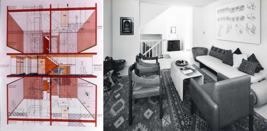
Twin Parks | L: Section perspective of skip-stop typology and the resulting split-level apartments designed by Giovanni Pasanella. R: Photograph of the model unit of Pasanella’s split-level apartments, (c) Thorney Lieberman | Images courtesy of PKSB Architects, P.C.
The project consists of two focal areas: Twin Parks West, along a sharp grade change between the Grand Concourse neighborhood and commercially-oriented Webster Avenue; and Twin Parks East, along Southern Boulevard, facing Bronx Park. At Twin Parks West, the half dozen, carefully sculpted buildings create a powerful ensemble through the use of a single type of 8 x 8-inch brick and variously dimensioned punched aluminum windows. The high-rises, spotted only as one moves north or south through the mile-long stretch of hilly terrain — aptly described by architectural historian Vincent Scully as a “flotilla” in the foreword to a 1983 monograph on Pasanella + Klein (Pasanella’s later partnership, the successor firm to which is today’s PKSB Architects) — were an experiment with program, typology, and urban design. Pasanella’s buildings apparently boast the first application of skip-stop circulation in New York City, enabling split-level units with the benefit of two exposures that provide cross-ventilation and a clear separation of shared and public space. To negotiate what might be the most impossible site in the development, a six-story vertical grade change at 183rd Street where a public pedestrian stair connects Tiebout Avenue to Webster Avenue, Pasanella’s building turns the granite cliff into the fourth wall of a courtyard enclosed on three sides by apartments sheltering a public playground and daycare. In this public housing building, Pasanella employs not only the same skip-stop access as the moderate- and middle-income buildings, but grants its residents small balconies. On a similarly challenging sloping site just north, Prentice & Chan, Ohlhausen, together with landscape architect Terry Schnadelbach, positioned a large C-shaped courtyard building to create a sunken public garden with new visual and physical connections (since fenced off) that residents could appropriate.
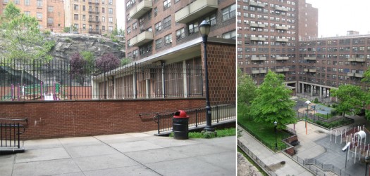
Twin Parks | Views of the granite cliff, public stair and courtyard of Pasanella’s 311-unit public housing building on 183rd Street between Tiebout and Webster Avenues, 2012 | Photos by Susanne Schindler
At Twin Parks East, the sites are less dramatic and the individual buildings connect visually only along Southern Avenue. Besides Pasanella, designers include the then emerging practices of Richard Meier, James Stewart Polshek, and Skidmore, Owings and Merrill. Meier’s site, Twin Parks Northeast, comprised of three buildings on adjacent city blocks, is perhaps the project’s most recognizable and most published site. Polshek’s tower- and midrise gateway buildings at 180th Street and Southern Boulevard are exceptional for incorporating two-story apartments accessed from a double-height exterior gallery across a private balcony area.
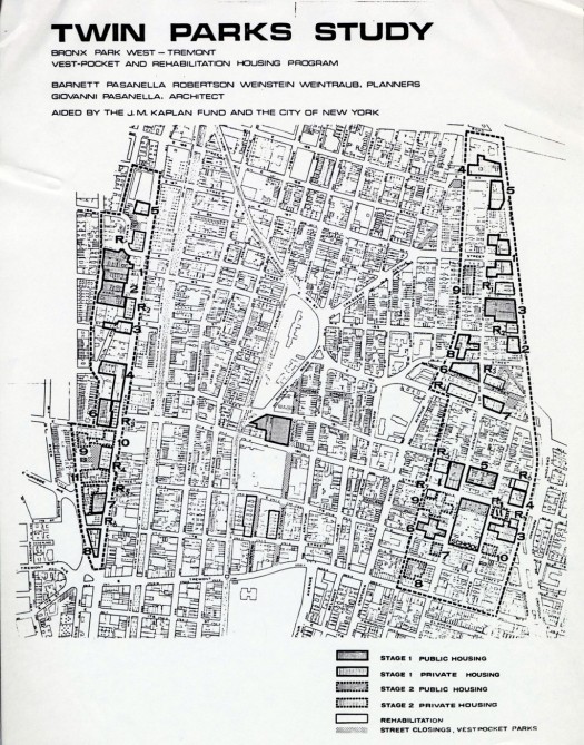
Plan showing the site selection of the Twin Parks Study, prepared in 1967 by the Urban Design Group | Courtesy of PKSB Architects, P.C.
Reading about the planning history of Twin Parks made the buildings even more compelling. As Mariana Mogilevich writes in her recent doctoral dissertation, Designing the Urban: Space and Politics in Lindsay’s New York, the project originated within the City’s planning department, where Mayor John Lindsay started an Urban Design Group in 1967. Its declared goal was to advance decentralized, neighborhood-based development, particularly in the city’s poorer and increasingly “blighted” neighborhoods. The approach was to rehabilitate rather than demolish buildings; to develop new structures in an infill strategy on “vest-pocket” sites (those less than a full square block); and to work together with local community groups. So, when Twin Parks (taking its name from the nearby Bronx and Crotona Parks) was established as an urban renewal area in 1967, the planners and architects responsible – Jonathan Barnett, Giovanni Pasanella, Jacqueline Robertson, Richard Weinstein and Myles Weintraub — engaged a coalition of local religious groups in the effort. When the bottom-up effort began to stall, the project was brought to the attention of UDC, which had just recently formed with the goal to build low- to middle-income housing throughout New York State, placing high value on design.
At Twin Parks, a combination of bottom-up advocacy and top-down implementation, with both sides open to architectural innovation, created the rare urban hybrid of high-rise structures inserted into an existing mid-rise neighborhood. The project offers an example, from forty years ago, of the kind of “community” engagement that today is so often invoked as a goal or model, but which now generally functions more as a political panacea or an excuse for mediocre planning and architecture.
Co-op City and Twin Parks Seen Today
With Twin Parks, then, it seemed that we had stumbled upon a forgotten precedent providing us with several lessons for today. First, the project was ambitious in terms of numbers, yet affordable by virtue of its subsidy structure (put on hold in 1974 by the Nixon administration, leading to today’s complex system of funding affordable housing, heavily dependent on tax incentives and assembling multiple sources of subsidy). Second, Twin Parks pushed the program to involve a diversity of housing forms and income levels, including everything from studios to five-bedroom apartments (the latter unthinkable today in affordable housing development, where an apartment seems to end at three bedrooms, in part due to a subsidy-per-housing-unit structure, in part because larger households are not acknowledged). Third, it allowed emerging architects to propose solutions that emphasized a connection to existing neighborhood public spaces, proving that innovative architecture does not have to be at odds with the neighborhood. Finally, Twin Parks engaged in a systematic evaluation of its projects, titled “Live Ins.” Initiated by Ted Liebman, then the agency’s chief architect, UDC required all employees, regardless of their position, to live, with their families, for one week a year in one of its housing developments, and provide feedback on their experience. This feedback informed future projects, leading, among other things, to the agency’s turning away from high-rise construction for low- and moderate income families, toward the exploration of low-rise, high-density prototypes. Perhaps the greatest lesson of all: the agency was willing to learn. But since it was dismantled in 1975, many of these lessons seem to have been lost on us.
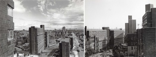
Twin Parks | Views from Pasanella’s 1880 Valentine Avenue building toward other Twin Parks West buildings, ca. 1974 | Courtesy of PKSB Architects, P.C.
In his 1973 article “Twin Parks as Typology,” published in Architectural Forum,Kenneth Frampton lauded the project’s “contextual” approach, but identified a mismatch between some of its architectural elements, such as the pilotis, and the people who live there, concluding that Twin Parks, like many projects of the modern movement, was “built for a society that does not exist.” To date, attempts at trying to speak with the owners of the Twin Parks buildings, still regulated by Mitchell-Lama, about their portfolio have failed. It is as if the mismatch resides here, between the building forms’ invitations to appropriate their space — for instance, the mix of private and shared open spaces offered at Prentice & Chan, Ohlhausen’s courtyard building — and the apparent absence of residents’ ability or interest in doing so, manifested in the general neglect or non-use of these spaces. Perhaps it is the private management companies to whom the properties were transferred upon their completion who are uninterested in exploring the buildings’ potential. Co-op City, in contrast, is its residents. It creates, and continues to create, the society the buildings were built for. And yet, as proud as they are of their community, Riverbay’s employees will tell you that it would be impossible to build Co-op City today. The cost of land and construction is too high. And even if 300-acre swaths of land were still available for housing, the UHF master plan would not be the model to use.
There is one more lesson for affordable housing in the Bronx, and a benchmark for future Hunter’s Point Souths. Via Verde, the recently completed and much discussed 222-unit building in the neighborhood of Melrose, may actually be a middle ground between the housing production emphasis of Co-op City and the urban integration-architectural innovation model of Twin Parks. Urbanistically, it is not afraid of being large, and yet combines low-rise, mid-rise and tower typologies. Like Co-op City’s enviable central air conditioning, Via Verde’s shared exterior terraces and interior common spaces provide amenities not usually associated with income-restricted housing. Like Twin Parks, Via Verde embraced architectural innovation, even managing to get beyond the double-loaded corridor, creating two-story, floor-through apartments or single-story apartments accessed from an exterior stair. The reason for Via Verde’s success in today’s difficult development climate may be this: it resulted from a transparent competition process for architect-developer teams that moved both beyond the single-architect model of UHF’s Jessor and the UDC’s practice of directly engaging diverse, emerging architects, and benefited from strong political will and adequate public funding in its implementation. At 5,000 units, Hunter’s Point South certainly taps into a tradition of large-scale affordable housing development, but numbers are not enough. We need to reengage with this history to evaluate, inform, and push our current practices forward.
The views expressed here are those of the authors only and do not reflect the position of The Architectural League of New York.
Comments