
We are celebrating 15 years — and counting — of stories that are deeply researched and deeply felt, that build a historical record of what the city has been.
We are celebrating 15 years — and counting — of stories that are deeply researched and deeply felt, that build a historical record of what the city has been.
In the article below, Juliet Helmke traces the origins and prospects of a genre of art that aims to educate and more effectively influence consumer behavior through the reinterpretation of ecological data.
In a 2007 TED talk, Bill Clinton recalled giving Al Gore a piece of advice. He suggested, after the huge success of An Inconvenient Truth, to follow up quickly with a second film, one based solely on the final piece of information that the first one imparts: the six things we can do to combat the effects of greenhouse gasses. An entire movie on those six categories, so they would be embedded in our minds and we would learn to organize our lives around them. I saw An Inconvenient Truth, and could make an educated guess at those categories, but can’t honestly remember what they were. They are not embedded in my brain and, though I consider myself to be an environmentally conscious person, I (like many people) don’t organize my life around actively conserving resources. Our system for combating climate change is flawed. We don’t know how to educate en masse and we don’t know how to change consumer behavior in an effective way. Eco-visualization is trying to change that.

7000 oaks and counting | Courtesy of Tiffany Holmes
“I coined the term eco-visualization in 2005 because I saw so many artists and designers beginning to focus their work on the communication of ecological threats,” says Tiffany Holmes, a media artist who works within the field. She was responding to a shift in her own practice, and to the movement she witnessed around her, including such works as Eve Mosher’s High Water Line, Brooke Singer’s Superfund365, and Mierle Laderman Ukeles’s work from the early 2000s. “Somehow I felt that the ecological projects deserved a special category,” says Holmes. The category is specific, defined as artworks that respond to ecological data by reinterpreting them through new technological and artistic means with the aim of educating and actually changing consumer behavior. It started to catch on in 2007, when she wrote on the topic for The Journal of Museum Education as well as the Creativity and Cognition conference held in Washington DC.
Holmes’ own project, 7000 oaks and counting, is a prime example of eco-visualization. The artwork consists of a touch-screen kiosk situated in the lobby of a campus building at the University of Illinois that displays an animation of dynamic energy loads. It’s a mesmerizing, circular image. Rings of oak trees represent carbon loads, which, when low, cause the trees to spin slowly with healthy, lush foliage. As the loads peak the trees disappear, replaced by hair dryers, toasters, light bulbs, coffeepots, and light switches. The image, now less calming, rolls furiously on, the jagged edges of electrical appliances imploring passers-by to be aware of their usage while in the building.
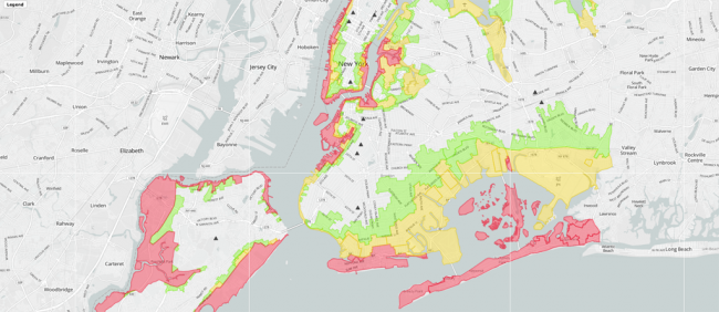
NYC Evacuation Map
Eco-visualizations place the use of resources in the lives of viewers, trying to connect the abstract “plundering of our natural environment” with daily life. When Hurricane Sandy came blustering into the lives of eastern seaboard residents in October 2012, there was a moment of dawning understanding. The largest Atlantic hurricane on record, its devastating intensity and massive rainfall were certainly exacerbated by the effects of global warming. Suddenly, for many, climate change was no longer a theoretical danger that had no discernable effect on their lives. Now it was an immediate threat. Now, what once were abstract conversations about warmer sea-surface temperatures on the Atlantic coast and an overall increase in water-holding in the atmosphere manifested in flooded streets and buildings and in red, yellow, and green evacuation zones. People were glued to the maps.
For years, artists have been trying to figure out how to communicate these dangers in a way that makes them more real, more close-to-home. Eve Mosher’s High Water Line from 2007, for example, showed just how destructive, and likely, rising water could be. For this public artwork, Mosher used blue chalk and illuminated beacons to create a continuous line along 70 miles of the New York City waterfront at ten feet above sea level. The line marked the predicted extent of increased flooding brought on by stronger and more frequent storms as a result of climate change. Though the chalk has disappeared, the project is still active. Mosher has created ten different walking tours of the line, available on the project website. And with the aid of a smartphone, the now invisible line is easy to track. Trekkers can follow an interactive tour of our potential new coastline, drifting occasionally into areas that could be — and were, during Sandy — new parts of the Hudson, the East River, or Jamaica Bay.
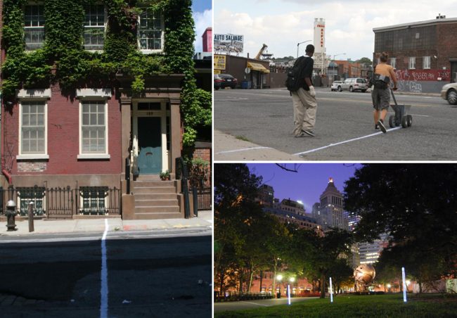
High Water Line | Courtesy of Eve Mosher
In a similar way, Brooke Singer’s Superfund365 situates viewers in relation to environmental threat. Beginning in December 2007 in New York City, Singer traveled across the country to document one Superfund site (an uncontrolled waste area so hazardous its cleanup has been designated a federal responsibility) every day for a year, ending in Hawaii. The information Singer collected was assembled into www.superfund365.com, which profiles each of the 365 sites she visited using a number of methods of documentation: a hazard ranking score, photos of the land, demographic descriptions for the population of the surrounding area, and an interactive data display that relays information about the toxins present and who is responsible for them. It puts its viewers on the map, situating us in relation to exposure, making us residents of the places that Chevron, Honeywell, Dow Chemical, GE, and hundreds of others, have all but destroyed.
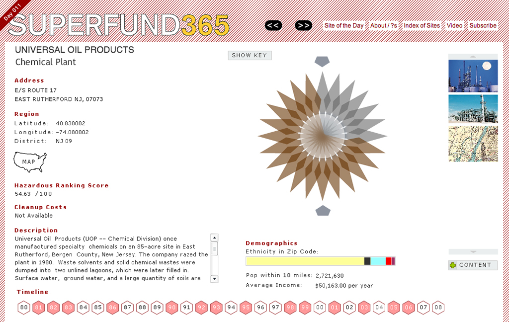
Superfund 365 | Courtesy of Brooke Singer
The historical roots of eco-visualization can be traced to the Land Art movement of the late 1960s and ‘70s. This lineage is apparent not only in an advocacy for an increased environmental awareness. They also share a similar rejection of art for purely aesthetic, commercialized purposes devoid of concept, and champion the engagement of art with social issues. What seemingly divides the two the most is medium, one going back to nature, the other making use of our newest, fastest technological advances. But as Robert Smithson, the father of that original movement, wrote in “The Sedimentation of the Mind: Earth Projects,” “The tools of art have too long been confined to the studio… even the most advanced tools and machines are made of the raw matter of the earth. Today’s highly refined technological tools are not much different in this respect from those of the caveman.”
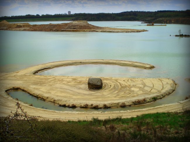
Broken Circle by Robert Smithson | Photo by Retis
The technology of big data visualization is not so far removed from the organic media of land art. And herein lies the gap that eco-visualization is trying to close. Because of the way our resources are accessed and delivered, we easily forget that our technology is connected to the earth, ignoring how utterly reliant our artificial environments are on the strength and sustainment of our natural ones. Our attempts to bridge this gap in public consciousness fails because the numbers are unintelligible, the PSAs don’t stick, and our infrastructure continues to be invisible, whether it’s energy efficient or not.
At this point I have to confess to some initial cynicism about the effectiveness of eco-visualization. While I’m fascinated by works that profess to have an instrumental purpose, I’m always skeptical about their actual impact. These works seemed so earnestly to want to “do good” and I had doubts about their ability to influence behavior. One day while crossing the street, shortly after becoming aware of this concept, I passed a woman carrying a reusable shopping bag that read: “Every year I use this bag a tree grows another ring.” Admittedly a nice sentiment, but it caused me to question what effect we believe we’re having by reusing bags, paying to offset our carbon footprint, or unplugging at the outlet, and how this squares with reality. Later, when reading about a prototype from Sweden’s Interactive Institute and their explorative design unit Static!, I started to realize the potential for eco-visualization.
Identifying their focus as “design for debate,” rather than design for mass production or wide-spread use, Static! aims to develop aesthetic means to render energy more “visible and tangible – more available to sensory experience.”[1] To achieve this, they call on a variety of perspectives, from media artists to human-computer specialists, as well as professionals in the applied arts and strategic designers.
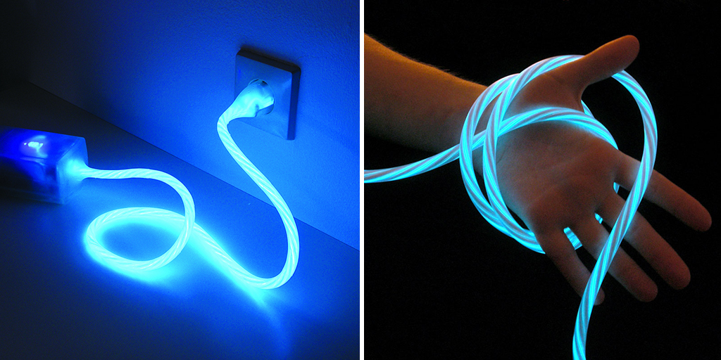
Power-Aware Cord | Via Interactive Institute
Static!’s Power-Aware Cord is simple, beautiful, and effective. It’s an electrical strip with a cable embedded with wires that emit light relative to how much electricity is being drawn from the grid. The more current, the brighter the light and the faster it spirals. TIME Magazine listed it on the 50 best inventions of 2010 and commented, “In testing the device, researchers found that making the invisible visible tuned consumers in to their bad habits, nudging them to power down and offering some surprising appliance insights: when a radio broadcasts drumbeats and bass riffs, its electricity consumption jumps.”
After my initial misgivings, looking at this product was like being hit in the head. Education on the effects of global warming is a complicated area, fraught with the difficulties of obtaining and interpreting scientific data. Seeing that data as numbers, whether in educational material or embedded in our built environment, doesn’t make it any clearer. I came to realize I was mistaken in thinking this wasn’t a job for our artists and designers, for those who deal in the visual. As Valeria Mogilevich, the program director of the Center for Urban Pedagogy who developes youth education programs on such topics as New York’s energy sources and infrastructural systems, says, “It’s hard to picture how our energy gets to us when the bulk of the infrastructure is hidden underground. Unless you live in a neighborhood with a power plant in plain sight, energy infrastructure is pretty inconspicuous.”
Martti Hyvönen, Environmental Director of Helsinki’s Helsingin Energia, makes a similar point: “People are not wasting power or heating energy on purpose, but because the flow of kWhs is so invisible. Price would be one incentive to consider energy usage, and online metering might help in this. But a more positive way to raise consciousness is to make the flow of kWhs visible.”
Nuage Vert, Helsinki
As an energy company, Helsingin Energia has been globally recognized for its best energy practices, having developed a citywide heating and cooling system that will reduce Helsinki’s carbon dioxide emissions by 60,000 tonnes by 2015. It was with the assistance of Helsingin Energia and Hyvönen that Helen Evans and Heiko Hansen were able to bring their Nuage Vert to fruition in Helsinki in 2009. Transforming power plant emission clouds into surfaces for projection, Nuage Vert uses laser tracking to create an amorphous green shape that shifts and changes depending on the size and shape of the emissions — and therefore the amount of energy being consumed by the city.
In researching eco-visualization I found myself constantly drawn to pieces like the Power Aware Cord and Nuage Vert, which deal specifically with energy consumption. Not only do they connect people to the resources they use — and the outside world from where those resources originate — but they also have the best ability to take the near unintelligible data of resource consumption and reinvent it in a way that actually allows consumers to gauge their use, significantly changing the way they consume. As Hyvönen commented, “Energy efficiency measures are the most efficient in tackling the climate change challenge… Short-lived campaigns like Earth Hour do have symbolic value but real energy savings are minimal. But if we arrive to a change of our individual and collective behaviors, a lot is won.” Which is why, as Holmes mentioned, “Eco-visualization could be most effective in the home as the potential for contact is so much higher and thus the capacity for influencing behavior,” citing the workplace as the second best place for implementation.

Real Costs, a browser plugin that shows energy and carbon expenditure for travel activities
Works of this sort require a huge amount of funding and dedicated teams. Especially ones commissioned for public areas. Support for these projects by companies like Helsingin Energia as well as from government organizations and independent philanthropy is crucial. The task of creating them is often too big for individuals or small groups. Speaking on the difficulties he encountered when creating Real Costs, a Firefox plugin that overlays charts showing energy expenditure for travel related activities, artist Michael Mandiberg said, “The initial difficulty was the science. As with many scientific situations, there is no one-size-fits-all answer. The amount of CO2 released per passenger per mile is different per plane and flight length and if there are free seats on the plane. Additionally, there is (or was at the time) wide variance on the effectiveness of carbon sequestration, with those selling offsets typically underestimating the impact and overestimating the offset.” To complete the project he worked with Timon McPhearson, Assistant Professor of Urban Ecology at The New School’s Tishman Environment and Design Center, and some of his colleagues to establish the most accurate numbers for the situation and specifics of the plug-in.
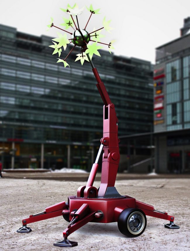
Power Flower | Courtesy of Miro Vivolin
Similarly, Andy Best said of his yet-to-be-realized public sculpture, Power Flower, which was selected from an open call for public artworks sent out in 2009 by Pixelache and Helsinki Energy, “The problem with Power Flower is getting it from non-working model to working prototype stage. I worked for many months with some students from a technical university, but due to a number of reasons we didn’t get a successful outcome: student motivation, delays in supplying parts, lack of finance.” Planned for one of Helsinki’s public squares, this 60-foot-high sculpture would convey, like Nuage Vert, an idea of city-wide energy usage through the movement of its armatures.
Flower Lamp is also a project of Static! and, like the Power Aware Cord, it relies on purely aesthetic changes to show a trend in household consumption. The lamp constricts when loads are high and fans out to “bloom” with a decrease, rewarding good behavior with a more pleasing shape. “Small sacrifices in saving electricity or hot water are thus rewarded by a poetic change in form.”[2] In their best instances, works of eco-visualization do seem to have the potential to influence behavior dramatically when resolutely inserted into daily life, when, for example, your lights tell you they shouldn’t be on full blast, or your outlets show you that the appliance may be off but electricity is still flowing.
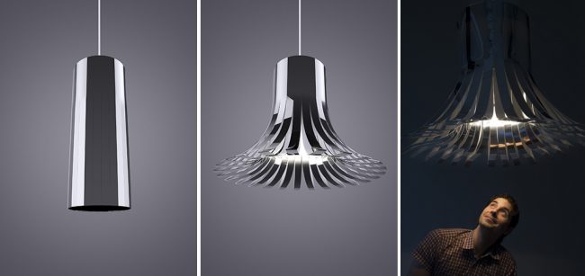
Flower Lamp | Via Interactive Institute
So what if these and other eco-visualizations were to became part of our “system,” first integrating into the way we organized our lives, and then the aesthetics of our homes, businesses, and cities? What if every urban planning unit and energy company had departments dedicated not just to conservation efforts, but to showing consumers what the data means? Not in tables, not in numbers, but in ways that visually integrate an understanding of resource consumption into the everyday; into the actual use of energy. These artists and designers show it’s not only the most enriching, but also the most effective means of education. Could we put a Power Aware Cord in every home in New York, subsidized and provided by ConEd? Or make Nuage Vert a permanent fixture of Helsinki or Paris? Our urban landscape might be dramatically different if, instead of clocks on our building façades or city squares, we installed visual beacons, rendering our real-time collective energy use visible, intelligible, and beautiful.
[1] Mazé, Ramia. Static!: Designing for Energy Awareness. Stockholm: Arvinius, 2010.
[2] Ibid.
The views expressed here are those of the authors only and do not reflect the position of The Architectural League of New York.