
We are celebrating 15 years — and counting — of stories that are deeply researched and deeply felt, that build a historical record of what the city has been.
We are celebrating 15 years — and counting — of stories that are deeply researched and deeply felt, that build a historical record of what the city has been.
The sheer prevalence of maps in our daily lives, for journalism, entertainment, and personal convenience, suggests we are living in a golden age of cartography. But while the digital tools that enable the map’s increasing accessibility may indeed be new, the practice of mapmaking is nothing but ancient, and the creation of actionable cartographies stretches back centuries.
Beneath every map’s intended cartographic purpose lie veins of additional information, clue-laden contexts with the potential to inform contemporary research and historical inquiry. Leah Meisterlin and Gergely Baics, an urbanist and urban historian, respectively, are working together to unlock some of that latent data and interrelate them with a wide range of relevant datasets. Through this combination of emerging mapping technologies and deep historical research, the pair is opening up new seams in experimental urban research. Here, Meisterlin and Baics demonstrate their approach by remapping John Snow’s famous 1854 map of the London cholera outbreak and articulate the possibilities of this budding variety of urban archaeology. –J.T.
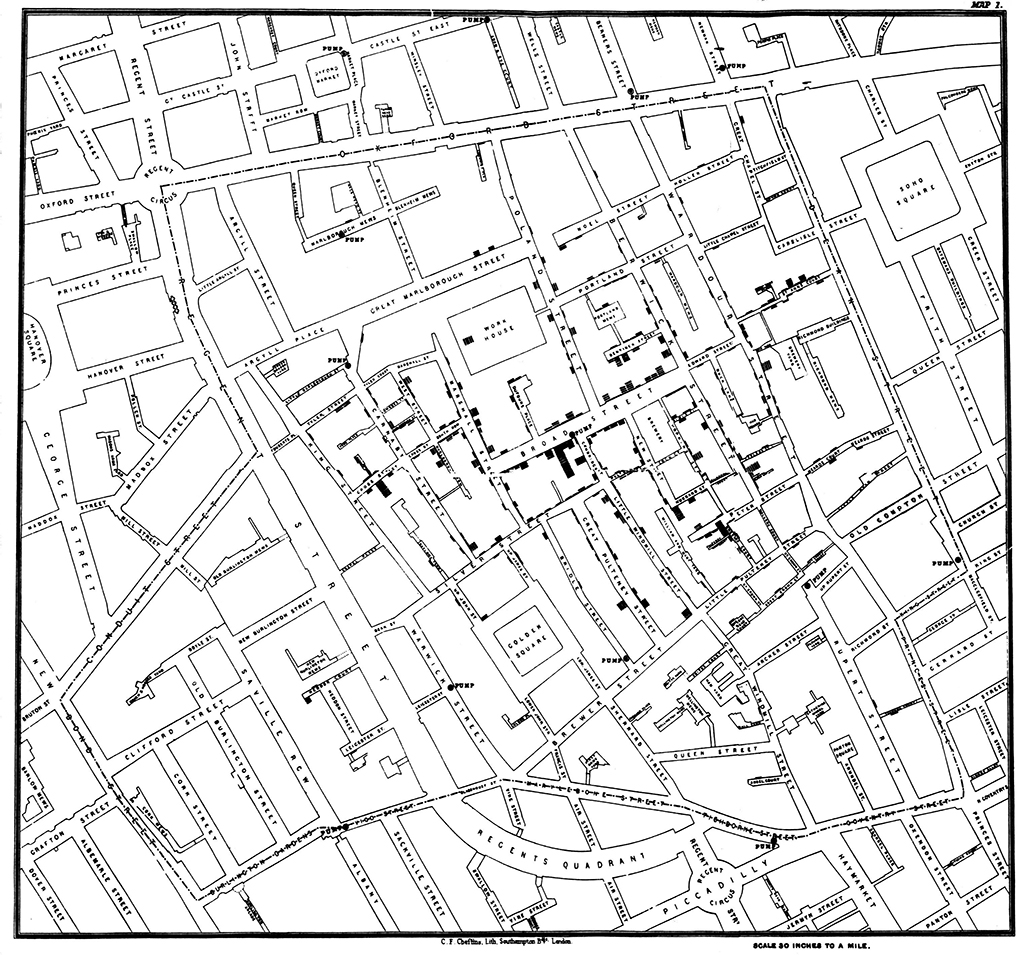
Figure 1: John Snow’s map of cholera deaths in London’s Soho neighborhood in 1854 | Cartography and printing by Charles F. Cheffins, from Snow, John. 1855. On the Mode of Communication of Cholera, 2nd Ed. London: John Churchill.
If you love maps, now is a good time to indulge that cartographic excitement. Cloud-based and integrated map servers are offering geographic insight to more industries, designers, and thinkers than ever before. The last 40 years have seen enormous advances in geographic information systems (GIS) and software. The last 20 placed navigational maps at the fingertips of anyone with Internet access. The last decade brought participatory mapping capabilities to the fore, enabling communities to self-define their places, priorities, and spatial politics in public via Internet-based map applications. Simultaneously infographic maps charting social networks, election results, demographic distributions, polar ice cap melting, and all (data) points in between have become common. And in only the last few years, geographic data lovers have benefited from and participated in the push for more open data enabling the drawing of even more maps. Yes, if you love maps, the 21st century has much to love.
Of course, the map itself is nothing new. Whether for conquest, commerce, or curiosity, humans have drawn their environment for millennia. Today, collectors and researchers alike pour over artifacts of incredible technological achievement, from historical maps of territory to navigational charts from the Age of Exploration. So it is no wonder that with the accumulation of environmental and urban data and the development of more sophisticated and accessible digital mapping technologies, we are compelled to project that information onto our representations of the world — drawing for interpretation, insight, decision making, or persuasion.
While the cartographer’s tools have advanced greatly, this sort of purposive data mapping is also not particularly new. Prominent examples date back almost two centuries, including John Snow’s famous 1854 cholera map of London’s Soho neighborhood (see Figure 1) and William Perris’s 1852-54 fire insurance atlas of New York City (see Figure 2). Like today’s data-driven maps, Snow focused his readers’ attention on a specific problem crafted from his information: the clustering of cholera deaths surrounding the Broad Street water pump to support his argument against the miasmatic theory of disease. Perris provided his audience of insurance underwriters with maps that foregrounded significant information for use in risk assessment, including the location, size, land use, and construction material of each building in the city. Where Snow had to find a quick and easy way to visually represent individual cases of cholera deaths, for which he decided to use parallel black bars building by building, Perris faced the challenge of inventing an entire nomenclature of colors and symbols to document various aspects of the urban landscape. With time, fire insurance maps became ever more complex, with one sheet of paper compounding layers upon layers of the built environment.
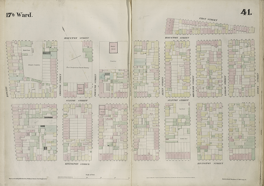
A sample page from Perris, William. 1852-1854. Maps of the City of New York. Surveyed under Directions of Insurance Companies of Said City. New York: Perris & Browne. | Image via New York Public Library
Revisiting such previously mapped information has also long been commonplace. Scholars have redrawn Snow’s data on the cholera outbreak countless times, although usually to illustrate certain aspects of Snow’s research and technique.[1] Fire insurance atlases, including Perris’s pioneering work and the better known Sanborn Maps, are standard references for urban historians and are widely consulted by anyone interested in the historical built environment of cities.
What is now newly emerging is the ability to apply advanced digital mapping methodologies to extract and study the data embedded within these historical representations of the city, as well as to introduce and interrelate new datasets with the original maps. Imagine this as a sort of digitally enabled cartographic archaeology: we may uncover layers of information in the city beneath the data — drawn to varying extents and intended as contextual reference by the authors — just as we would sift through other historic sites. With access to a wide range of information pertaining to demographics, economics, and public health in the 19th century, we can introduce new data sources to the original maps, using visual overlays and various new tools to interrelate these data. The real task becomes identifying the kinds of questions to ask, types of data to include, and methodologies to introduce to the analysis. And just as an archaeological site may bring together experts from several fields — from art history to anthropology to environmental sciences — these emerging techniques are creating new opportunities for interdisciplinary collaboration.
Remapping John Snow’s Cholera Map (Once Again)
First, some background on the map is in order. For six weeks in 1854, Snow documented individuals killed by cholera at the location of their homes (or where they died of the disease), which he mapped relative to neighborhood water pumps. Water feeding the Broad Street pump was contaminated from a nearby cesspool, unlike the water reaching the other pumps, and the map shows the clustering of cholera victims near it. Snow not only intended to document and illustrate that the Broad Street pump was contaminated but more generally that the disease was waterborne, not airborne as the theory of the time held. The map was meant to convince the medical profession of a specific etiology of cholera and is often cited for achieving just that. Perhaps more accurately, it should be referenced as an example of the limits of scientific reasoning in compelling the public health community toward a paradigm shift: even after Snow delivered his map, Filippo Pacini isolated the cholera Vibrio through his microscope that same year, and Robert Koch discovered the cholera bacterium 30 years later, still no clear consensus emerged about the cause of cholera. The miasmatic theory continued to hold until the century’s end — but that is another story.
Back to the map: when focusing on the cholera narrative, the map of the outbreak seems to contain only the collected information and offer only this story. Snow’s map, however, does not present the cholera data in isolation. Beneath the death counts and water pumps, the map includes a few noteworthy buildings (such as the workhouse and the brewery) and, more notably, Soho’s streets and their varying widths. This seemingly trivial decision can transform interpretations, as those streets were the conduits of traffic and exchange, stitching together the daily routines and paths of residents. While originally intended to convey a landscape of death relative to pump locations, we can also read those layers relative to the walkable geography of the neighborhood. With the detailed representation of streets, Snow offers us the basis of a networked dataset of origins (homes) and destination (the Broad Street pump) for the daily activity of acquiring water — as essential and fundamental a routine as procuring provisions, attending church, or socializing with neighbors. This task in many ways defined the spatial and social contexts of a 19th-century working-class neighborhood.
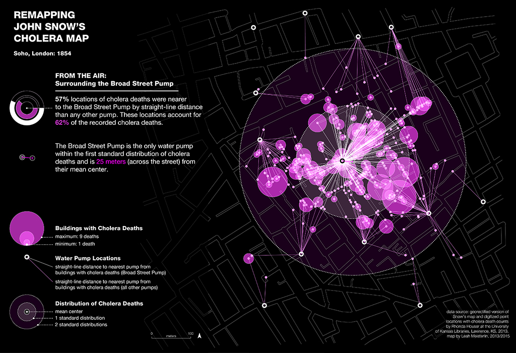
Remapping John Snow’s Cholera Map: From the Air
Remapping Snow’s data[2] with descriptive spatial statistics and attention to the street network reveals new and intriguing findings, even to researchers long familiar with the map. Figure 3 illustrates an analysis based on straight-line (“as the crow flies”) distances between affected households and the neighborhood’s water pumps along with the number of deaths per location. Here, the distribution of cholera deaths is clearly concentrated around the Broad Street pump: the mean center of deaths is just across the Broad Street intersection, and that pump is the only one located within the data’s first standard distribution (the spatial equivalent to a standard deviation), accounting for 62% of deaths. Importantly, this also means that for more than one-third (38%) of cholera victims, a different pump would have been a closer alternative. People, of course, do not move around the city as crows do, and so we would expect different outcomes perhaps explaining some of that one-third if we included the street network in our analysis. On the contrary, the analysis based on street-line distances actually reveals an even higher number of cholera victims (41%) living closer to another pump.
What if we incorporate, from the historical record, the use of street widths as a proxy for route preference and accessibility? In other words, we know that larger streets are prioritized over smaller alleys, the latter often leading to dead-ends rather than providing additional connectivity. Reanalyzing Snow’s data with this in mind, and applying a ratio of the street width as a weight, we can remap the relationship between the water pumps and cholera death locations based on convenient access distances (see Figure 4). What we find is still puzzling: the Broad Street pump remains the closest water source for only a little more than 60% of the victims. Whether measured by straight-line distance or along the street network (even after accounting for street width), almost 40% of cholera victims resided closer to another pump.
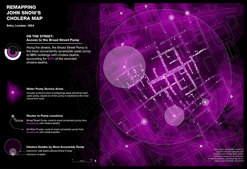
Remapping John Snow’s Cholera Map: On the Street
How to make sense of this? It is, of course, possible that not all cholera victims contracted the disease directly from the Broad Street pump. Some may have contracted it in other ways, such as eating food washed in contaminated water or coming in close contact with cholera patients, but these should account for only a small number of cases. A better explanation involves space and proximity: the new maps show us that distance alone was not the most important factor in determining the centrality or convenience of the Broad Street pump when acquiring water. Snow’s map does not contain adequate information to clarify this matter conclusively, but the analysis carries with it implications about the functions and built environment of Broad Street itself.
If proximity cannot fully explain the geography of cholera deaths, then Snow’s map implies a specific collection of activities and businesses near the Broad Street pump not replicated at the same intensity elsewhere and in high enough demand to attract residents on a daily basis. Women and children, typically tasked with acquiring water, frequently combined this household chore with other activities; whether procuring provisions, exchanging news, or chatting with neighbors, these activities likely pulled them to Broad Street. Commuters to work, school, or other destinations who selected this comparatively wide and bustling thoroughfare as their preferred route, could also drink from the Broad Street pump. Further, as we consider the ecology of the neighborhood, we begin to identify its edges. In many cases water pumps along or near other large streets were indeed closer options than the Broad Street pump. Thus, the new maps reveal the centrality of Broad Street within its neighborhood, not in terms of direct proximity from one’s home but as advantageously located for multiple daily activities. This, in turn, suggests that Oxford and Regent Streets (traced on Snow’s map to the north and west, respectively) delineated the neighborhood’s boundaries rather than its connections.
Peeling back the layers of Snow’s map to consider the city beneath the data, we begin to find hints about the spatial routines of neighborhood life. For continuously inhabited and redeveloped cities like London, much of the historic built fabric remains intact even as the context of local urbanism has changed. In short, exploring the cartographic record presents a unique opportunity for historians and urbanists to study the sociospatial practices of past neighborhoods, raising questions we now have the means to investigate. The next step would be to reconstruct the other determinants of this neighborhood geography, including demographics, land-use patterns, the distribution and types of businesses and activities on and near Broad Street, or the commuting patterns of residents, each of which requires introducing additional sets of data. Moving beyond the question of cholera, we could then begin to reflect on 19th-century working-class neighborhood life with the provisioning of water as one spatial determinant sourced from Snow’s map. By mobilizing emerging mapping technologies upon the historical maps and sources available, we can thus excavate and reconstruct urban history layer by layer.
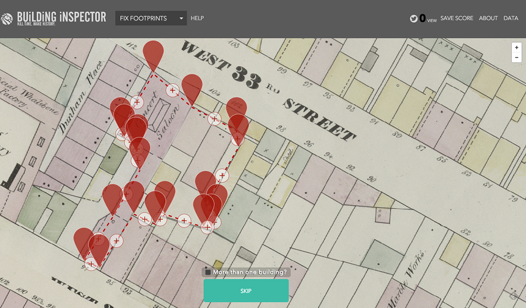
New York Public Library’s Building Inspector, which allows citizen cartographers to check a computer program’s work identifying building shapes and other data from georectified atlas sheets. | Image via NYPL
Beyond John Snow: New Avenues for Urban Research
The questions and patterns inferred through remapping John Snow’s cholera map are latent in other maps as well. Sufficient contextual information can instigate reinterpretation and reconsideration of that context as drawn. For example, we have been working with building footprint and land-use data encoded in the earlier described Perris atlas, digitized through a valiant, crowdsourced effort by the New York Public Library’s New York City Historical GIS Project.[3] Some of the early research was presented last year at Raising the Bar (and has been written up for publication since then), and includes findings that have long interested urban historians but until now were impossible to study at the fine detail GIS mapping allows. Specifically, we have been examining land-use patterns in mid-19th-century Manhattan’s largely unregulated built environment, studying the separation, mixing, and varying intensity of commercial, industrial, and residential structures. Our reexamination of the Perris atlas through digital cartography opens ways to remap, at greater precision, key issues of urban development, land use geography, the Manhattan grid, social and economic clustering, population density, and residential crowding, to name a few. Notably, these maps can also provide context for introducing additional data from censuses, directories, or other sources to address a variety of urban historical topics. The opportunities for research are almost endless, ranging from the city’s economic and cultural landscapes to patterns of residential segregation or unequal access to public health and housing — issues that are always changing and ever-pressing.
Even further, these sources may include the conditions and criteria for new experimental research on urbanism, without the difficult ethical concerns raised by using the city as a site for such experimentation.[4] Given that the historical record includes changes in built environments and that many of our 19th-century, data-driven maps can be read as empirical observations, the opportunity to construct new questions answerable through digitally enabled cartography opens a novel area of research. For example, a closer look at the land-use geography of mid-19th century New York reveals intriguing spatial patterns about the city’s environment — both built and regulatory — at an earlier point in its development. It provides empirical evidence of the processes and policies that produced those patterns, allowing scholars to formulate new questions, reframe their research, and test hypotheses.
Successful mapping of past urbanisms for new insights presumes interdisciplinary approaches and meaningful collaboration.[5] Without knowledge of the specific historical context, GIS-based analyses will fail to adequately comprehend source maps and will likely include methods that are inappropriate to the historical city. Similarly, historians stand to gain from the layered and relational approaches that characterize the representational and analytical methods of spatial practitioners. For us (an urbanist and urban historian), this iterative back-and-forth has been an opportunity to learn from other disciplinary approaches, integrating spatial techniques of analysis into historical frameworks and vice versa. Our collaboration has seen many of these benefits in inspiring new research, designing new methodologies, and constructing new images of the urban environment. Yes, if you love maps, the 21st century certainly offers much to love, but our collection of maps presents far more than moments of cartographic indulgence. If, like us, you also love cities, the evolution of spatial tools carves out new sites for urban archaeology and exploration to mine, understand, and represent our cities past and present.
Since 2013, Baics and Meisterlin have been researching the spatial organization of 19th-century New York City based on the historical record encoded in William Perris’s 1852-54 atlas.
NOTES:
[1] For reference, Tom Koch’s 2004 comparison of a few of these redrawn maps is an important discussion of cartographic intentionality, and UCLA’s School of Public Health keeps a remarkable list of publications on Snow since 1950.
[2] As mentioned earlier, Snow’s data has been remapped several times with varying results. The data sources for this analysis were Houser, Rhonda. 2013. John Snow Cholera Map as Rectified Raster Data, Water Pump Location Data, Deaths by Building Data, 2011 and 2013. University of Kansas Libraries. Accessed March 2013.
[3] The frontier in historical GIS is located precisely within such collaborative efforts as the NYPL’s Map Warper and Building Inspector sites and its more recent NYC Space/Time Directory. Designed to generate large amounts of historical GIS data, these will soon revolutionize the datascapes available to historians and the wider public to engage New York City’s historic landscapes. Read more in Urban Omnibus’ interview with Matt Knutzen, geospatial librarian at the New York Public Library.
[4] See Meisterlin, L. 2014. “The City is Not a Lab.” ARPA Journal 1.
[5] Some of the best examples of fruitful collaboration between historians and geospatial analysts are created at interdisciplinary labs such as the Spatial History Project at Stanford. The lab currently displays dozens of ongoing GIS-based research, among them the spatial history of 19th-century Rio de Janeiro, to cite only one of the most developed and comprehensive projects.
The views expressed here are those of the authors only and do not reflect the position of The Architectural League of New York.