
We are celebrating 15 years — and counting — of stories that are deeply researched and deeply felt, that build a historical record of what the city has been.
We are celebrating 15 years — and counting — of stories that are deeply researched and deeply felt, that build a historical record of what the city has been.
Earlier this year, it seemed change might be coming to New York City’s planning processes. A coalition of community-based and policy-oriented nonprofits argued for revising the city’s charter to require a comprehensive plan to address racism, inequality and the climate crisis in the built environment. Instead, a proposal on the November ballot ultimately tweaked the New York City Charter to extend the period for community review of land use proposals, and required the Department of City Planning to post those development plans online.
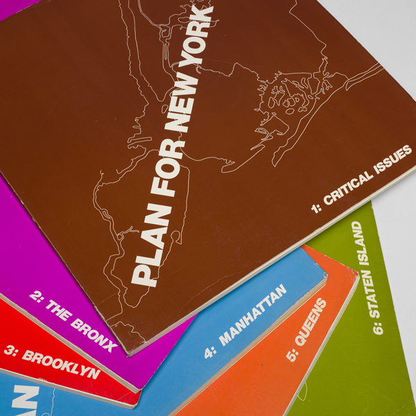
Compare the current, lackluster communications efforts to the story in 1969. Then, a search for public participation around New York City’s only comprehensive plan meant the production of a film broadcast on public television, and an unparalleled editorial endeavor bringing together writers, designers, and a star-studded cast of photographers to translate the city into a unique media artifact: six oversized books containing 450,000 words, 800 photographs, and 200 maps. On the 50th anniversary of the Plan for New York City, Greg Foster-Rice looks closely at the picture it proposed of the city. Though the plan left no physical legacy — it was never adopted or implemented — its invitation to an expansive urban conversation has something to offer today’s urban planners. To see and understand the experience of living in the city is still the first step to making it better.
It has been 50 years since New York City published its first and only comprehensive plan: a six-volume, candy-colored, 17-by-17-inch tome filled with hundreds of photographs. A mass media spectacle published in 1969, the Plan for New York City re-emerged into public consciousness this year during debates about whether revisions to the New York City Charter should require a comprehensive urban plan. On one hand, critics cited the 1969 Plan’s imprecise goals as evidence of the impossibility of comprehensively planning for a city as complex as New York. On the other hand, advocates for comprehensive planning took note of the Plan’s social vision, an element missing in a current climate of zoning regulations that privileges private real estate development at the expense of the city as a whole.
Alongside comprehensive plans for Chicago (1966) and Los Angeles (1970), the Plan for New York City represented an ambitious rethinking of urban planning in the wake of discredited postwar “slum clearance” programs. These plans’ emphasis on the renewal of the populace (through education, job opportunities, and participation in government) over the renewal of the built environment was magnified by the communication of these ideas to a broad public through ambitious design and innovative photographic strategies. The successes and failures of these precedents provide an opportunity for reflecting upon and shaping our own mechanisms for public outreach about urban planning today. While comprehensive planning did not ultimately make the ballot this year, some New York City Council members have argued that it is now an issue up for discussion at the legislative level and, potentially, in the 2021 municipal elections.
The Plan for New York City was the broadest and most elaborate of the era’s comprehensive city plans, and a centerpiece of Mayor John Lindsay’s time in office (1966–73). William H. Whyte, the noted sociologist and urbanist, was the lead author of the plan’s final text, whose drafters included Donald H. Elliott (the chairman of the New York City Planning Commission), and members of the Department of City Planning’s new Urban Design Group, composed of a small group of Ivy League–educated architects. This group was heavily influenced by the work of urban theorist Kevin Lynch, who argued in his widely-read book The Image of the City (1960) that the task of urban planners was not just to demolish and rebuild, but to also understand and improve the visual legibility of urban space. Combined with Mayor Lindsay’s well-known affinity for mass media, Lynch’s theories formed the Plan authors’ basis for incorporating innovative graphic design and photographic imagery to amplify the plan’s public appeal, which the Mayor hoped would engage ordinary New Yorkers in the planning process. The Plan was introduced with a 50-minute cinematic preamble, broadcast on public television on November 18, 1969, and as the architect McLain Clutter has argued, the volumes’ almost overdetermined use of design and photography reflected the Department of City Planning’s belief that images could situate readers within a sensation of actually being in the city. New York Times architecture critic Ada Louise Huxtable described how this approach was reciprocated by the Urban Design Group’s simultaneous belief that “conceptualization, or visualization before the fact” was necessary to developing city policies that affect urban design.
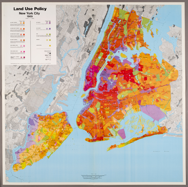
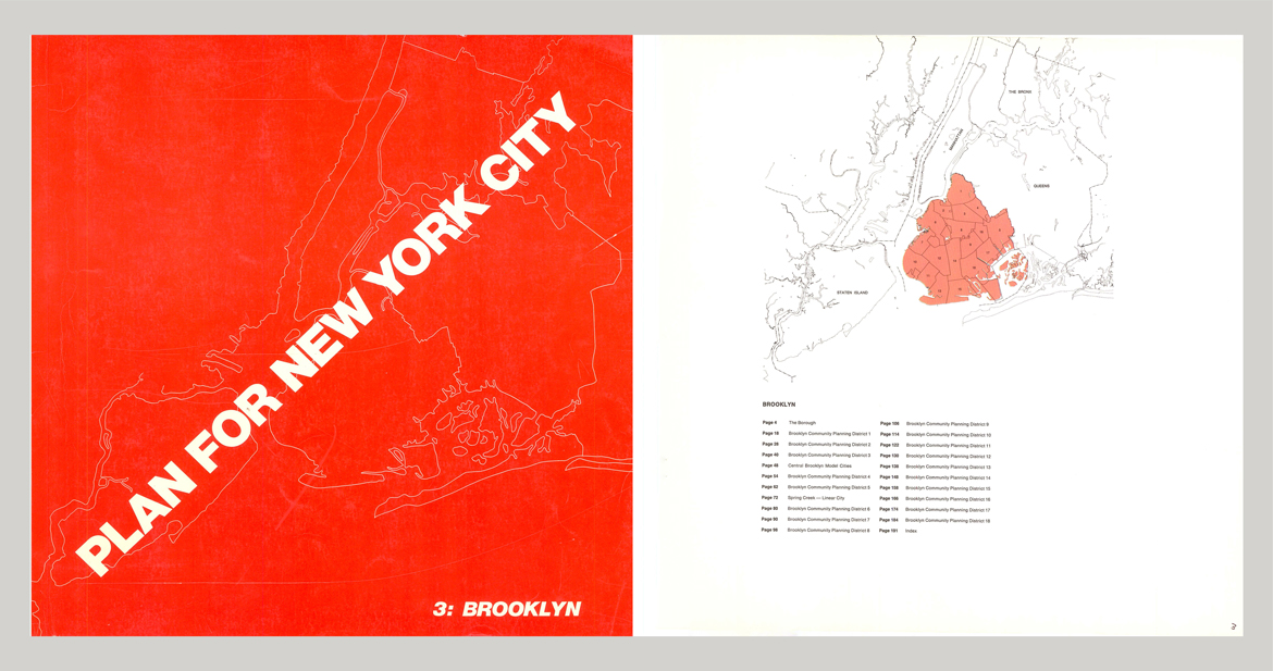
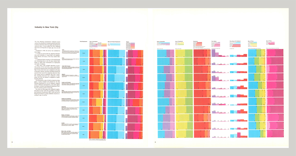
The complementary relationship between image and experience is clearly evident in the lavish design treatment of the Plan for New York City, which was overseen by architect and graphic designer Don Page of Page, Arbitrio, & Resen, Inc. Page was the former head of graphic design at I.M. Pei & Partners, a job he described as solving the “graphic problems” of architecture just as an engineer handles the “engineering problems.”[1] Given both the scale of the city (with a population of approximately 7.8 million residents in 1960) and the issues addressed by the Plan, the first of Page’s challenges was packaging such a massive document — with more than 450,000 words, approximately 800 photographs, and more than 200 maps — into a legible form. In structuring the Plan around an introductory volume (titled Critical Issues), with five other volumes dedicated to each of the boroughs, Page turned the set of weighty tomes into an analogue for the city itself. Even the angle of the title on the cover appears to be a clever reference to the Manhattan street grid’s rotation along the north/south axis. Flipping through the massively-scaled and densely-illustrated volumes therefore offers an experience tantamount to strolling through the city’s streets.
Page further brought his experience in designing wayfinding for actual built spaces to the interior design of the books, reinforcing their metaphoric relationship to the lived experience of the city. For example, all of the books’ photographs and text are in black and white, while color is reserved for the maps and charts that accompanied each volume, lending a clear separation between different types and categories of information. Each borough volume is also color-coded, not unlike the lines of a subway map (purple for the Bronx, red for Brooklyn, blue for Manhattan, orange for Queens, and green for Staten Island), and in the opening page of each volume, those colors are repeated to locate individual “Community Planning Districts” within the respective boroughs. Diagonal text, bold fonts, and differently scaled typefaces are used to establish hierarchies between headings, subheadings, pull quotes, and analytic information, while white space is used to relieve the reader’s eyes from the density of information that threatens to overwhelm. Overall, the experience harkens to Massimo Vignelli’s and Bob Noorda’s nearly contemporaneous, late-1960s design of the New York City subway’s uniform navigation system, as well as other modernist strategies for rationalizing complex systems and spaces.
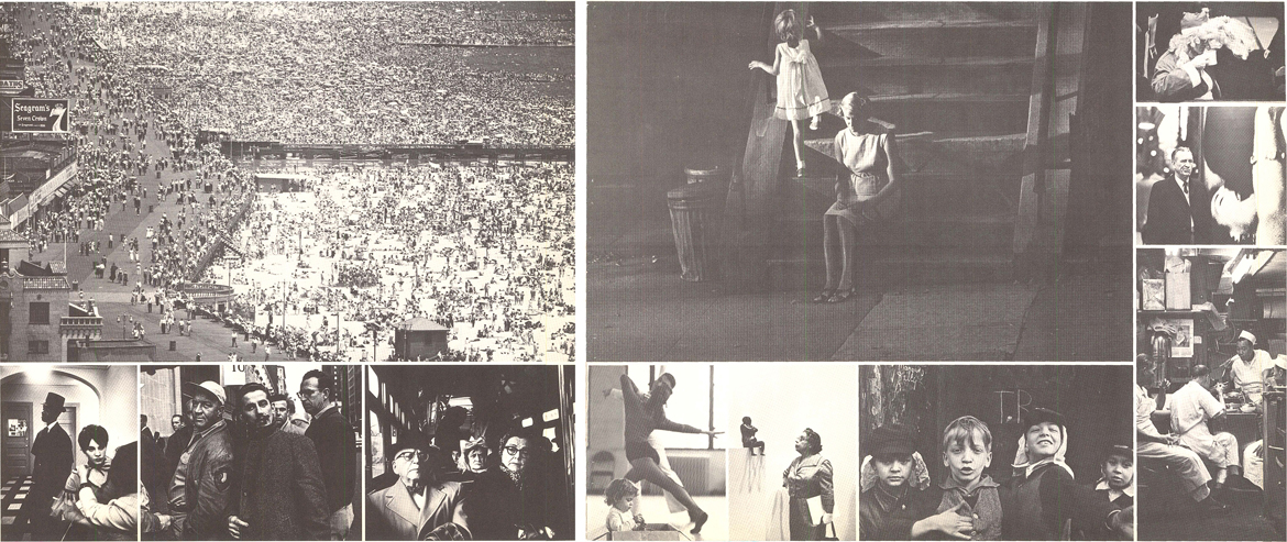
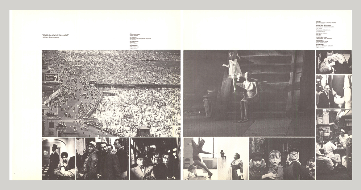
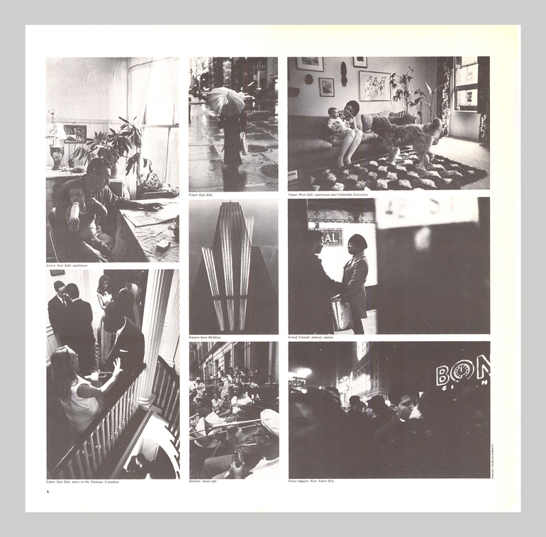
Just as Page’s design reflected new graphic sensibilities, the photographs reinterpreted the conventions of the photo essay. Originally developed for picture magazines of the 1930s as a kind of transparent delivery of facts, the photo-essay format was undergoing significant changes at the hands of contemporary practitioners like Bruce Davidson, Robert Frank, and Danny Lyon, all of whose work was reproduced in the 1969 Plan. The task of editing the Plan’s photographs fell to Charles Harbutt, an acclaimed Magnum agency photographer who also shot a majority of the new images (in all, about three quarters of the Plan’s total photographs were made expressly for the project). Reviewers frequently noted the volume and concentration of imagery, which was uncharacteristic of earlier city plans. Mirroring the compactness of urban experience itself, it visually reinforced the plan’s promotion of density.
The first volume begins with a ten-page sequence of photographs that oscillate between the vast scale of the city’s structures (from skyscrapers to the Statue of Liberty) and intimate sites of human social interaction (from beaches to picket lines to restaurant kitchens). In a 2014 conversation, Harbutt described how he was assisted in compiling these “city symphony” essays by two photo editors for the Magnum agency, who contributed a trove of historical images. These reproductions lent the project such credibility that it was selected by Life magazine for its annual list of recommended photo books alongside monographs by W. Eugene Smith and Minor White.[2]
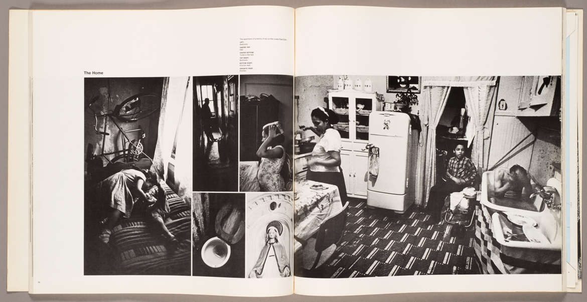
In addition to arranging “city symphonies” throughout the six volumes, Harbutt created multipage photo essays around each of four main themes in Critical Issues: strengthening the “national center” (or central business district), increasing economic opportunity, improving the built environment, and increasing government social services. Visually, these photo essays reflected a novel approach to what Harbutt called “the multilevel picture story.” Reflecting on the Plan in 2014, Harbutt described his symbolic strategy for organizing images as a rebuttal to the conventional narrative sequence of typical Life magazine photo essays.[3] The eight-page photo essay on “Opportunity” balanced what Harbutt characterized as the journalistic level (pictorial facts represented through legible photographic records of people, places, and things) with the allegorical level (a broader theme; in this case, the limited opportunities available to Black and Puerto Rican New Yorkers, as exemplified by the cramped residence where a man bathes in the kitchen) and the editorial level (the photo essay ends with images of children at school and men working in a factory, implying the need for education and job training).
Harbutt argued that, to establish meaning, the layout, scale, and placement of images on the page were as important as the content of individual images or their sequence. Relationships between visual elements in the photo essays mirrored the logic of comprehensive planning, drawing an analogy between the act of photography, editing, or layout design, and the deployment of infrastructure, zoning, or social services to bring a degree of legibility and order to the disorder of the city. And, like comprehensive planning, which relies upon teamwork, the final layouts were a collaborative effort between Harbutt and Page’s associates Dominic Arbitrio and Ken Resen, who integrated these “multilevel picture stories” into the Plan’s overall graphic design.
The five borough volumes of the Plan are less densely illustrated, but almost all of the several hundred borough photographs are distinguished for having been made as direct observations for the Plan. For example, in 2014 Harbutt recalled needing a photograph of the Empire State Building as the book’s deadline was approaching: “I ran out to photograph it . . . I went to 34th and Fifth. And of course, that’s exactly what not to do because you are at the base of the skyscraper. Then I turned around, looked in a window and found the building’s reflection in the window.” The resulting image became a centerpiece of the photo essay introducing the Manhattan volume, perfectly encapsulating the density of the borough in its compression of the reflected skyscraper with the fluorescent lighting of an office across the street.
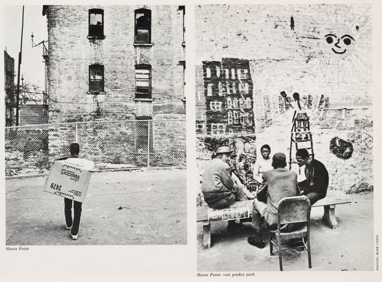
More typically, the process for creating the borough photographs was undertaken systematically, district by district, with guidance from the staff of each of the city’s 62 Community Planning Districts. They provided local knowledge and helped steer Harbutt and a small staff of photographers (including Burk Uzzle and Richard Kalvar from Magnum) to both the most distressing and impressive features of their communities. Harbutt noted that he and the other photographers were directed by the urban planners to “give a taste of reality, away from theory,” implying that the photographs were meant to function as a kind of evidence, rather than a mere illustration of planners’ preconceived notions. As Harbutt freely admitted in conversation, the influence of Jane Jacobs was everywhere in the Plan, reflecting the importance of the opening lines to her 1961 book The Death and Life of Great American Cities: “The scenes that illustrate this book are all about us. For illustrations, please look closely at real cities. While you are looking, you might as well also listen, linger and think about what you see.”
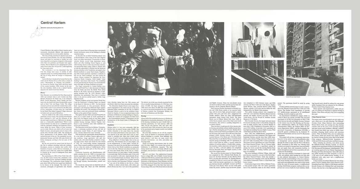
For the Plan’s section on Harlem, Harbutt relied upon African American photographers like George Frye and John Shearer, along with the noted Civil Rights photographers Leonard Freed and Bruce Davidson, to provide intimate images of Black life in the city, from front porch stoops to apartment interiors. While the addition of images by Frye, Shearer, Freed, and Davidson was mainly limited to the Harlem section, Harbutt’s inclusion of their work reflected a growing recognition of the need for different kinds of representation on many levels, from images showing New York’s diverse citizenry, to images made by a more diverse group of photographers.
If the Plan for New York City was novel and forward-thinking in its design and photography, it was also notable for its inability to effectively achieve its goals. In a dissenting opinion published in the Plan itself, planning commissioner Beverly Moss Spatt critiqued the proposal as a “Santa Claus list” of general platitudes, lacking in specific remedies and with no hope of realistic implementation during a time of fiscal instability. Others criticized the Plan for its establishment of 62 Community Planning Districts, an attempt to decentralize authority and give priority to local initiatives which, in retrospect, made it difficult to pass significant initiatives and challenged the ability to plan comprehensively across the city.[4] The Plan was largely abandoned as the new administration of Mayor Abraham Beame focused on the fiscal crisis of the mid-1970s, ushering in an era of austerity.
If another comprehensive plan were to be undertaken today, it would need to address today’s crises of income inequality and climate change, as well as the contemporary social and political climate in which private investment is privileged over the much larger roles that labor and government played 50 years ago. At the same time, we could still learn from the more positive components of the 1969 Plan, especially its progressive use of design and photography. We should want to imagine how design elements from recent urban experiments could be incorporated into the design of a new plan, what visual media might function now similar to how photography did in 1969, and what delivery mechanisms would be appropriate for today as television and candy-colored books were in 1969. But most importantly, we should be inspired by the human-scaled and human-oriented principles that were so central to the now half-century old, but still visually provocative Plan for New York City.
Author’s note: This article builds off my essay “The Dynamism of the City: Urban Planning and Artistic Responses to the 1960s and 1970s” from the exhibition catalogue The City Lost & Found: Capturing New York, Chicago, and Los Angeles, 1960-1980 (Princeton University Art Museum, 2014), edited by Katherine Bussard, Allison Fisher, and Greg Foster-Rice. It also relies upon my telephone conversation with Charles Harbutt on February 6, 2014, the year before he passed away.
Unless noted otherwise, all images from Plan for New York City are used with permission of the New York City Department of City Planning. All rights reserved.
Andy Leon Harney, “Signage: Fitting Letter Forms to Building Form,” AIA Journal (October 1975): 35.
Frank Kappler, “Photography in the Bookstore: Photo Books of 1970,” Life, December 1970, 12.
Charles Harbutt, “The Multi-Level Picture Story,” Contemporary Photographer 5, no. 3 (1962).
Brian J. O’Connell, “Concentration: The Genius of the City; A Critique of The Plan for New York City,” Journal of the American Institute of Planners 42 (January 1976): 74.
The views expressed here are those of the authors only and do not reflect the position of The Architectural League of New York.


Comments