
We are celebrating 15 years — and counting — of stories that are deeply researched and deeply felt, that build a historical record of what the city has been.
We are celebrating 15 years — and counting — of stories that are deeply researched and deeply felt, that build a historical record of what the city has been.
The title of the Skyscraper Museum’s current exhibit, Times Square 1984: The Postmodern Moment, appears to be a contradiction in terms. The New Times Square, as it was eventually called after a massive redevelopment culminated in the 1990s, is a rationalist machine designed to spew maximum profits per square foot. Its financial infrastructure and service sector economy, acting as a stage for neon-etched tourist fantasies, make it an unrivaled sign of the times. And it confidently embodies the assumed inexorability of global capitalism that postmodern thinking tries to complicate. There is a manifest triumphalism in the persistent verticality bordering its streets, otherwise bland buildings masked by explosive signage looming overhead. You are forced to scan upward as you ramble through intentional congestion that really does give the impression that Times Square is the crossroads of an interconnected world.
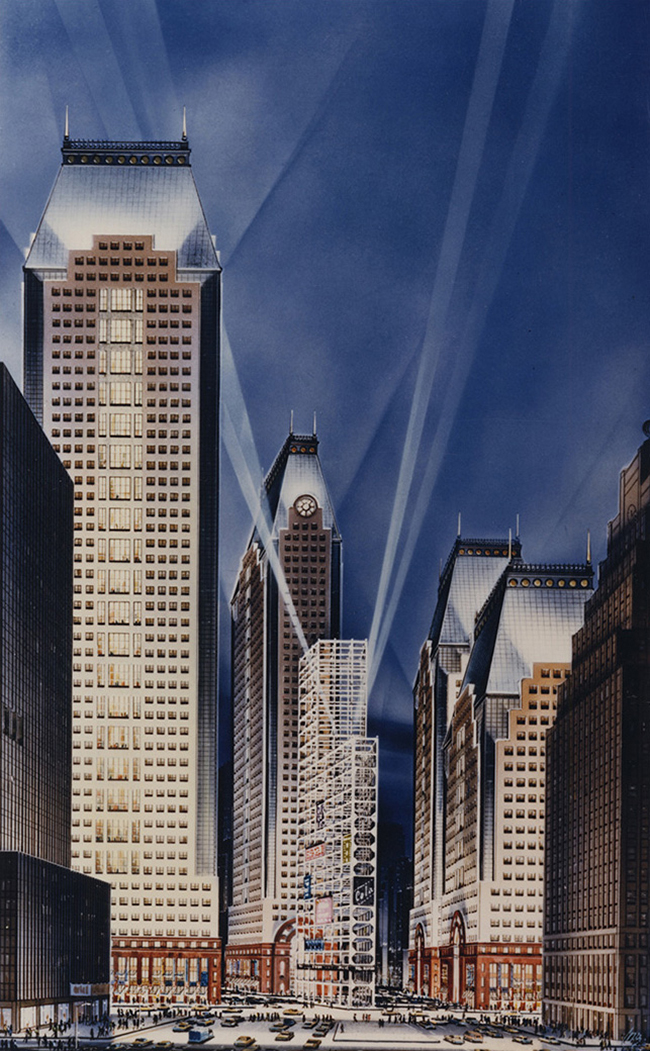
Illustration of the Johnson–Burgee Plan for Times Square | Image courtesy of the Skyscraper Museum
The exhibit, which runs through January 18, 2015, explores an interesting period of free thought around the square during a significant transition. In 1984, a proposal by Phillip Johnson and John Burgee commissioned by Park Tower Realty — the development firm chosen by the New York State Urban Development Commission and the New York City Public Development Corporation to develop the site — was poised to turn the square into a giant suburban office park. “Times Square Center” would have featured four monotonous, granite-color buildings, differentiated mainly by size and crest. As with Rockefeller Center, which the name was meant to evoke, repetition was supposed to inspire a sense of place. Instead, it inspired active opposition from many quarters.
Historic preservationists, for one, objected to the heavy-handedness of the approach, calling for protection of the cultural relics in the area, particularly endangered theaters. Following this dissatisfaction, the National Endowment for the Arts and The Municipal Art Society sponsored an ideas competition to solicit alternatives from artists, provoking schemes reminiscent of Rem Koolhaas’s fantastical Delirious New York. Since the competition did not require the schemes to be buildable, participants were given virtually unlimited freedom to reimagine Times Square. Function could follow form. The resulting designs — 565 in all, 24 displayed in the exhibition — play on the ironies of the square and present grossly exaggerated versions of what we see today. These works called into question the modernist built environment that emerged in New York in the prior few decades.
Johnson’s scheme, which greets you at the exhibit’s entrance, is followed by alternative representations of what the square could be like. Among the most whimsical from the competition, Jaime Gonzales and Martine Maurins’ massive Roosevelt Island-like cable cars carry riders over the square. Michael MacDonald and Mark Mutchnik proposed a glowing neon steel frame in place of the Times Tower. (Times Square Center would have replaced the eponymous tower, which had a modernist façade by then and now exists primarily for its coveted LED screens). As alternative urban futures, the latter scheme is the most prescient, anticipating the hegemony of luminescent advertising that characterizes the square today. Interestingly, the sample advertisements in the MacDonald-Mutchnik proposal say little; they are rendered to appear as they would to the fleeting glances of busy passersby choosing to ignore them. This choice speaks to the essence of postmodern relativity, positing disconnection between the senders of messages and their receivers. On the other hand, it belies the philosophy of advertising, for which the message must be loud, clear, and speak to some common human emotion.
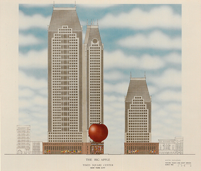
Robert Venturi’s “Big Apple” redesign | Image courtesy of the Skyscraper Museum
These proposals articulated artistic visions of what Times Square ought to be. Meanwhile, Robert Venturi was brought on to lead the redesign of the Johnson-Burgee plan called for by the City and State development agencies in response to public criticism and lawsuits intended to halt the redevelopment. The revised plans had ersatz postmodern elements, trying to complement the square with crowd-pleasing strangeness. At the center of the complex was to be a sculpture of a giant apple, a sardonic play on the city’s nickname. If built, the “big apple” might have become a magnet for the legions of photo-takers in Times Square today, much like the Charging Bull downtown.
But the proposal as a whole retained the gigantism of the previous design. Though the State’s Urban Development Commission had cleared a path for the project through rezoning and eminent domain, a downturn in the real estate market rendered the high towers economically unfeasible before the redesign could get off the ground. The UDC largely scrapped the plans by 1992, building none of the originally proposed buildings. Johnson would try for the rest of his life to build on the site, but work to bring about the New Times Square fell to a series of other firms working for multiple developers that ultimately took the place of Park Tower Realty.
For me, the most interesting proposal showcased at the exhibit was Lydia Rubio’s audacious attempt at an amusement park of sorts, titled City at 42nd Street, commissioned by a public-private initiative of the same name that generated ideas for the square in the ‘70s. Though not part of the NEA’s competition — coming five years prior — it fits nicely alongside the exhibit’s outlandish motifs. The vividly illustrated rendering captured Times Square holistically rather than as a series of independent events. Different attractions emerge block by block, including a 15-story indoor Ferris wheel, the world’s largest movie screen, and, in keeping with the postmodern understandings of the time, a “museum of museums.” Much of the walls were glass. Its cinematic studios and theaters recall the transparent façades facing the street around Tokyo’s Shibuya Crossing, where people huddle outside to watch activities going on indoors. The Times Square Center designs by contrast look monolithic, their inner workings closed off. The non-profit group City at 42nd Street used its connections to circulate the scheme to well-placed figures in city planning. Mayor Ed Koch dismissed the proposal, comparing it to Disneyland.
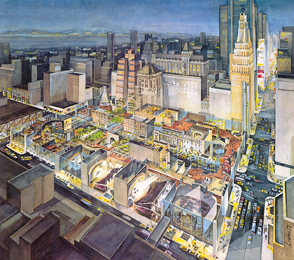
Lydia Rubio’s 1979 “City at 42nd Street” poster | Image courtesy of the Skyscraper Museum
The Postmodern Moment’s focus on experimental concepts sidesteps an important discussion on the square as it actually was. After all, Times Square was hardly a blank slate. Building something new in Manhattan usually requires dislocating something else, but that something remains invisible in the featured designs and in the exhibit itself. No one doubts that Times Square needed changes by the 1970s. Parts of the district were physically unsafe, particularly for women, and pornographic imagery was common. That said, Times Square also provided affordable housing and entertainment for New Yorkers. Facing uncertainty created by UDC’s condemnation threats, landlords allowed building stock to deteriorate, ultimately justifying demolitions as the square’s prime areas traded constituencies for a global clientele.
None of the square’s redeemable attributes of affordability and access fell under the carefully circumscribed rubric of preservation emerging at the time. What the period under study in the exhibit suggests is a design community ready to wipe the slate clean on the square as a community (albeit in a far less heavy-handed way than Johnson’s towers would have). This sentiment was there despite the many hard efforts of preservation proponents to save some of square’s existent virtues. The refurbishment of important architecture, such as the rich collection of theaters in the area, have done much for the vitality of the square, but for whom? Planners’ use of eminent domain for urban renewal bluntly displaced many of the area’s low-income residents and minority-owned businesses. The myriad ideas on display at this exhibition, starting with Times Square Center, showcase plenty of poetic ironies but do little for the people who made use of the square as it was. Even the alternative designs shown in the exhibit evade questions about social exclusion inherent in Midtown’s redevelopment.
All this said, how did the long, complicated process begun in the ‘80s deliver? “Overall, it has turned out less bad than we feared,” in the words of the late Marshall Berman. Like it or not, you can’t mistake the square for anyplace else, despite its generic chain restaurants and gift shops. Berman reminds us, despite all else, to relish the freedom to walk the city without looking over our shoulders. For all the efforts of developers to produce their desired public, the place is hardly exclusive. The gradual pedestrianization of the district during the Bloomberg years has made it more inviting, even resembling an actual square. Ongoing renovations by the design firm Snøhetta reaffirm this commitment to walkability by eliminating remaining barriers to foot traffic. Johnson’s scheme might have been a lousy start but hardly the endgame. The alternative visions on display in this exhibit attest to Times Square’s ever-evolving nature and its unique allure that promises to capture the imagination of urban designers of all stripes for generations to come.
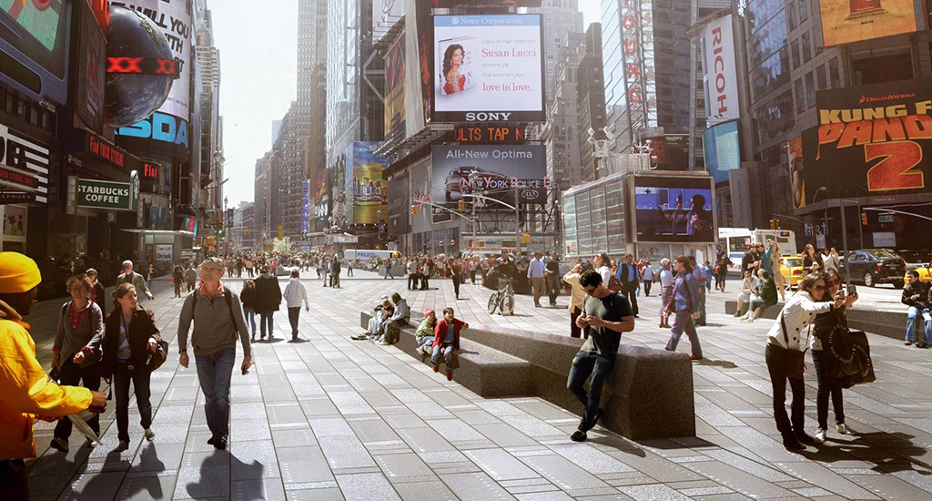
Snøhetta’s design for a more pedestrian Times Square | Image via Snøhetta
The views expressed here are those of the authors only and do not reflect the position of The Architectural League of New York.