
We are celebrating 15 years — and counting — of stories that are deeply researched and deeply felt, that build a historical record of what the city has been.
We are celebrating 15 years — and counting — of stories that are deeply researched and deeply felt, that build a historical record of what the city has been.
600,000 people pass through New York Penn Station daily, at last count. It’s possible just as many words have been written this year on the subject of the station’s present and future state. Demands for a rehaul, and debates over the shape it should take, while perennial, are at a fever pitch. Arguments are made on the grounds of human safety and dignity, while plans are hatched and scrapped based on property values and influence peddling. But while would-be power brokers sketch grand visions of a commuter-fed office district reborn, the mundane needs of the commuters themselves are usually missing from the picture. The lack of seating in the shiny new Moynihan Station, inaugurated to much fanfare last year, is only one indicator. Yet the real drama of Penn Station is not a metropolitan opera but a million small comedies and tragedies. It is a space of human passage. As urbanist Jess Myers argues in the essay that follows, nothing marked this so clearly as a subtle and ultimately short-lived public art commission by Maya Lin, removed in the most recent set of renovations. An eclipse over the Long Island Rail Road concourse underscored a humanity and precarity that more brightly lit transit fantasies seek to deny at all costs, and to our collective impoverishment.
As a child of the illustrious state of New Jersey, from a very young age I was both witness to and student of one of my region’s greatest skillsets: commuting. And in the many commutes of my life, one node of passage looms large over all the rest. Penn Station has been my gateway to home and elsewhere. Anne Carson once noted, quoting the classicist Oliver Taplin, “It is a truism of ancient stagecraft that the one who controls the doorway controls the tragedy.” As the greatest connector of the Northeast, Penn Station is a well-trod doorway made more complicated by all the doorways it contains.
For New Yorkers, Penn offers a portal between the city’s two longest subway lines, the A/C/E and the 1/2/3. Long Islanders and Jerseyans come in through their own doors on the Long Island Rail Road (that’s L I double R, please) and New Jersey Transit regional rail. For those traveling farther afield, there is the grey lady herself, Amtrak, who will ferry the paying public as far as Montreal or San Francisco. I have held a ticket for each of these railways, relying on them to relay me to work as well as to maintain what many residents of the Tri-State might call “long distance relationships.” As a young person from a bedroom community, I was terrified of the trains, plied with the usual stories of danger and crime. But after years of balletic sprints and dodges, after stepping over many mysterious puddles, after being shouted at, sobbed on, sobbing myself; after being offered everything from tissues to lotion, to drugs, to sympathy, sandwiches, eye rolls, dance performances, and musical numbers; after giving away money, water, my seat, and food, I have found that the trains were not only where I became an adult, but also where I became a New Yorker. Penn is not the biggest train station (that’s Grand Central) nor the one with most connections (that’s Times Square), but Penn Station’s regional gateways have made it something of a personal pied à terre.
Both public edifice and turbine of everyday life, Penn Station has the power to stage great conflicts, cultural and political alike. It has captured the attention of high-status cultural figures and served as a battleground for the invisibilization of New York’s most precarious communities. On the surface are dramas over the aesthetics of the station, its form, and material presence. Down below, there are the endless scuffles over who is allowed to loiter there and who should be hustled out. These struggles and tensions can be read in the building itself, with its patchwork of grand fixtures, hokey installations, and reliable fast food. But even though I have trampled its many corridors my whole life, it wasn’t until middle school that I started to pay much attention to it, and this was thanks to just one architect.
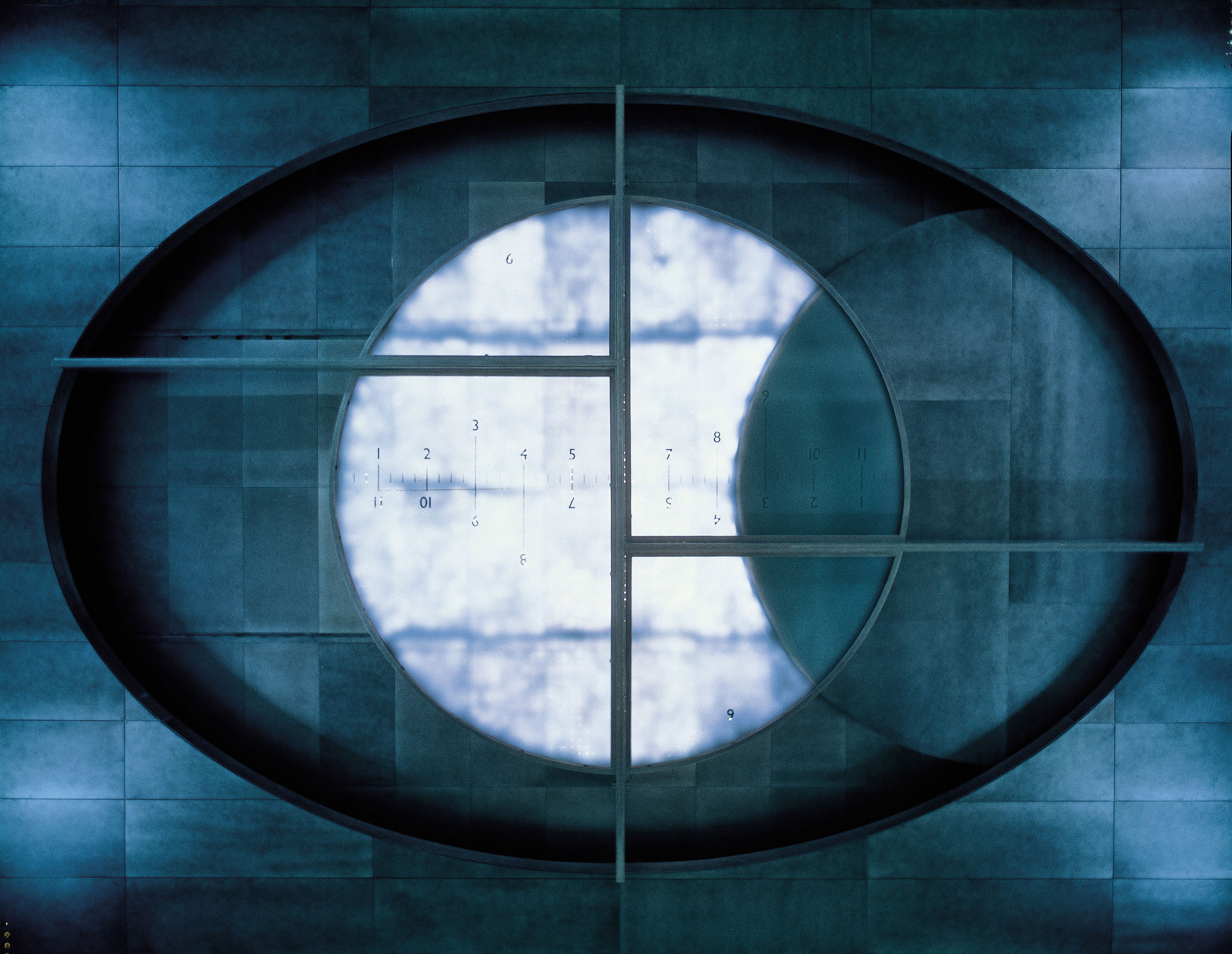
Maya Lin is hardly associated with the fuss of urban transit, and still best known for her Vietnam Veterans Memorial, with its origin story beloved by architects: the triumph of a young, underestimated student over a visionless professor on a national stage. Since that auspicious beginning, Lin’s career has knit together art and architecture, structure and land, in projects defined more by subtlety than flash. This appealed to me enormously as she explained it in the dim of my middle school auditorium. The fact of this lecture may surprise the reader, as Lin does not often subject herself to the public eye. (After months of inquiry I could not even get an interview for this piece.) How she came to be in the auditorium of a private girls’ school in Summit, New Jersey is anyone’s guess, but the school has a fund for such lectures and even landed astronaut Sally Ride one year. These were rare chances for me, a scholarship kid from an ailing school district, to hear from widely celebrated women. I would later come to understand this lecture to be rare in the field as well. Rather than parade through self-advertisements and post-rationalizations, Lin thoughtfully discussed her approach and methodology, as if addressing established practitioners rather than fidgeting twelve year-olds. The war memorial was a small part of the lecture, in which she mostly discussed her land art and installations of swells and waves. But one work she presented stuck with me in particular and, later, with my commute. For a few minutes, Lin talked about a 1994 work called Eclipsed Time, an installation in the barrel-vaulted ceiling of the LIRR concourse in Penn Station. The piece was essentially a clock, a fitting addition to a place called into existence by timetables. But rather than measuring passing minutes, it mimicked that twice yearly phenomenon of the new moon aligning with and thus seeming to obscure the sun.
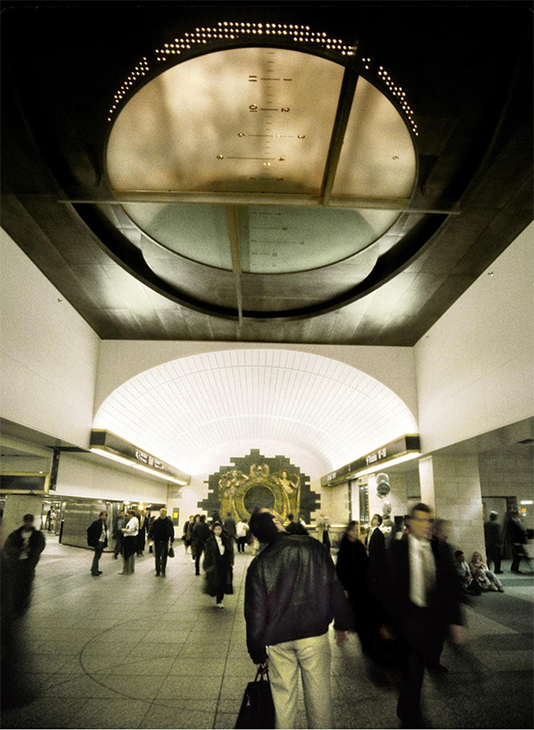
The mechanism was a burnished aluminum disk pressed behind a frosted pane of glass with the day’s hours etched in a line across its center and in front of an array of fiber-optic lights. If you happened to look up on your way to the 1/2/3 or the now defunct 9, you would see the disk’s slow advance across the backlit glass. If it was functioning, each day at noon and midnight you could see the disk obscure the lights above and radiate soft light from its edges. Grand Central may have the whole zodiac set in a twilight sky, but Eclipsed Time was Penn Station’s best reason to strain a traveler’s neck.
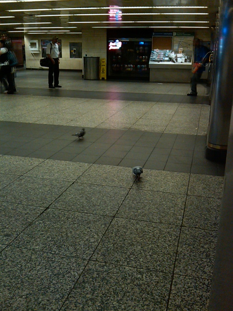
For its almost unremarkable appearance, it took five years to design Eclipsed Time and months of inter-agency coordination to install. Unlike the other installations at Penn — Andrew Leicester’s terracotta bas reliefs or George Greenamyer’s bizarre but cherished glass-encased merry-go-round of Jersey culture — Eclipsed Time had seemingly no purpose. You could not learn any state’s history from it, it was not a city crest, there was no historical reference, you could not easily tell time by it, and you could not buy anything from it. Often pigeons would roost in it and their leavings obscured the glass just as effectively as its burnished aluminum moon. There was no placard to read or sign to indicate its presence. The only clue that Eclipsed Time was above you was a set of semicircular aluminum tracks inlaid in the pavers below. Its only ambition was to slow you down for a few seconds, a momentary break in the legendary commuter stride, to regard something. Like a striking face on a crowded sidewalk, an encounter with Eclipsed Time was a glance, a moment of wonder, and a risk of being shoulder checked by the finance bro behind you.
When I first saw this piece, projected on the screen, it felt like a small invitation to capital “A” architecture. Not a tower or a plaza or a museum, but a secret. Starting in a college summer where I juggled two jobs in New Jersey and one in Brooklyn (only one of which was paid), Eclipsed Time became a personal St. Jude, a ward against missed trains and subway delays. However ineffectual, I dutifully saluted it during every mad dash to the 1/2/3. That is until 2019, when it was decommissioned to make way for the concourse’s renovation and a new “East End Gateway.” Today, not even the pavers remain.
No matter what is done to Penn Station there will always be opinions. A central train station plays the role of both critical infrastructure and civic calling card. In its efficiency as much as its aesthetics, it is a litmus test for the city itself. Is it a boom or bust era? Technologically forward or struggling to maintain itself? Culturally minded or terminally reactionary? The train station and its temporary denizens can speak to all this at a glance.
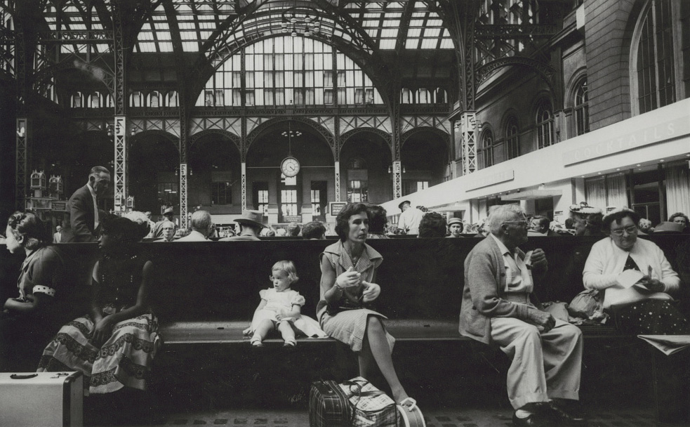
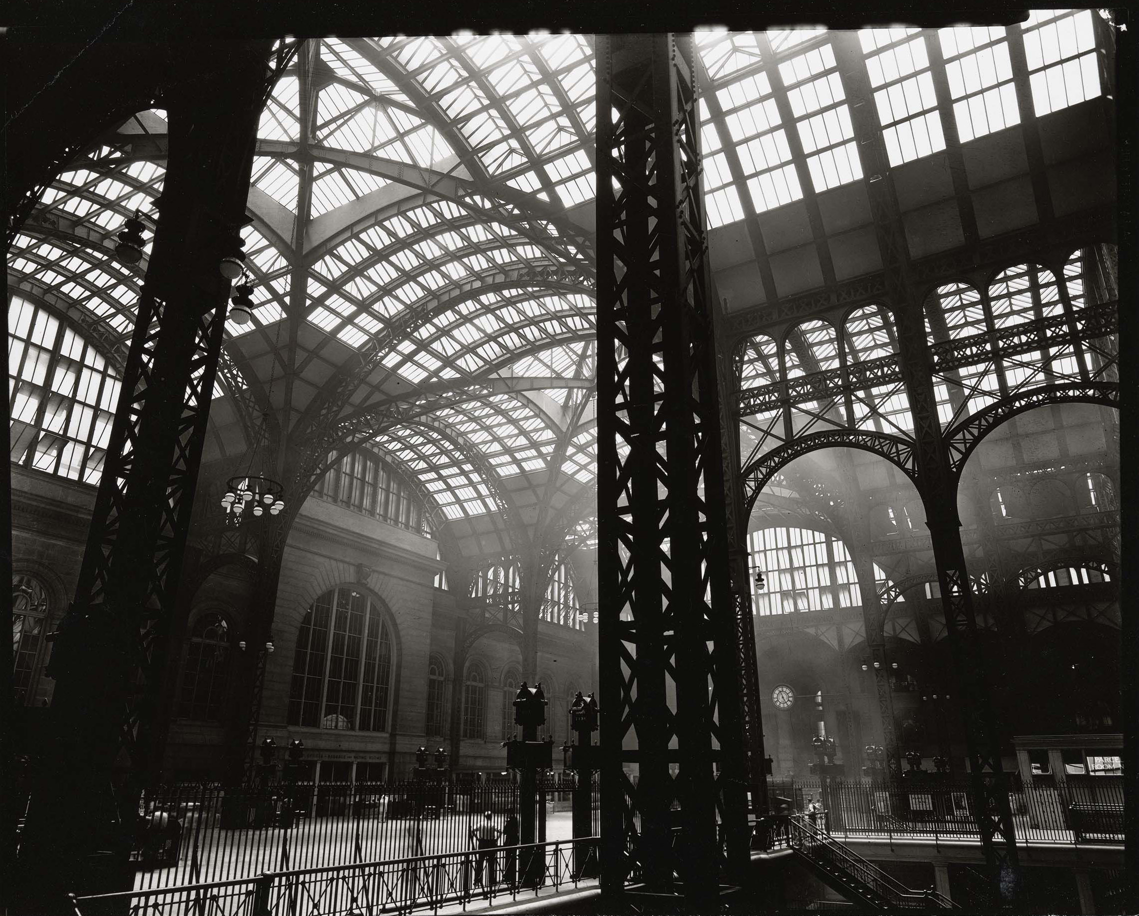
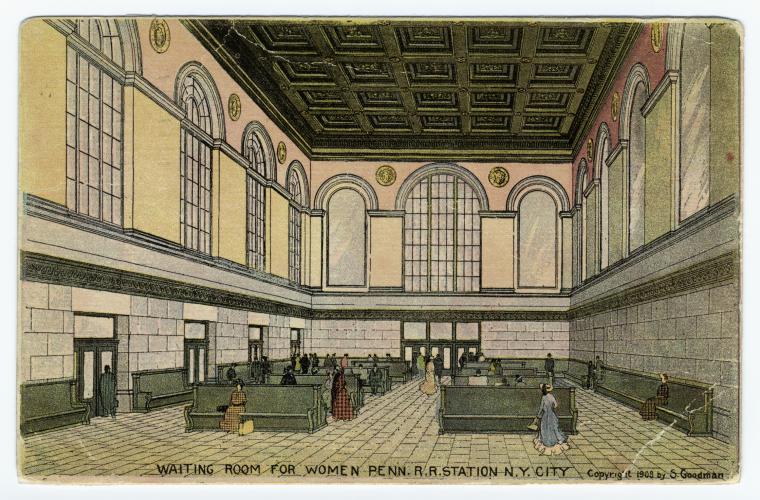
The original Pennsylvania Station, designed by McKim, Mead, and White, was an icon of delicate iron lattice work and a testament to the era’s ruling robber barons. The Pennsylvania Railroad Company’s decision to redevelop the station just over 50 years later was decried by preservationists from Jackie Kennedy to Vincent Scully, who would famously quip that where travelers had once entered the city like gods, they now scuttle in like rats. Although one could argue that the rats have always been the station’s true gods, the point on arrival is a crucial one. For all its doorways, Penn Station does not actually allow its guests to set foot in the city. It is an entirely subterranean space. The purpose of the soaring iron arches was to bring light and a hint of the life from the surface (and perhaps from the heavens) into the station. Since their removal, the only way to give a sense of light and air is to allude to them.
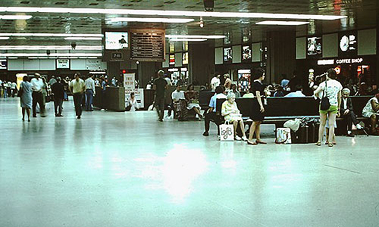
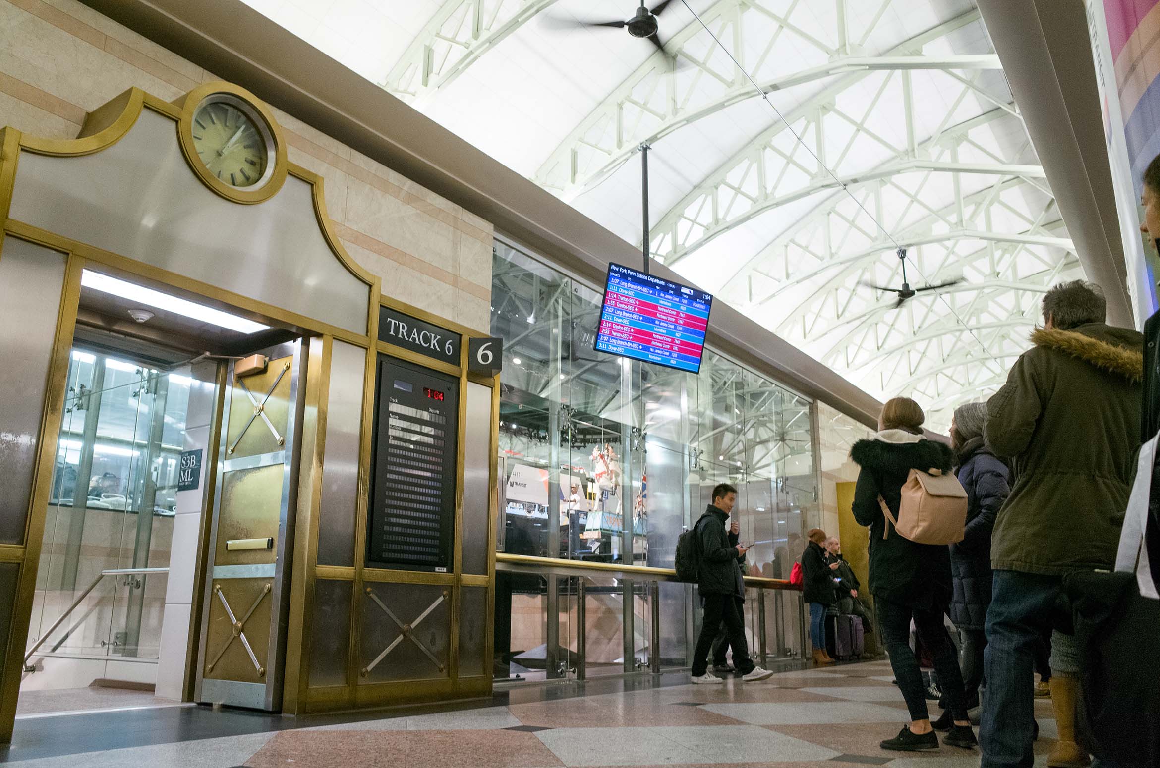
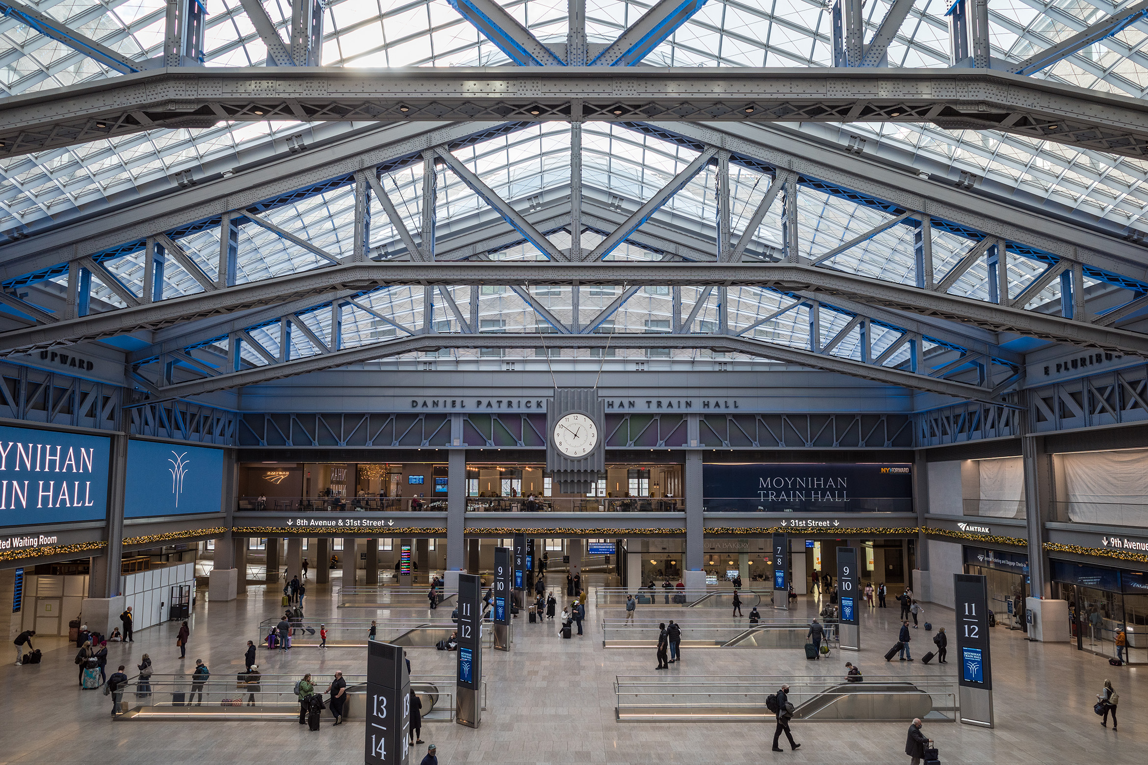
Like any intestinal system, Penn Station is best understood in section (there’s levels to this, as the kids say). Such a cut would reveal that although NJTransit, Amtrak, and LIRR share rails, each train system offers travelers its own separate doorway. NJTransit presents the bridge-and-tunnel set with a recessed waiting area finished in a 1980s pink and peach granite. Down the hall, Amtrak provides a cooler aesthetic in blues and grays for those headed up and down the Northeast Corridor, although the glittering Moynihan Hall has shifted Amtrak’s doorway by bringing some nostalgic lattice arch work back to the surface of Eighth Avenue. It wants the commuter striding (though crucially not sitting) across its spotless floors with glances thrown not to any art but rather to the sky-high LED screens meant more for advertisements than train schedules.
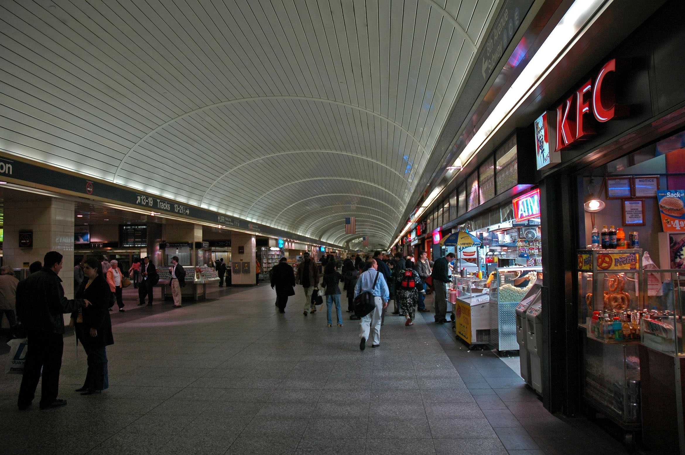
The Long Island Rail Road, a level deeper underground, never had a real doorway of its own. A ticket counter? Yes. A dimly lit waiting room? Sure. But for the most part, the LIRR has a concourse. Flanked by the turnstiles of the subway lines, it is and has always been a space to get from one place to another. No distinguishing aesthetic sets it apart from its neighbors. Not even the 90s renovation, which brought art installations and better lighting, could break the sense that the LIRR offered very few spaces in which to slow down. There was no point of pause. Like the light and air above, this had to be brought in through allusion.
According to a 1994 interview with Lin, a panel chaired by Wendy Feuer, the head of what was then called the Metropolitan Transportation Authority’s Arts for Transit program, commissioned Eclipsed Time on several conditions: “Viewers couldn’t touch it. It couldn’t slow down traffic. It couldn’t have seating.” A difficult mark for public art to hit, but one it achieved in its short tenure. Hovering above the concourse for 25 years, Eclipsed Time didn’t offer a true pause but the idea of one. Like the void created by a total lunar eclipse, it was an opening more concerned with passing on to the next thing than calling attention to the passage itself. And perhaps this makes the LIRR concourse the most honest of Penn Station’s doorways, in that it insists on the trajectory more so than the welcome. You may be passing through, but it’s the hustle, the dodge, the sprint that makes you momentarily a New Yorker. Somehow that motion is the welcome; the passage became the gateway. The one break in stride caused by Eclipsed Time was a reminder of that: You are here, now get where you’re going.
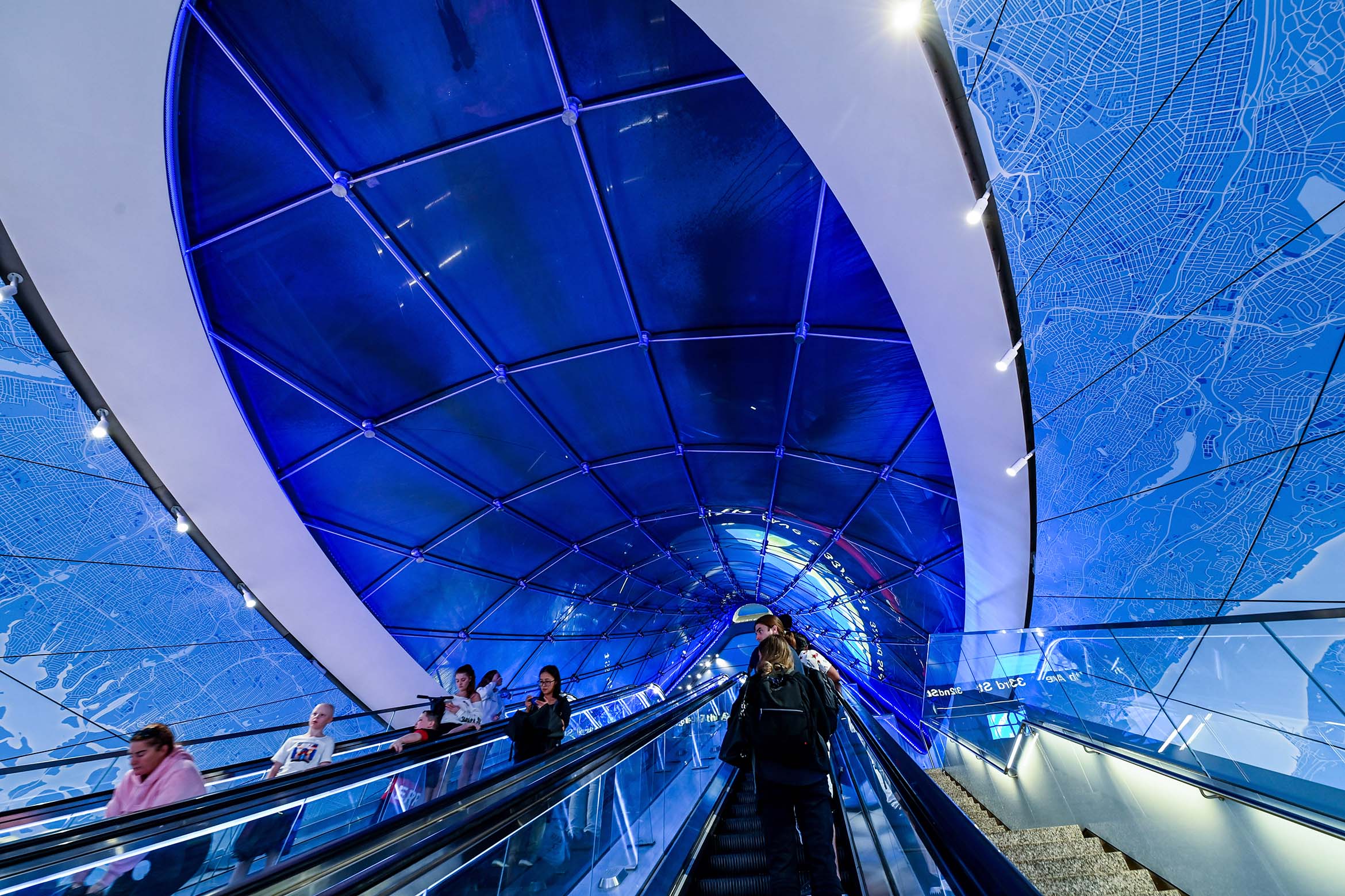
It is still unclear what, if anything, will replace Eclipsed Time. The renovation’s development partner Vornado has installed a vector map around the East End Gateway’s new escalator and a series of LED screens that clad the concourse’s barrel vault with projections of clouds drifting across a bright blue sky. On a Zoom call with the MTA Arts and Design department (the current iteration of the program that commissioned Eclipsed Time), director Sandra Bloodworth, deputy director Cheryl Hageman, and Matt Zettwoch, the vice president and program executive of MTA Construction and Development, all insisted that these aesthetic additions are neither commissioned nor art. Yet the department remains unclear on what role the arts will play in the future of the concourse. Bloodworth and Zettwoch agreed that the matter is both a question of ongoing funding negotiations and safety. Vornado’s installations, they clarified, were temporary. The removal of Eclipsed Time was also beyond the department’s control, but Hageman confirmed that during the decommissioning process the piece was conserved and crated, with some elements returned directly to Lin.
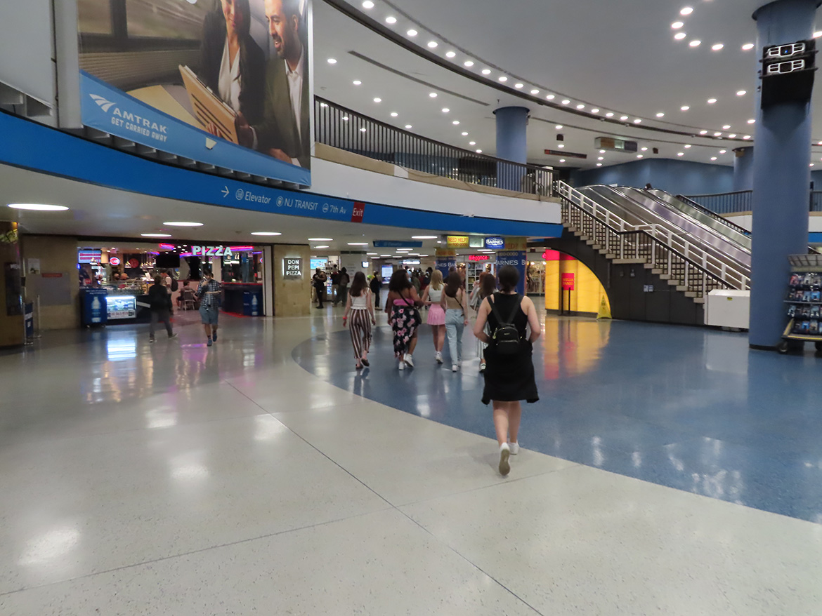
With the completion of the East End Gateway and the removal of Eclipsed Time, the LIRR concourse has a literal doorway at long last. It is also a gateway to the new commercial tenants that Vornado has assembled. The 2023 version of Penn Station’s LIRR concourse is a megawatt evolution of the ’90s renovation. It is full of announcements claiming, “This is for you New York,” like a proud parent presenting their child with a calculator for Christmas. Much like the widely panned “We Heart New York” logo, the members of the collective benefitting from this gift and this “heart” remain murky. The LIRR’s efforts follow a few tropes familiar to travelers who have traversed Penn’s costly 2014 sibling at the Fulton Transit Center; a grand open hall flanked by commerce and characterized by a lack of seating, bright penetrating lighting, a high volume of security cameras, and squadrons of police. It is clean, well-lit, commercial, and deeply surveilled.
The clean, well-lighted place is a concept lifted from a short story of the same name by Ernest Hemingway. As two waiters serve a drunken neighborhood elder his final tumbler of the night, they speculate on what is to be done with such a character, disgruntled though for the most part benign. After some debate they settle on the idea of the clean and well-lighted place, an environment where he can rest at length and undisturbed. Deployed in contemporary American public spaces, rather than accommodating the city’s huddled masses yearning to breathe free, the principle serves to monitor and remove them in the name of cleanliness and order. Like the repair of “broken windows,” a clean and well-lighted environment in the US is more an invitation to policed sterility than an impulse to care for those in need of a dignified place to pass the time.
The New Yorkers this secure aesthetic addresses appear to be more speculative than specific. They are the prodigal heirs the city has chased since time immemorial: the ones with money to spend at fast casual restaurants, who appreciate the planning of suburban malls and are theatrically appalled by trash or anyone else’s unruly behavior. The renovation appears to give the concourse a place to pause, but only for the time of a quick transaction.
In this combination shopping center and Apple Genius Bar, the everyday occurrences of a public life that are functional, a little dirty, but not derelict, can no longer be supported. When the performance of order can only be achieved by the appearance of spotlessness, it takes very little to look out of place. The aesthetic of security is often a powerful tool in leading the paying public to believe that insecurity could never fall upon us. That rather, it is only some removable blemish that could threaten our ease. Thanks to a suspicion, and indeed fear, of the visibility of homelessness, comfortable places to sit are now thinner and thinner on the ground, something that new parents, the elderly, and the overburdened traveler are also left to lament. Indeed, in any space with a constant aspiration towards spotlessness as order, loitering of any kind becomes so suspect that waiting on a train must be a swifter affair. The passage becomes accelerated and even the allusion of pause is scrubbed away.
In writing this, it is not my intention to turn into the worst of New York stereotypes by suggesting that in the good old days one could not claim to truly be a New Yorker unless they fell through a sink hole into a nest of rats (although this has happened). It was clear that the concourse needed to be upgraded and, even more crucially, that it needed to be maintained. My intention is rather to question the idea that function and maintenance can only be achieved at the hands of utter sterility. Slight discomfort, an unmopped corner, or indeed a person having a public meltdown have historically been par for the course in the tri-state commute. If the city is eager to serve a population unused to these sights to the point where public edifice cannot exist without heavy surveillance (rather than any significant investment in public housing or health), then New Yorkers are not the public it is planning for. How could it be, in a place whose dramas have shown its occupants time and time again that we, none of us, are very far from precarity?
Thanks in large part to MTA Arts & Design’s efforts, the transit system already has a variety of existing aesthetics worthy of evolving and engaging with. They are surprises in the form of intricate mosaic works, bronze cast tiny figurines, wooden benches, bright geometric animations of shapes bursting from the tunnel onto the Manhattan Bridge. They are the considered moments that break through the monotony of a day to remind a traveler that a commute can be more than just defensive crouch against potential danger, that unexpected delight could be as likely.
When I was a young person, what drew me to public art like Eclipsed Time was not that it was spotless — the pigeons ensured that it rarely was — but that it felt like a secret for me personally. Even though thousands of people passed under it every day, and many of them took a moment to crane their necks for it, an encounter with Lin’s Eclipsed Time still felt like a private audience. This was my subtle experience with a public space that somehow communicated without an advertising campaign: Hey, this is for you, now move along. As I move through Penn Station now, in the same rush as ever, I don’t see any similar anchor.
The ancients had many thoughts on eclipses, and none of them very auspicious. From the death of an emperor to the failure of crops, prevalent wisdom was that any blockage of regular light could only be a portent of disaster. Perhaps these readers of signs were looking for a language to explain what Ursula K. Le Guin once stated so well: “The enduring, the reliable, is a promise made by the human mind.” Even flanked by Chop’t salads and Dos Toros burritos, our safety is still a matter of the moment. Our public spaces are subject to the same cycles of boom and bust, of disrepair and renovation, of safety and ill-ease, as are we, their occupants. That is to say, never so far from a turn in fortune as we may lead ourselves to believe. It is often art that reminds us of this. In our new concourse, the LED blue skies will never be occluded, yet rather than being dispelled, our anxieties seem to play out on a brighter stage.
The views expressed here are those of the authors only and do not reflect the position of The Architectural League of New York.

Comments