We are celebrating 15 years — and counting — of stories that are deeply researched and deeply felt, that build a historical record of what the city has been.
We are celebrating 15 years — and counting — of stories that are deeply researched and deeply felt, that build a historical record of what the city has been.
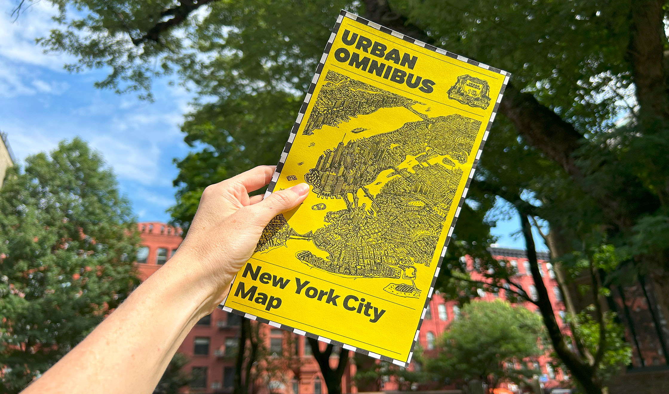
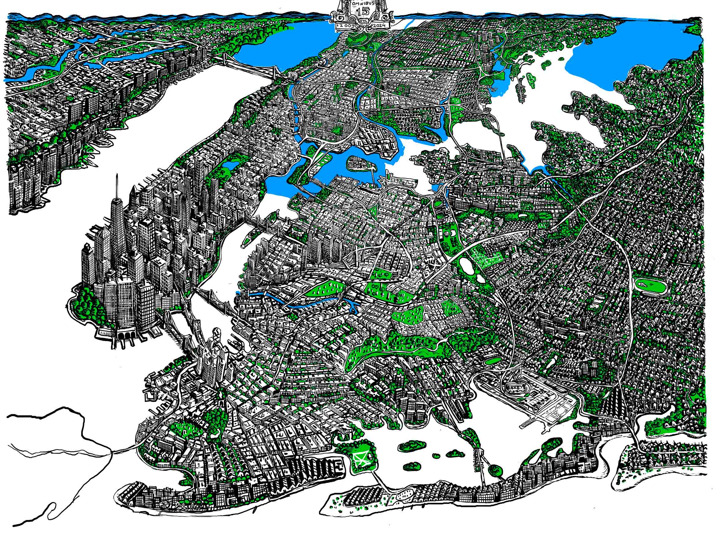
This year, Urban Omnibus turned 15. After a decade and a half of publishing online, we wanted to take our work off the digital screen and into the material world. We decided to make a commemorative map highlighting some of our favorite stories from over the years across New York City. It would be a good way to take stock of the places, people, and projects we’ve explored, and to help chart a path for the future. An Urban Omnibus New York City Map could both represent the work we’ve done and our approach to that work: deeply researched and deeply felt.
So we surveyed the geography of our stories and teamed up with an artist we love to create an Omnibus-eye view of New York City. Maps are great tools for analysis and representation, but they’re also highly subjective, the product of the places where we sit and the choices that we make. We always like to hear directly from people about the projects they take on and how they approach them; we thought we could also share the unvarnished story of how we made our map.
The first step was seeing what there was to map. We wondered what we would find if we tracked the locations of all our features. How much ground have we covered? Do we live up to our commitment to a city-wide lens, not just focusing on the usual highly imaged and over-narrated suspects?
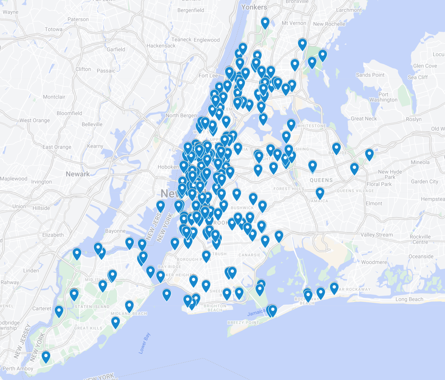
Since 2009, UO has published 1,293 stories. But not all of them are full-fledged features or correspond to a specific site. So we edited down our list, and we made a spreadsheet with 521 stories on it — and counting.
Some of these cover dozens of sites, or no specific site, or sites across the Hudson or over the Atlantic. So our managing and assistant editors, Kevin and Karla, and intern, Ayla, pulled out 236 stories that mapped more precisely onto the city, and put them into a Google map.
Staten Island, Southern Brooklyn, and Eastern Queens appeared to get short shrift. But when we looked at it in terms of population, we found that Staten Island is underrepresented in stories per square mile, but actually overrepresented in stories per capita. At the same time, the majority of the borough’s stories are tracking the transformation of the infamous Fresh Kills landfill into a new park. (THE CITY embarked on a similar exercise at about the same time, geolocating more than 4,000 stories with a similar distribution).
We have thought a lot about maps and mapping over the years. Some are more analytical, some are more idiosyncratic or psychogeographic.
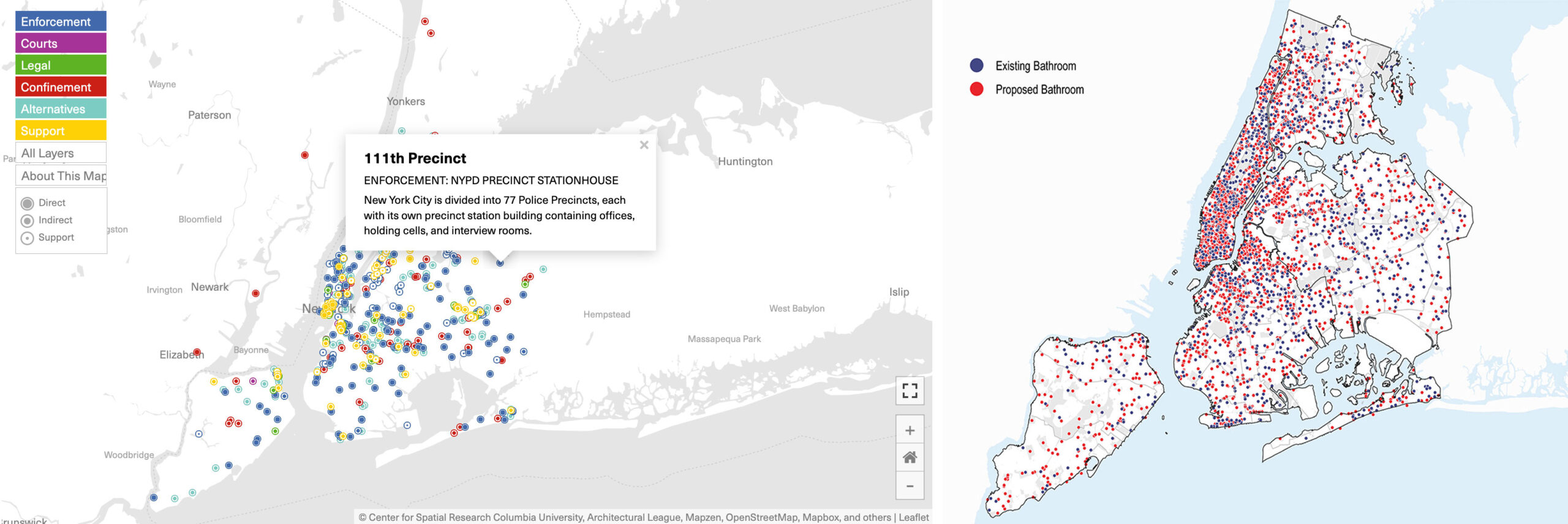
For our series, “The Location of Justice,” we worked with the Center for Spatial Research at Columbia GSAPP to describe the physical footprint of New York City’s criminal justice system. In their 2020 story, “Where Are the Public Bathrooms in New York City?” and a 2023 follow-up, Julie Chou, Kevin Gurley, and Boyeong Hong mapped the city’s public toilets and proposed sites that could feasibly accommodate new infrastructure.
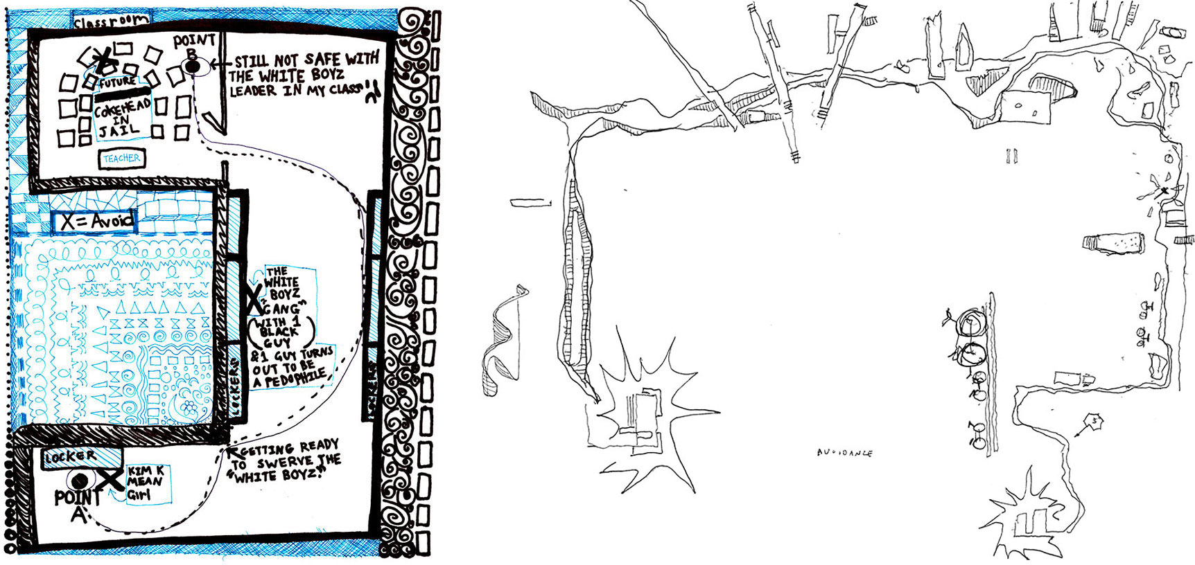
In a 2017 roundtable, Perfect City Working Group led us through an exercise in “avoidance mapping,” discussing how mapping what we avoid can also show us where we feel we belong.
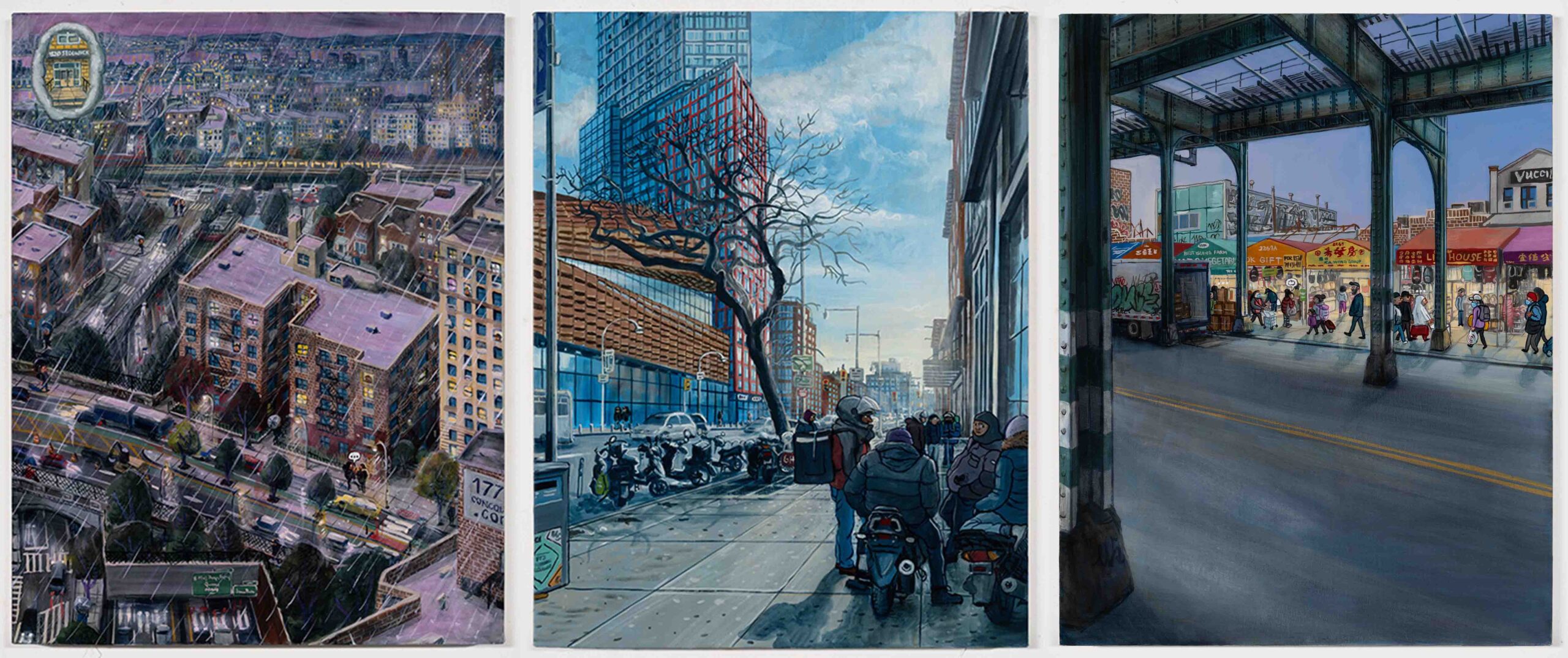
Our editor-in-chief Mariana first encountered Stipan Tadić’s work at James Fuentes Gallery. Metropolis: 36 Views of New York was a series of scenes along the D train from Norwood to Coney Island. She was struck by his multi-perspective depiction of a geography of everyday life and all the people that participate in it, dense with historical layers and digital overlays. Housing, infrastructure, public space, prominent landmarks and neighborhoods streetscapes, were all represented, as were teens and tourists, commuters, performers, and deliveristas. So she interviewed Stipan about this work, and asked him if he’d ever want to work on something together, like say, a map.
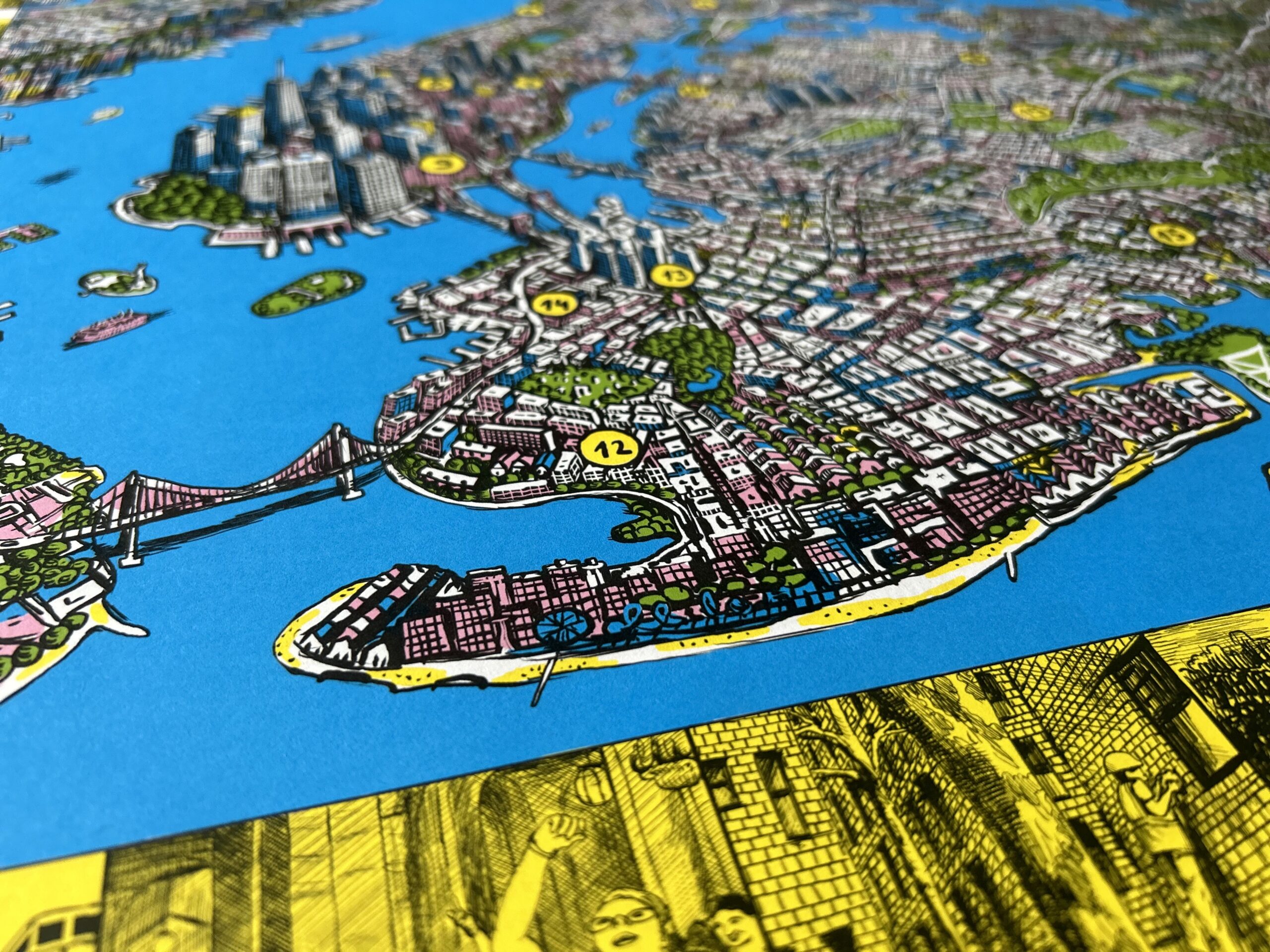
Stipan had already painted some of the places we thought we’d put on our map, like Atlantic Yards and the Cross Bronx Expressway.
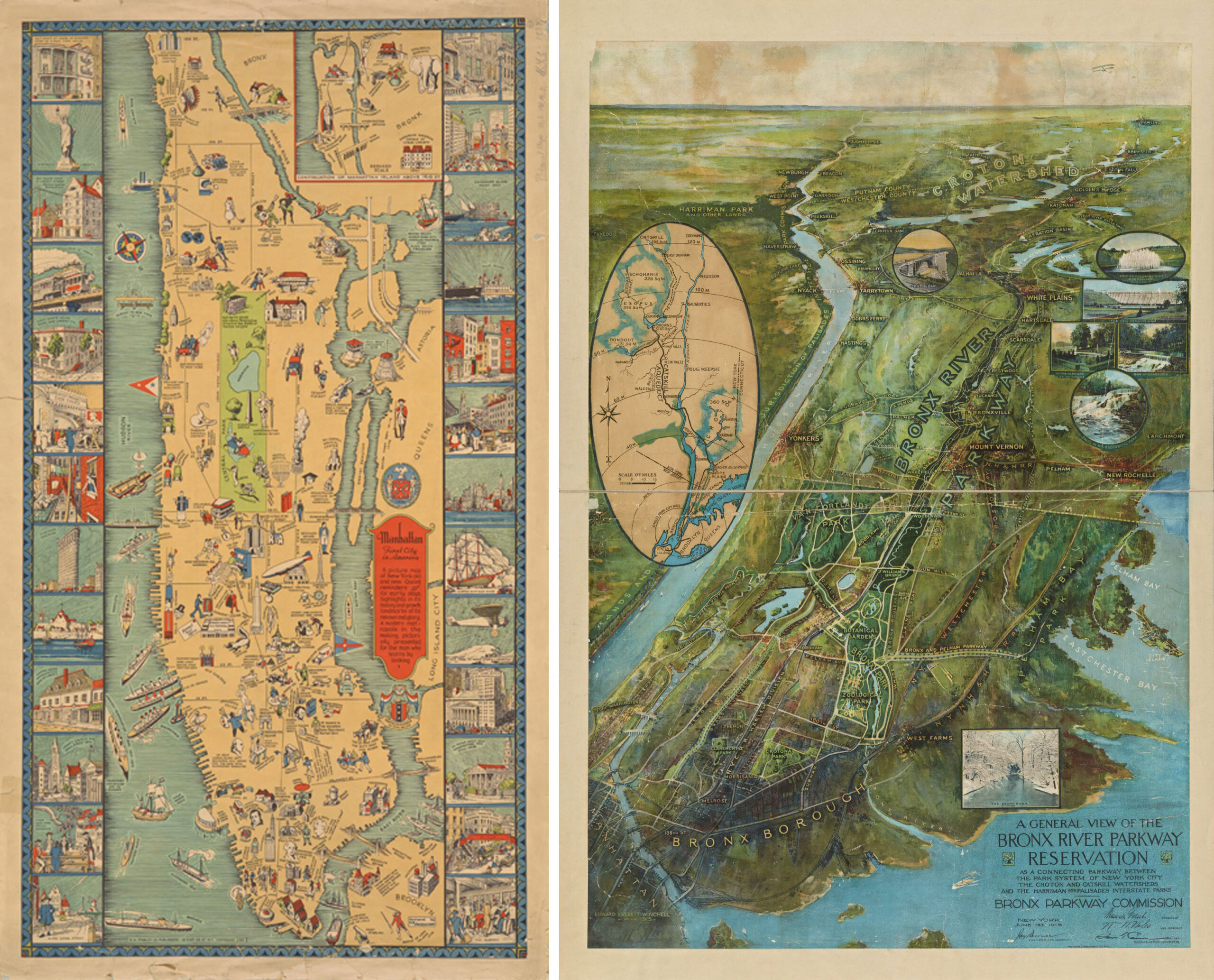
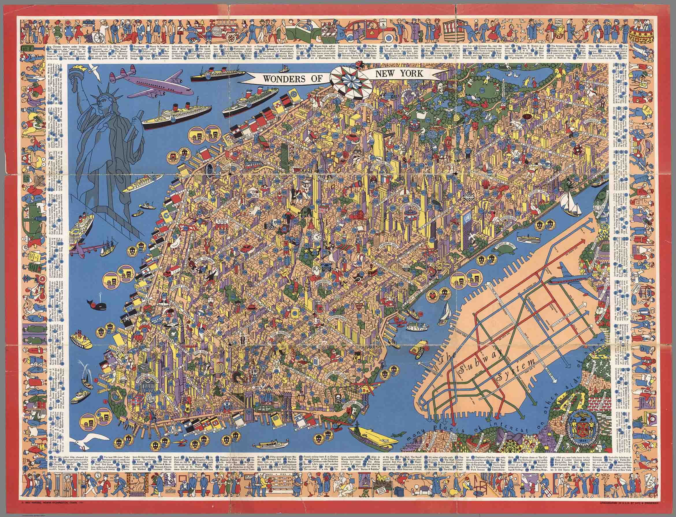
Together, we started by looking at historical maps in the collection of the New York Public Library. Stipan was drawn to the illustrated maps that call out notable sites and scenes. But they all focus on Manhattan, tall and skinny.
Stipan found this map poking around online. We loved the level of detail, the architectural projections, and the concept of mapping the “Wonders of New York.”
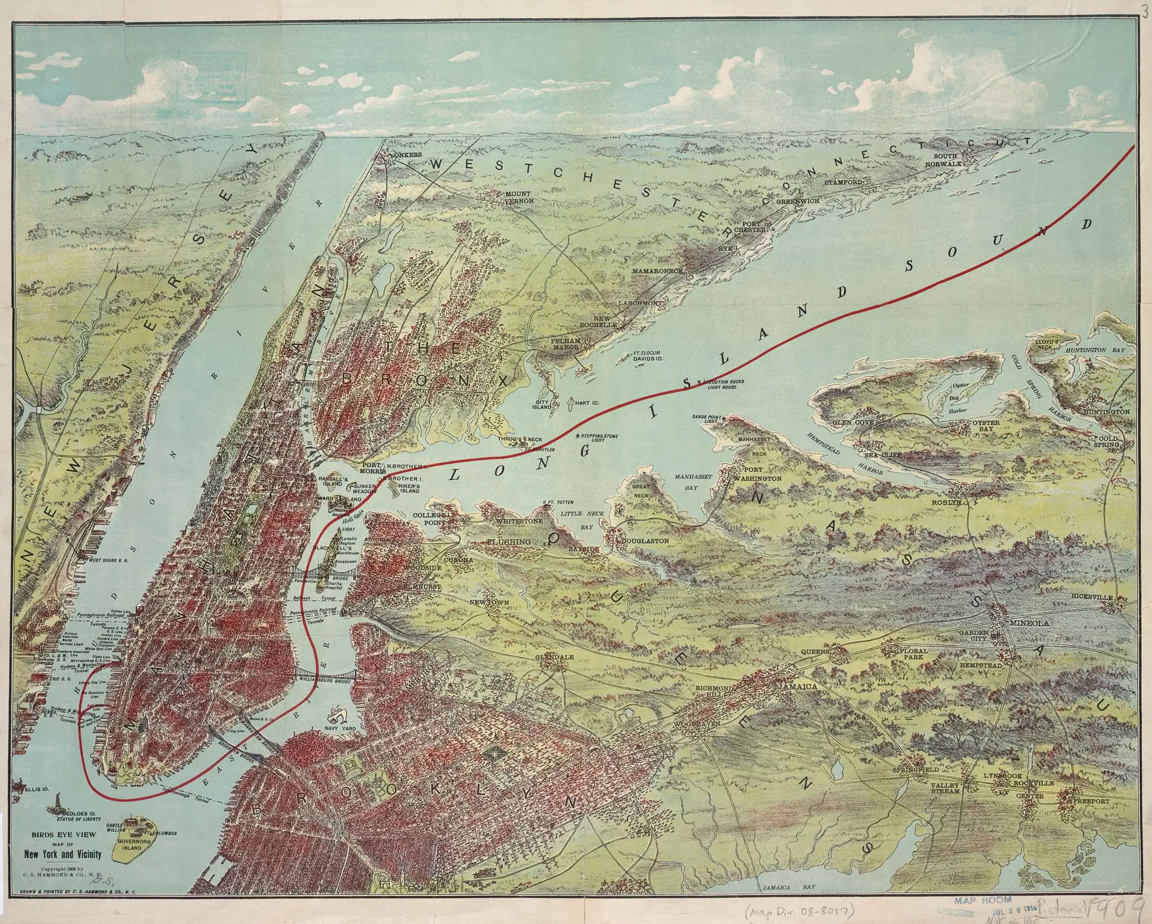
We also liked this 1909 bird’s eye view from NYPL’s collections. It captures New York “and vicinity” — although not all of it. It’s illustrated in a topographic style, with the region seen from above and stretching out to the horizon. The artist even included the sky. . . that’s nice.
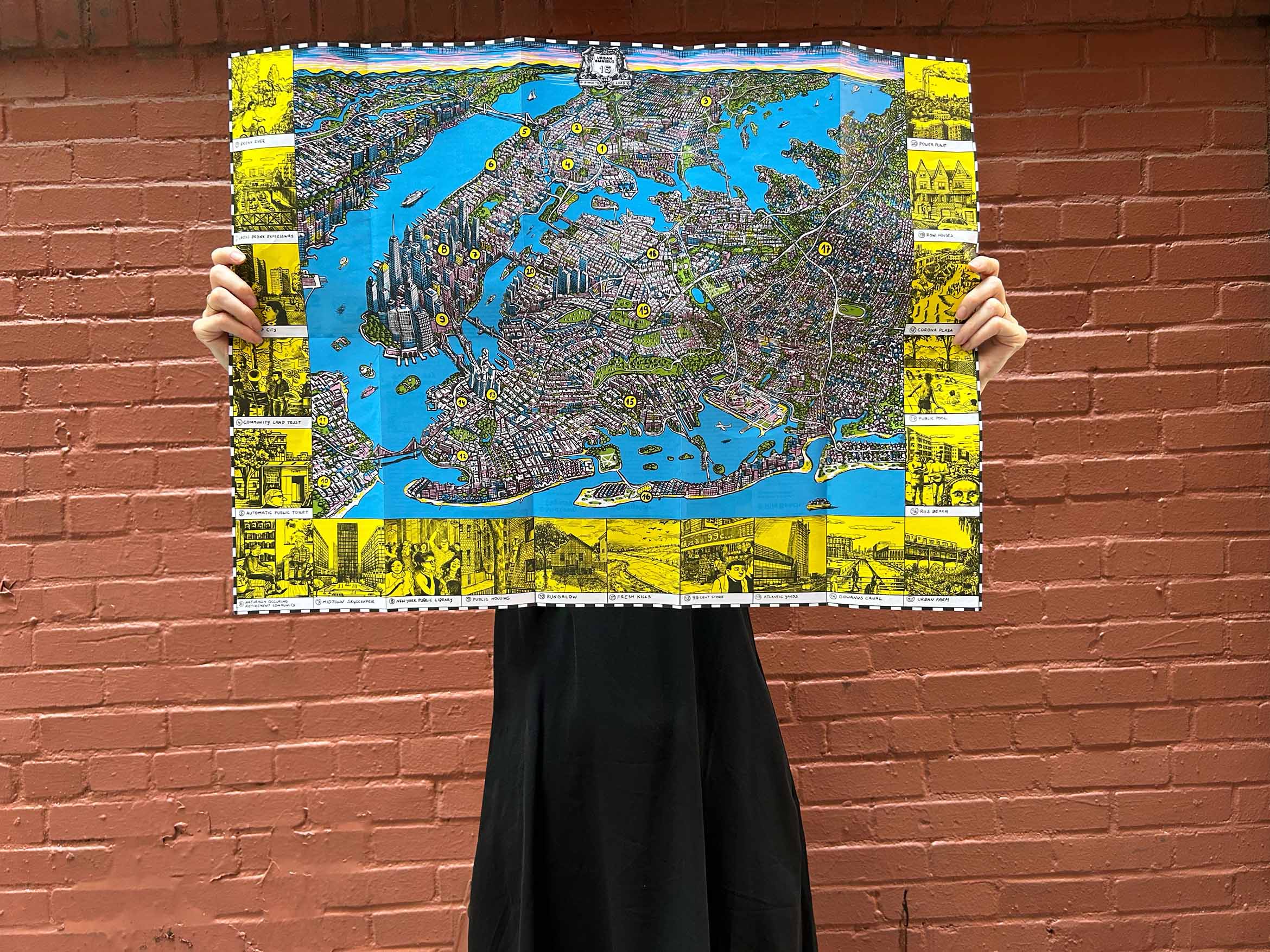
We wanted to make sure all of New York City made it onto our map: not just Manhattan and the East River waterfront. Even all five boroughs felt insufficient. While our focus is New York City, we understand the city as part of a metropolitan region and the flows of people, materials, and capital across the globe, even into outer space. But a map of the New York City region would lose too much detail, and stories from Long Island, or New Jersey, or beyond, only make up a fraction of our archive.
Then there’s the longstanding issue of proportions: the esthetic value of abstraction versus geographic accuracy. Should each borough be at scale? Stipan eyed it and took some liberties where needed to fit the map into the proportion we would be printing it at. “But,” Stipan reflected in an email, “the final proportions came more from within. When I started making the big highways especially, those were a great orientation for different neighborhoods and shapes.”
The biggest cartographic puzzle piece was Staten Island. It’s so big and extends so far southwest. Unless we were going to give half the map over to New Jersey, we had to decide whether to show only the tip, or to shrink it and put it in a box, as the New York City subway map does. In the end we decided it was better to keep Staten Island at scale.
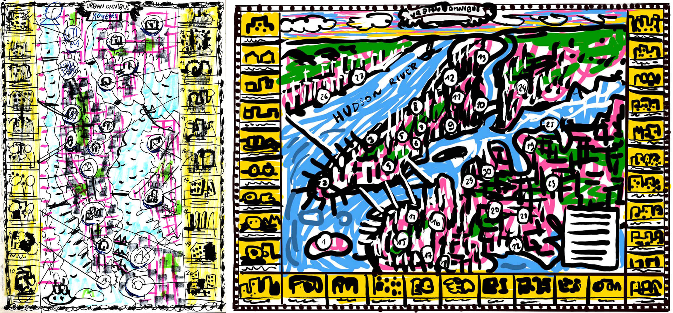
Now, it was time to draw. Stipan thought this would be a fun, quick exercise.
“I don’t know exactly how much I will get into details,” Stipan wrote in March. “I think I’ll just point out some major monuments and style of building. I will maybe try to make one part exactly how it will be. I imagine mostly it will be quite funny and generic nyc buildings. . . . I don’t think I can get too specific about the whole city.”
Stipan moved to NYC from Zagreb, Croatia in 2018 and lives in Brooklyn now. He has been studying and exploring the city, but 300 square miles is a lot of territory to cover (UO has been doing it for 15 years and our mapping exercise already showed we still have a long way to go).
Stipan started with Manhattan and Brooklyn and that went pretty well. We requested more detail, like getting the Bridge Apartments over I-95 in Washington Heights and the new Pier 17 in the South Street Seaport.
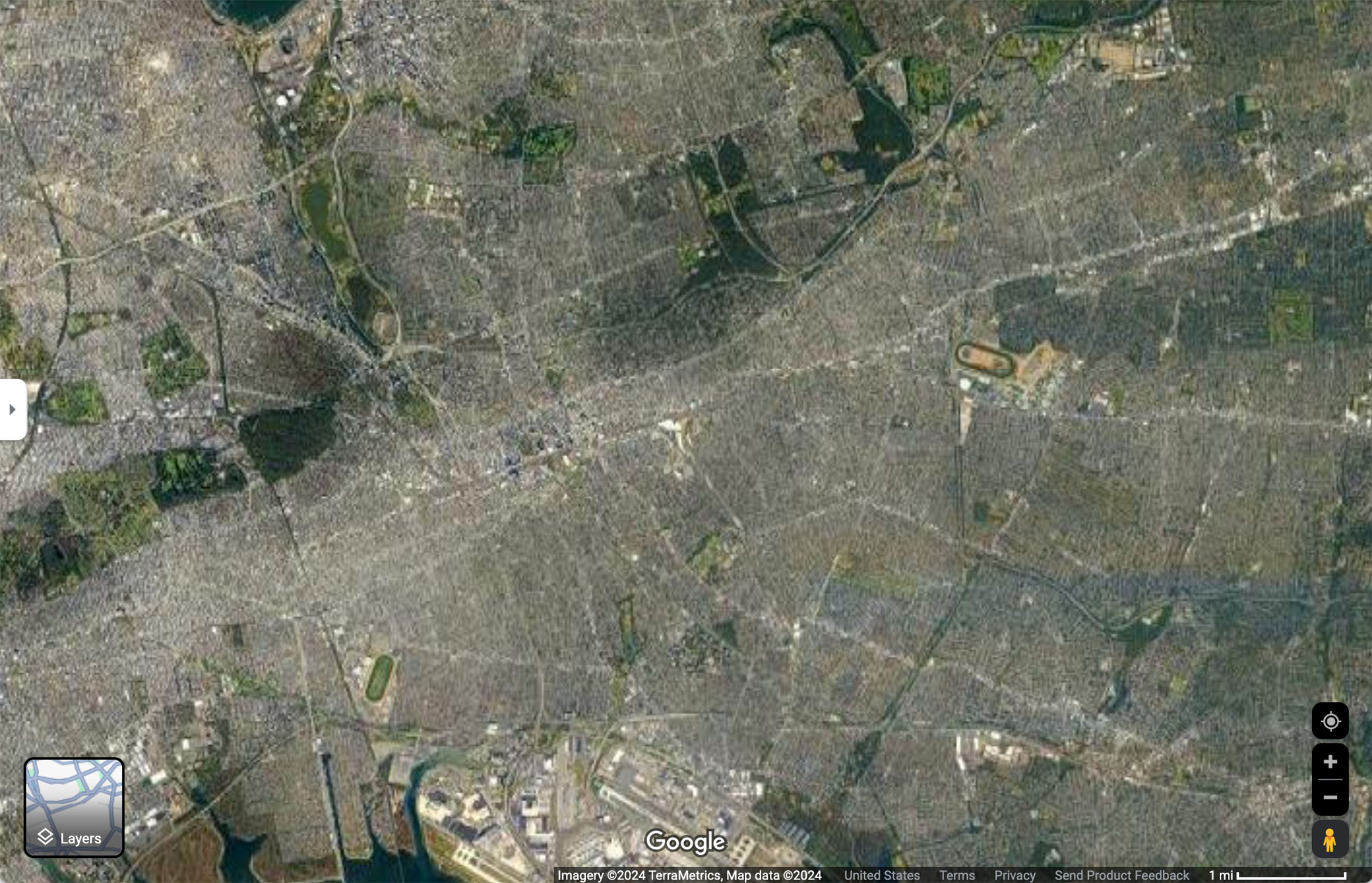
Then it was time to move on to Queens. “Wish me luck : )” Stipan emailed in March. Queens is so expansive, so residential, so lacking in a coherent urban image: a “sprawling, multinucleated, highly varied urban place,” one scholar described it in a recent story. Stipan was working off Google Maps’ satellite view and a lot of Queens was a blur.
Mariana offered some admittedly personal reference points in a stream-of-consciousness list: “The high-rise areas of Long Island City, the LIE and maybe Queens Center Mall, Forest Hills, the airports, single family houses towards the eastern end, industry along Newtown Creek, all the cemeteries, Alley Pond Park and all the highways at the Long Island border, Flushing also some taller development, Flushing Meadows/Corona Park. ”
Eastern Queens and Long Island took up a lot of space on the map, and Stipan treated a lot of that as proverbial flyover country, in terms of detail: two- and one-story housing units interspersed with greenery.
It was only working on this article that we realized some of what we’d forgotten to include: the Ridgewood Reservoir, which we’ve written about more than once. Some of the city’s lesser islands, which we recently did a story on. You won’t find the 79th Street Boat Basin, or any other marina. Every one you ask would draw New York City differently and everyone will notice something that is missing.
Finally, after two months of intense drawing, Stipan added color: blue, green, yellow, and pink, and he added some boats, those jet ski crews that are always zipping around the East River and Long Island Sound, some airplanes and, for extra verisimilitude, a helicopter taking some one percenters out to the Hamptons.
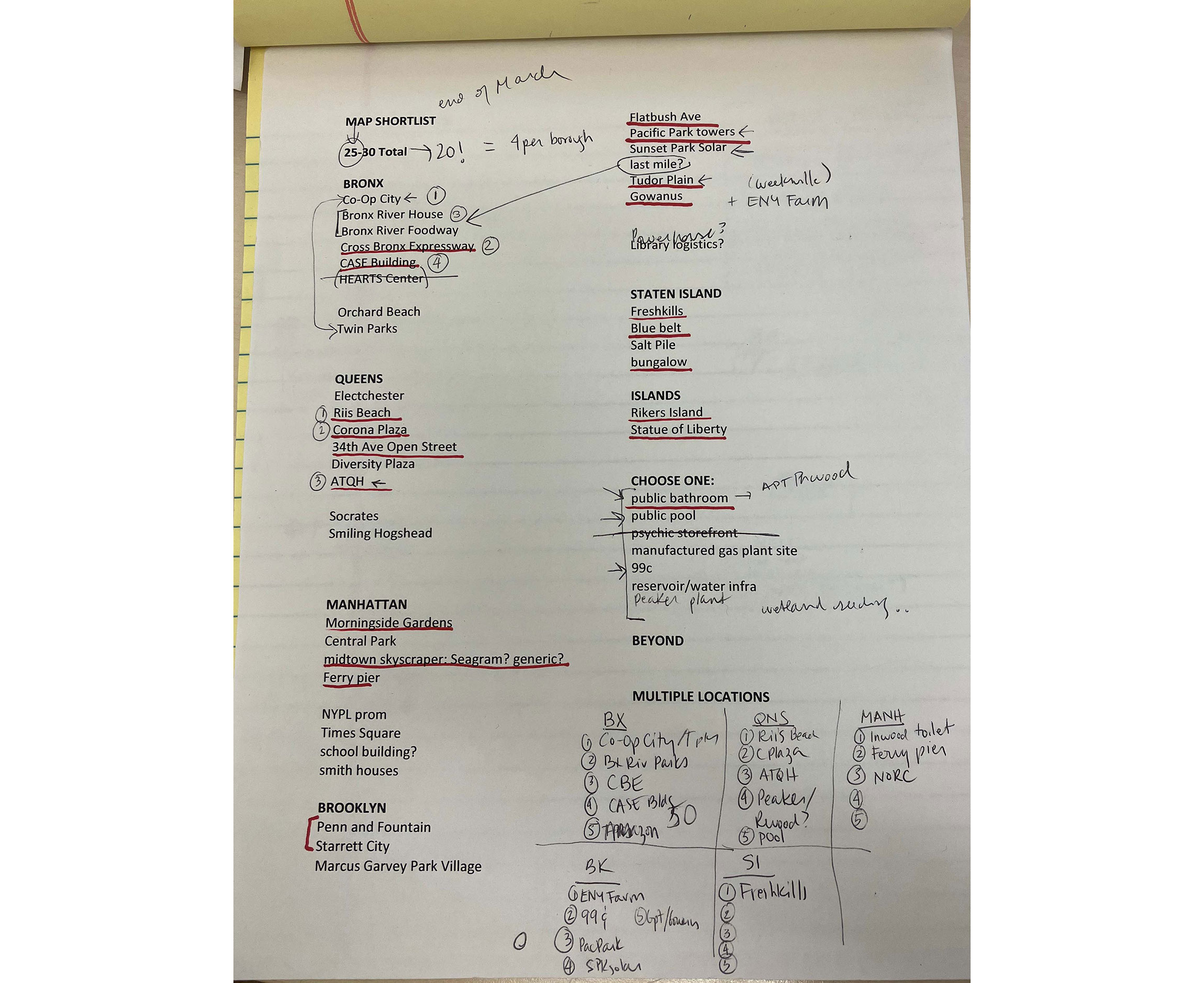
We had to make a small selection of sites and stories to highlight on our map. But how to narrow it down?
We started thinking about stories about things we would want to see on a New York City map, like this nice one about restoring the Statue of Liberty from 2013. But while the Statue might symbolize New York to new arrivals, we were looking for sites that represented our stories. They needed to cover all 15 years of the publication to date (2009–2024), reflect areas of enduring concern, and highlight some of our thematic series, and, ideally, work from some of our favorite contributors. We wanted to feature each borough evenly (ish), and for the locations to be spread out evenly (ish) and lend themselves to illustration.
In narrowing it down to 20, we would inevitably lose some important focuses of our work and favorite stories, but off the bat, we wanted to be sure to include some of the following: towers in the park, energy infrastructure, a commercial building or two, public institutions and social infrastructure (a library), a historic landmark or two, a remediated landscape or three.
This was a celebratory map, so we thought a lot about whether we wanted to include a jail or police precinct building, even if we’ve paid a lot of attention to those. We wanted more good than bad and ugly, and focused on sites that reflect the hard work of architects, landscape architects, planners, activists, city agencies, gardeners, business owners, residents; homes, public spaces, infrastructure, institutions, workplaces, cultural spaces and other sites of everyday life.
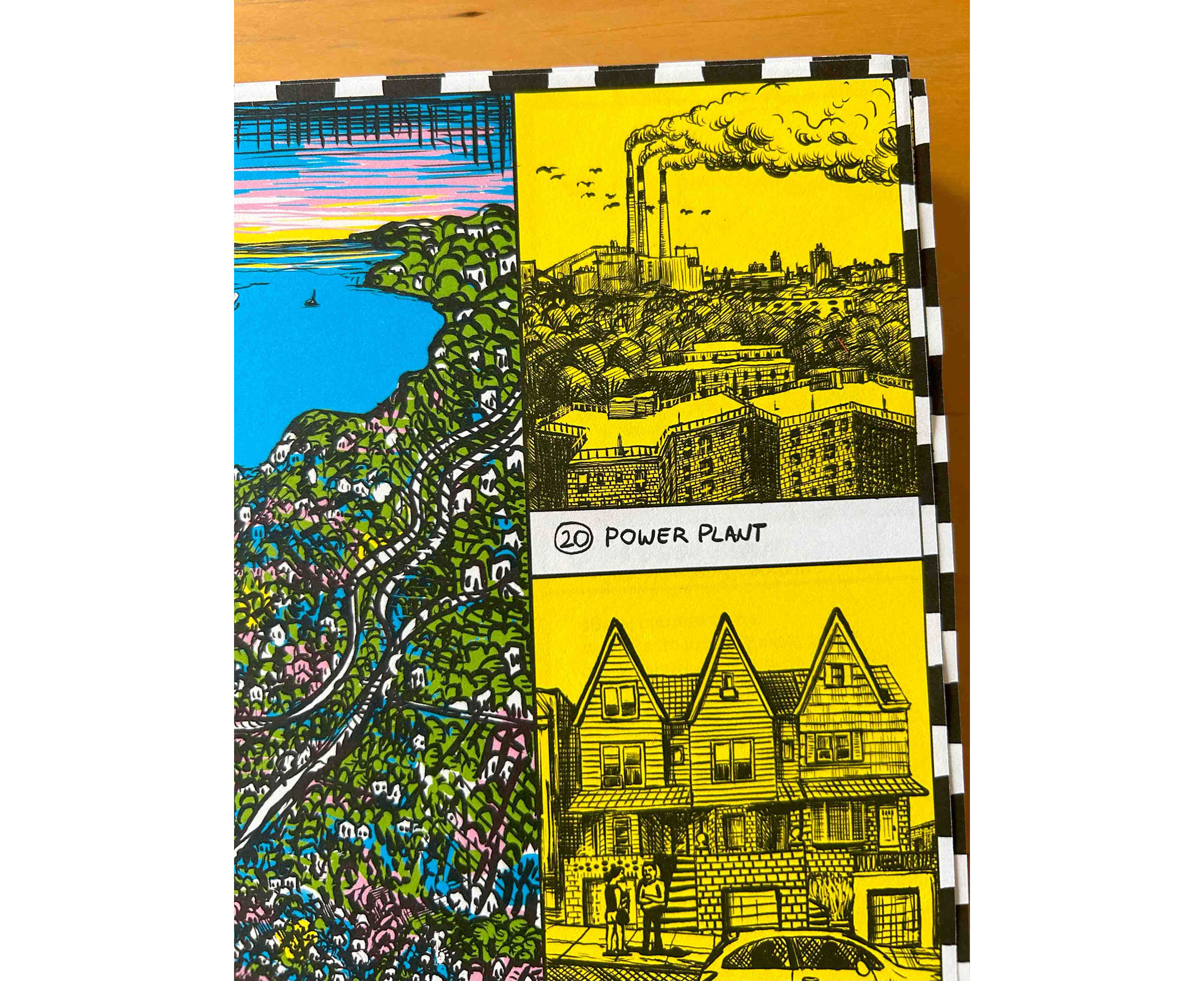
The final selection extended from an urban farm in East New York that we profiled in a 2009 video series, to a section of the Cross Bronx Expressway that we documented in a 2024 photo portfolio. We chose a public toilet in Washington Heights because we’d already made selections in Midtown. We chose the Seagram Building in Midtown so we’d have a skyscraper (can’t ignore what people think makes NYC), and because a map from the Architectural League should include at least one architectural “masterpiece.”
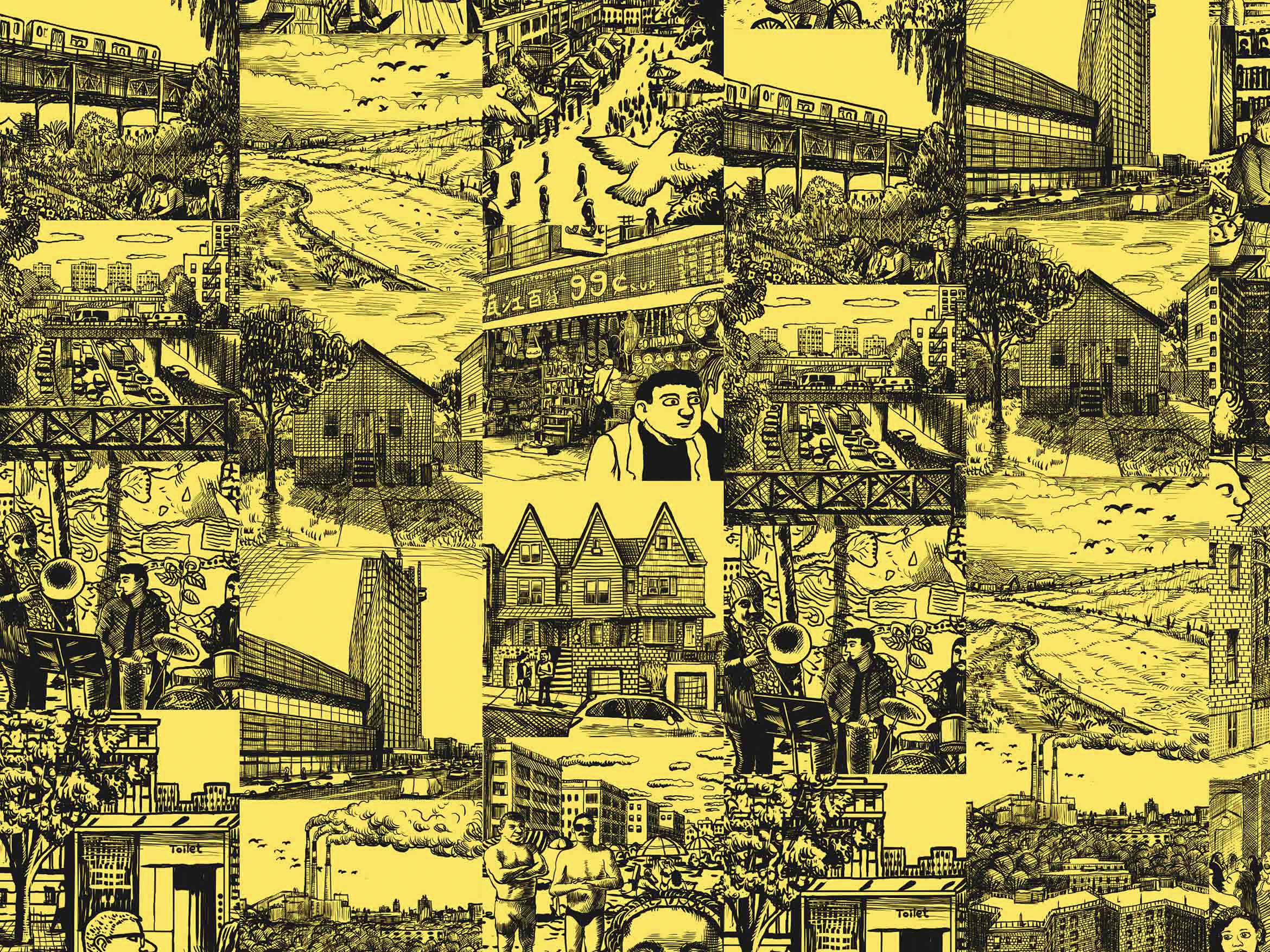
Urban Omnibus would never give just a bird’s eye view of the city without spending some time at the street level. The contrast between the unitary view from above and the multivocal spatial practices that take place on the ground, these different ways of understanding and knowing and making a city, is Urban Studies 101. We always aim to make our stories concrete, and to bring serious consideration to humble and even mundane places: gas storage tanks, EV charging stations, or sidewalk bioswales. Stipan’s design for the map included space for twenty illustrated scenes from the sites we selected.
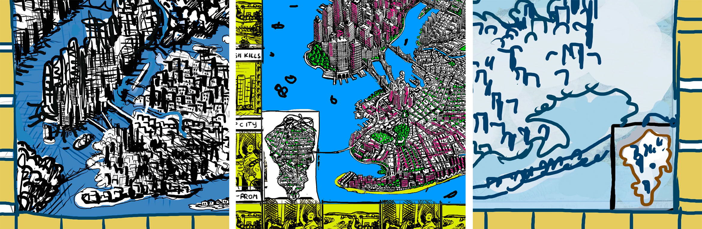
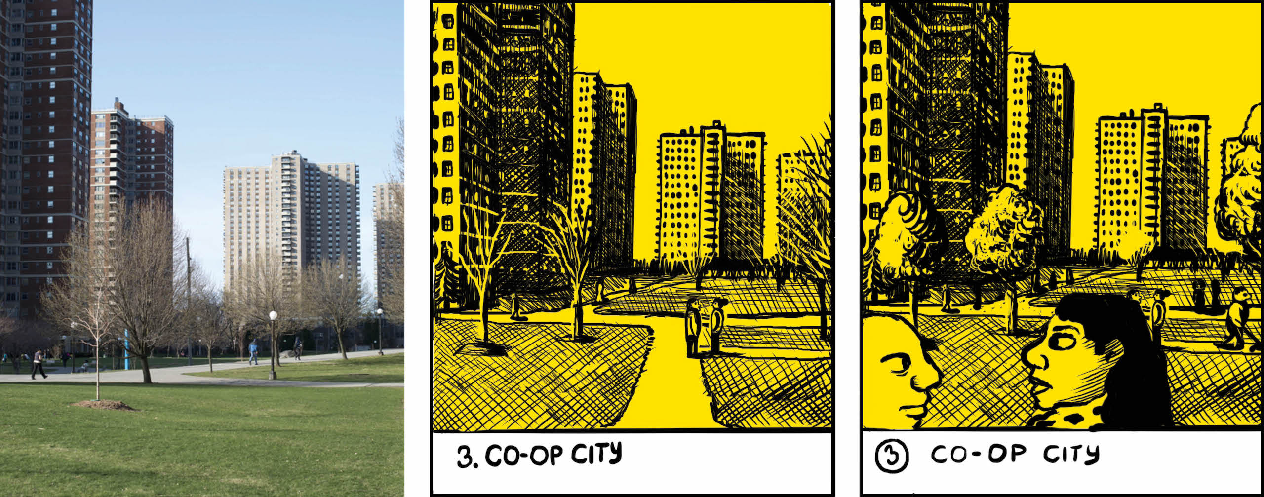
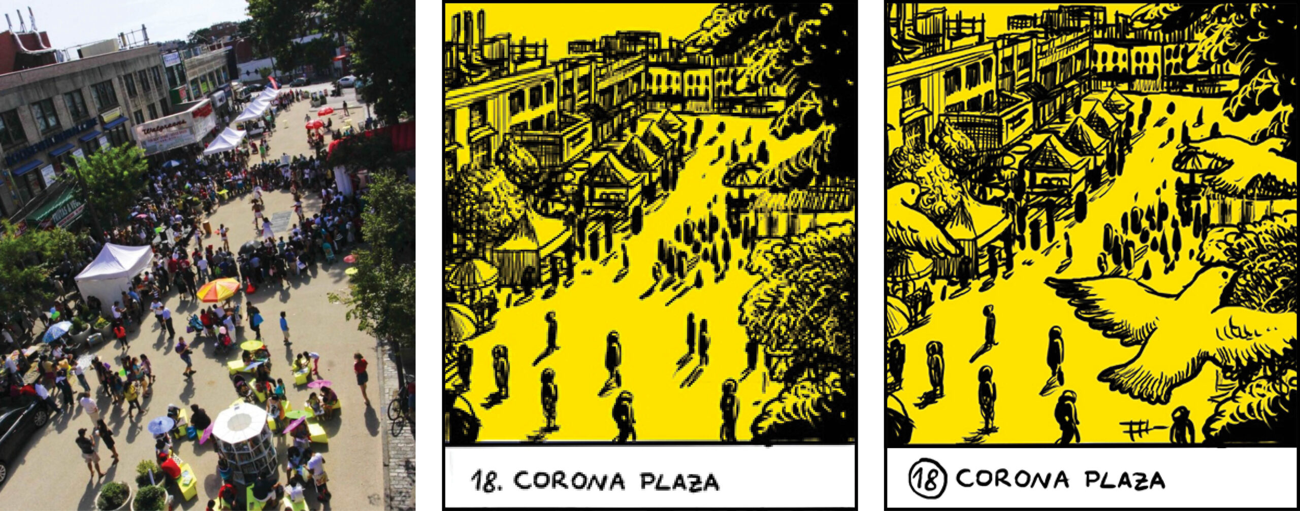
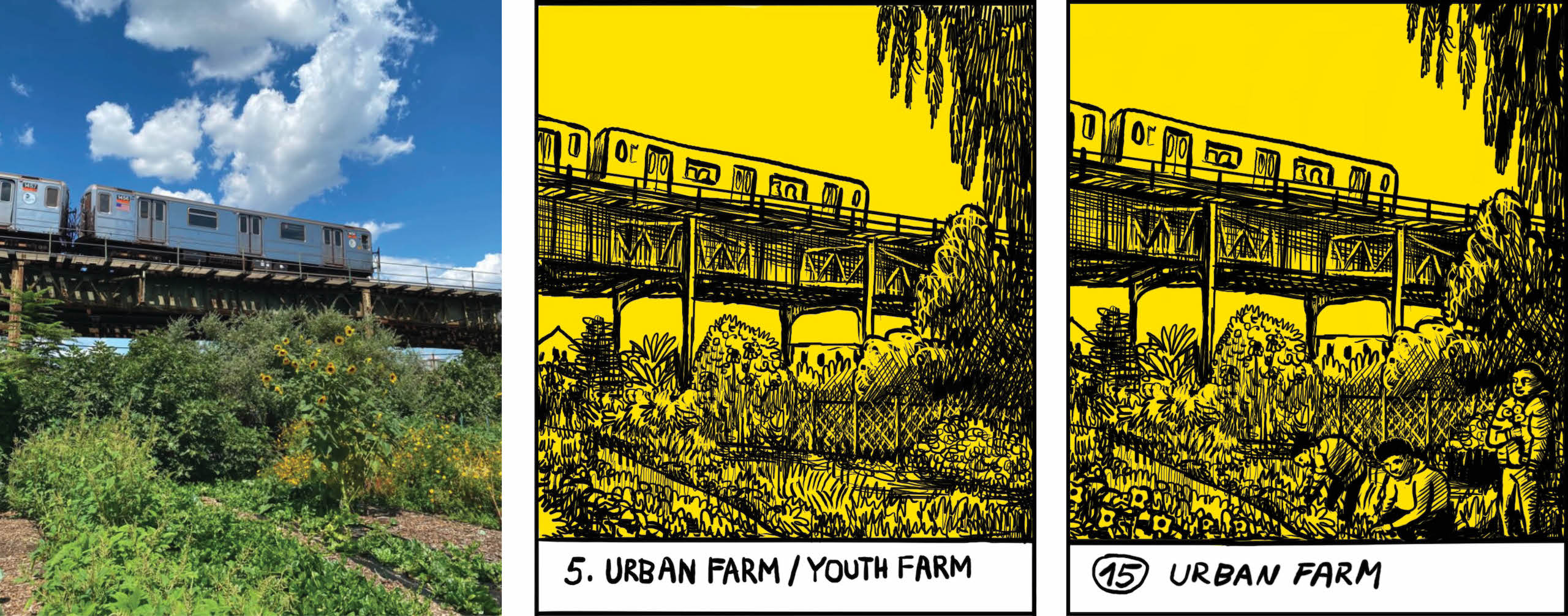
When Stipan draws a location, he always visits in person and takes photos, which he brings back to the studio. “Impressions and interpretations are very important to me,” he wrote in an email. But 20 sites was a lot of ground to cover, so we sent him images, mostly from our features, and some from Google images and excursions that Kevin took to find out what was on the ground or if a project was still standing. (A lot has changed over 15 years!)
Spot the differences between the source photograph, the process sketch (center), and the final!
After a few rounds with Stipan, we looked at the vignettes together and they looked a little sad. We look unflinchingly at the city, but from a place of love and celebration of hard-won successes. So we asked for some tricks we’re familiar with from commissioning photography: get people in the pictures, make sure there are leaves on the trees.
“Look” Stipan said when we gave him this note at our last meeting, “If you don’t want it to look sad, you might have hired the wrong artist.” We all laughed. He made some concessions to “bring a bit of life to a few vignettes” like adding more people, birds and cars. The jolt of yellow helped too.
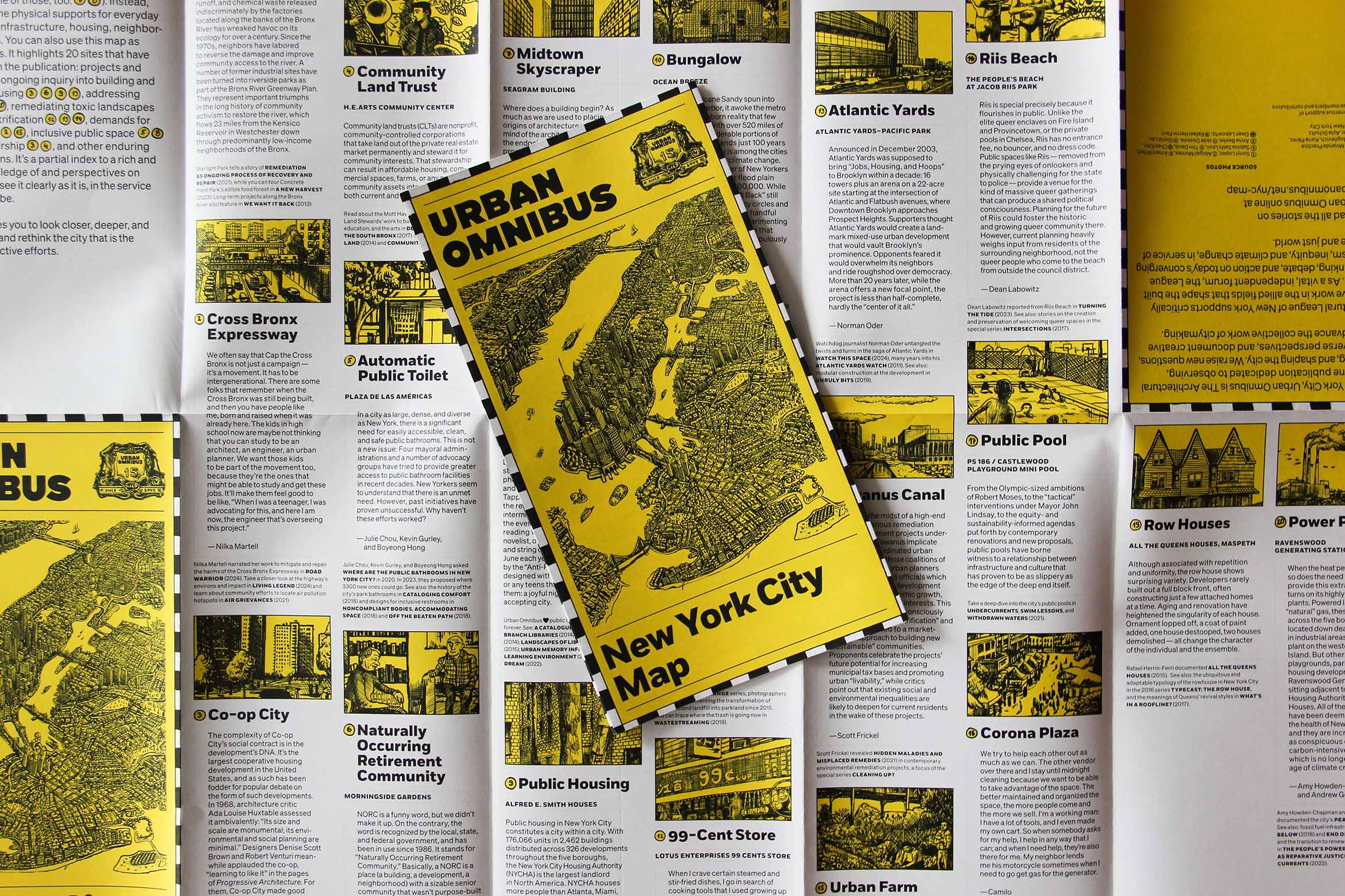
We wanted the map to feel like a folded tourist map you might pick up at a souvenir shop, but also like those high-end “brutalist architecture” maps you can find at a museum gift store, and also like the Center for Urban Pedagogy’s pamphlets for popular education (which we wrote about in our early days).
We worked with the designer Manuel Miranda to put everything together. If the illustrated side of the map was Urban Omnibus’ guide to New York, Manuel suggested the flipside could be a New Yorker’s guide to Urban Omnibus. For each vignette, we selected some writing by our editors and contributors to connect that place to the bigger themes it illuminates, and we cross-referenced each entry with more stories on Urban Omnibus. A QR code takes you from the physical map to an index site — and nearly a hundred stories — on this site.
We looked for a local printer, which felt like the right thing to do (and would ensure the maps were done in time for our birthday party). Though we worked with a printer in Midtown, they sent the project to their press in Hauppauge, on Long Island. Our map was printed in New York, but not exactly in “the city.”
The map represents a good overview of our work: paying close attention to places, people, and processes outside the news cycle and disciplinary echo chambers, and all across New York City, building a historical record of what the city has been alongside a critical and caring imagination of what might be. There are so many other sites we could have put on the map, and so many more we would want to put on the map, and we haven’t even covered yet! A new map would include a massive Amazon warehouse; it would have more to say about Southeast Queens and the Northeast Bronx, and Staten Island landmarks beyond Freshkills. Maybe in 15 years, those areas will be much denser; maybe in 15 more, new blue ink will cover the built-up waterfronts as sea levels rise.
We’ll keep tracking the changes and exploring, and reflecting on how we tell those stories and whose perspective they reflect. This map is one way we get the support to do that. We made it to raise money so that we can keep commissioning and producing open-access, ambitious work from a wide range of contributors, pay them fairly, and engage consistently and creatively with our diverse community of readers.
You can get your own copy of the map and support 15 more years of our work when you make a donation of $50 or more to our 15th anniversary campaign.
The views expressed here are those of the authors only and do not reflect the position of The Architectural League of New York.